We had a blast joining our friends at Content Marketing Institute for the 8 Second Challenge webinar. We loved sharing tips on how you can connect email design to brain science to not only stand out in the inbox, but also get the marketing results you’re looking for.
It was such a smart crowd who attended, so it was no surprise that we got a whole slew of great questions – so many in fact that we just couldn’t get to them all during the webinar. CMI was nice enough to compile the ones we missed so we could answer them here on the blog. And if you missed the webinar or just want to geek out all over again, you can download a recording here.
Many of the email examples you showed were B2C. Do these strategies also apply to B2B marketing?
Absolutely. The important thing for marketers to remember is that regardless of whether it’s a B2C or B2B campaign, it’s still a human being on the other side of that email. And unless you’re marketing to the scarecrow from Wizard of Oz, that person has a brain, so all of the brain science and research that we discussed still applies. So along with all the other data we discussed, using images that appeal to the primitive brain, thinking about the effect of color choice and designing with mobile in mind will have an impact on your email results whether you’re doing B2C or B2B marketing.
Can you talk about experimenting with color in your email CTA buttons while still maintaining your brand identity? Are you tethered to your brand colors?
Branding is certainly important, but I wouldn’t get too hung up on it when it comes to the color of your call-to-action buttons. After all, it’s likely that the rest of your email and the landing page that the button leads to rest comfortably within your brand’s identity.
We use yellow for our buttons because brain science tells us it adds that little sense of urgency that encourages people to click (or tap), which is the whole point of adding a button in the first place. But you don’t have to use yellow. Due to the Von Restorff effect, things that stand out or look out of place hold our attention, so try using a color that complements or contrasts with your brand’s colors (e.g. orange with blue). It’ll look great and beg to be clicked.
So test out different colors for your buttons to see what works for your brand. You might find your audience responds better to blue or green – or maybe even smaragdine or coquelicot, if they’re particular like that.
Pick a contrasting color to make your CTA buttons pop. Our brains can’t help but notice it.
I love the image-heavy look of the emails, but what are your thoughts on mailing tools that don’t auto-load images? What about people who have images blocked?
The great news is that the default for most email clients is to automatically display images, so more often than not, your subscribers will see them. But in case images are disabled, there are a few things you can do:
- Don’t put important written content in the image that isn’t included elsewhere in the copy. If images are blocked, your subscribers will never see it.
- Always add simple and clear ALT text for each image. That way, you can get your message across even without the image.
- And as the good folks at Litmus suggest, consider stylizing that ALT text so it stands out. Adjusting the font, size and color can help engage readers who have images turned off.
You stated that imagery is important in email, but what’s the best image-to-text ratio to use so we don’t get blocked by spam filters?
Unfortunately, there isn’t a magical formula or algorithm to share, but a nice balance between images and text is best. If your email is 100% image-based, then you could run into some issues with spam filters or if your subscribers have images blocked.
But really, we recommend focusing your attention on your actual content rather than worrying about a particular ratio. Sending content that’s a nice blend of eye-catching images and relevant, useful copy not only helps make sure that your message is delivered, but also improves the chances that your audience continues to open and engage with it.
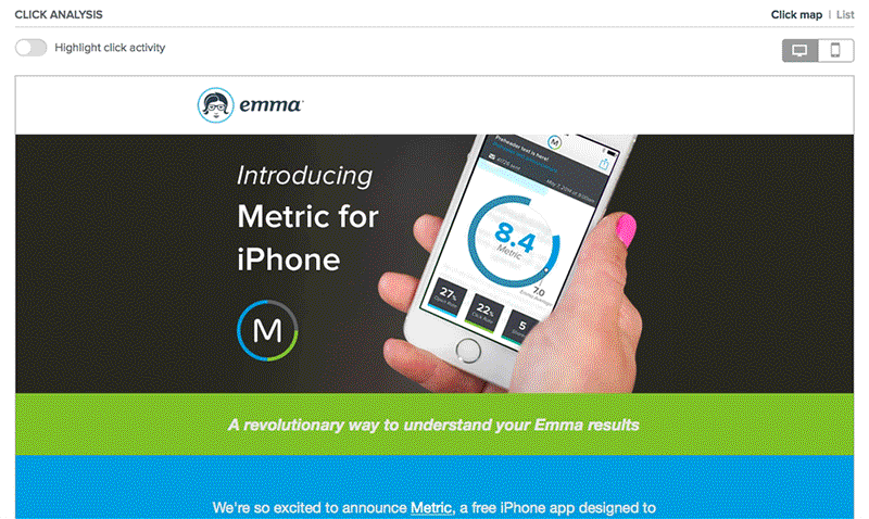
In one example, you had a heat map on an email campaign that showed where people clicked. How did you get that heat map?
The click map that we used is actually one of the new features from Emma’s Response overview. The click map is one of our favorite tools because it shows you where people are clicking within the context of your actual email. For example, you can see at a glance if people are clicking on images vs. text links. Or, if you’re wondering if people are reading your entire email, then check out the clicks on links at the bottom of your email to see if people are scrolling all the way down. Plus, you can toggle between desktop and mobile views to see how people are engaging on different devices. Then you can take what you learned and adjust your design accordingly before your next send.
When is the best time to send an email to get people to open it?
As nice as it would be to say that sending on the third Sunday of each month at exactly 7:17 a.m. is the email marketing holy grail, there is no time and frequency that works for everyone. Every audience is different and every organization has different email marketing goals, so we recommend that you test and test often.
Try sending on different days and at different times, and play with the frequency of your sends. And most importantly, always keep an eye on your response metrics, so you can see what gets the most results from your particular audience.
Also, don’t be shy about getting to know your subscribers. Periodically ask them to update their preferences so that you can get a better idea of when and how often they would like to hear from you. They’ll appreciate the extra little TLC you’re giving their brand experience.
Have more questions for us? Feel free to leave ’em in the comments and keep the discussion going!