Landing pages are one of the best tools a marketer can use.
These types of web pages act as a guide for your fans, followers, and mailing list. They convey a clear message and inspire visitors to take action.
That is, of course, if your landing page is designed correctly.
Unfortunately, it’s common to have one or more landing pages that just aren’t working. This can be frustrating, especially when you factor in the time and money it takes to design a landing page—not to mention any landing page tools you’ve invested in.
Thankfully, not all hope is lost. With some design and content tweaks, you can create a beautiful landing page that actually converts.
Landing pages that convert: 8 design examples and why they’re so effective
In this post, we’ll share some landing page design tips and examples of brands that have pulled them off successfully. Implement these tips and you, too, can start seeing a better landing page conversion rate.
1. StorEDGE

Source: Really Good Emails
One of your first priorities should be to draft engaging copy for your landing pages. When a visitor reads this type of content, they’re more likely to stick with you until the very end because they’re so engrossed in what you have to say.
Additionally, engaging content gives them a chance to know you and your brand. It gives them an idea of what they’re going to get if they choose to invest in your products or services.
How can you create engaging content?
-
Be accurate
-
Be yourself
-
Use questions to make people think
-
Utilize images
Takeaway: Always strive to make the content on your landing pages as engaging as possible. It will take some time to be sure, but it’s definitely worth it.
2. PEEL
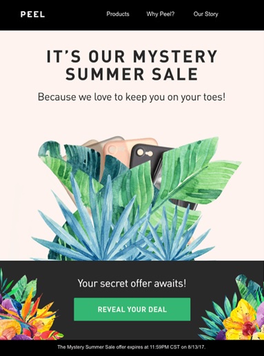
Source: Really Good Emails
Headlines capture attention. The right headline can help you take advantage of a person’s curiosity.
The headline above is a good example of this. Not only is this company having a sale—it’s a mystery sale. What does that mean? Why is it such a mystery? What do they have to offer?
Headlines that stimulate a person’s curiosity will help to make your landing pages way more effective.
Takeaway: Take the necessary time to create captivating headlines.
3. Payday Loans
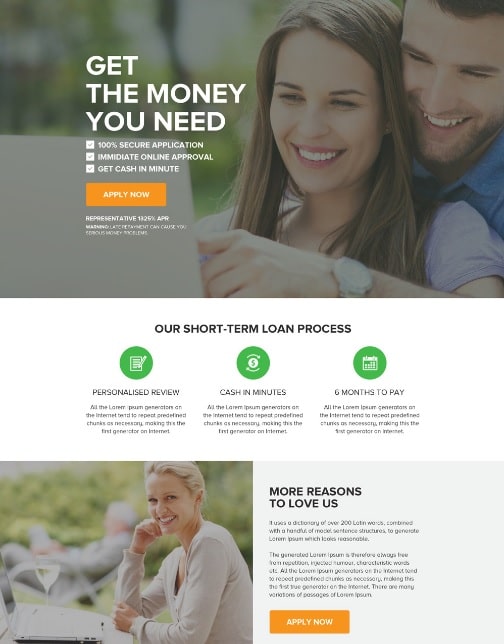
Source: Pinterest
One of the essential components of an effective landing page is the call to action. Your customer needs to know what you want them to do.
Make sure your call to action is clearly visible, and make sure the message is clear, too.
Notice how Payday Loans utilizes a call to action button. It’s in a bright color, so it stands out. The button tells people what will happen when they click and is placed in multiple locations so the customer can easily click on it whenever the content they’re reading moves them to do so.
Takeaway: Make sure you have a clear call to action.
4. Hawaiian Air
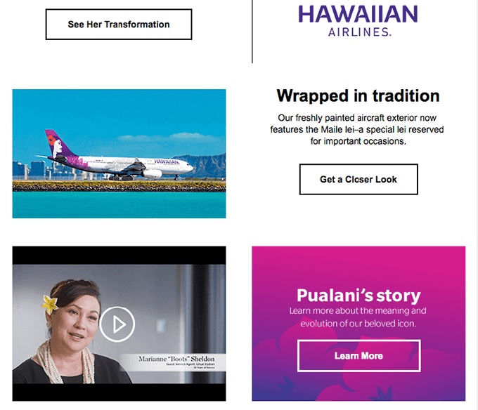
Source: Really Good Emails
Videos are so important in modern marketing. In fact, it’s expected that this year a vast majority of internet traffic—up to 80%—will be video traffic.
You should definitely take advantage of this tool. People love to watch videos. Just seeing that little play button makes people curious and, in many cases, they’re more likely to click the play button before they read the full content of the page they’re visiting.
Seeing someone on screen also helps to humanize your brand, product, or service. It helps to build trust and engagement. And you don’t have to record a long video to get results.. A simple, one- or two-minute video will work just fine.
Takeaway: Get your audience emotionally involved with video content on your landing pages.
5. Royal Spa
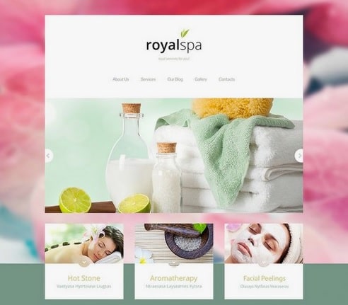
Source: Pinterest
Your landing page should have only one purpose.
Unfortunately, some people try to put too much information on one page. This leads to confusion and frustration for the customer, which can lead to high volumes of site abandonment.
Always remember to keep it simple.
Each landing page should have a unique purpose. Royal Spa does an excellent job of this. Their page lists an overview of what they offer, and that’s it. They don’t have a list of the last 10 healthy living blog posts or information about all of their service providers. That information can be found on separate pages.
Takeaway: Keep it simple: Focus on one offer/product/service per page.
6. Silence Anti-Snoring Spray

Source: Pinterest
Numerous companies on the internet try to entice customers this way: “Give us your name and email address, and we’ll send you a weekly newsletter.”
Email newsletters are an excellent way for you to build trust and rapport with your audience over time. If you want them to take action right away, though, you need to offer something of real value.
Neil Patel’s course of action is to offer a free course or webinar, something that will benefit them right away and give them a taste of what he can do for them.
The example here—Silence Anti-Snoring Spray—does something similar. They offer a free trial kit for interested people. Product samples and quality content give people a better idea of whether investing in you is really worth it to them.
Takeaway: Create a strong promotion—something of real value that will give potential customers a taste of what you have to offer.
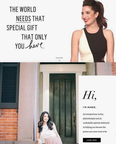
7. Marie Forleo
Source: Pinterest
A common mistake people make is to format their landing page improperly. This can lead to confusion and be really distracting.
The best thing to do is to design your page the way people will read it. Typically, that’s from top to bottom. Studies show that users’ eyes follow the shape of the letter F when consuming a web page—left to right, down, left to right, down.
It’s important to think of your landing page as a guide. You want to motivate your customer to take some sort of action. Along the way, you’ll need to provide them with signs to guide them along.
One of the easiest and most effective ways to do this is with images. Images can break up the content so that it’s read in the proper sequence.
You can also have the person in your image looking directly at the text that you want your customer to read. A great example of this is Marie Forleo’s landing page picture. She’s looking right at the copy she wants her customers to read.
The more guidance you give your customers, the more likely it is that they’ll end up where they’re supposed to be, which will lead them to take action and buy your product.
Takeaway: Design your landing pages in a way that is natural to read. Guide users with images to the content you want them to see.
8. Sprout Social
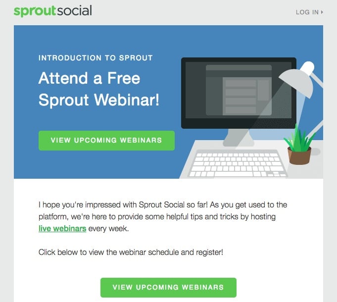
Source: Really Good Emails
The buyer’s journey is something you’ve probably heard about. You might even know what it is inside and out, but the big question is: Are you using it to your advantage?
The buyer’s journey can be broken down into five steps.
1. The decision-making phase
In this phase, the customer decides what it is they want to buy.
2. Research/planning
To get the best deal, the customer will start doing some research. They’ll look at product reviews by industry experts, as well as customers.
3. Ready to buy
Next, the customer will do some comparison shopping. They’ll check out different companies to compare prices and convenience.
4. Making the purchase
If the buyer is convinced they’ve found the best product for their money, they’ll make the purchase.
5. Post-purchase
After they’ve made their purchase, they’ll think about the buying experience. Was it easy? If a product was shipped to them, did it arrive in good condition and promptly?
Have a good understanding of the buyer’s journey will help you design a landing page that converts.
For example, for someone in phase one of this journey, a straightforward eBook that describes the overall perks of your product or service might be sufficient. This might not work for someone who is further along in the journey who wants detailed information. In this case, a longer, more detailed, informative webinar might be ideal.
How can you find out where your target audience is in the buying phase? Talk to them. Reach out to them via an email newsletter, do some research on Quora, or start a conversation on social media.
Takeaway: Take the time to find out where your customers are in the buying process.
Wrap up
Your landing page doesn’t have to be a source of frustration. With the right tools and by implementing some of the design tips above, you’ll create a page with a high conversion rate.
Remember to:
-
Keep it simple
-
Use storytelling and questions to engage your audience
-
Use images or videos to engage visitors
-
Create captivating headlines.
Start putting these tips into practice with every landing page you design. Before you know it, you’ll start to see results from your landing pages.
Are you interested in learning how to utilize landing pages with your email marketing campaigns better? Contact us today to see how we can help you create a successful campaign.