Email newsletter design can get rather stale quickly, especially if your team is continuously using the standard “top articles” newsletter layout. Now, there is nothing wrong with that design layout, but with millions of brands using the same method, readers can tune out rather quickly.
That’s why experimenting with varying email newsletter design ideas can help you identify which techniques sit well with your readers and converts them from subscribers to engaged readers.
Why your brand needs a newsletter
If you don’t already have a regularly scheduled newsletter built into your email marketing strategy, then it’s time you do so. With over four billion active email accounts worldwide, you may be missing out on a massive opportunity to not only find new customers but create brand awareness and opportunities for quality engagement with your ideal targeted audience members.
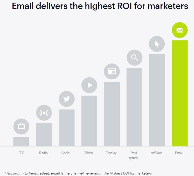
Source: Campaign Monitor
Email newsletter design must-haves
While the content that you include in your email newsletter is vital, your email newsletter design should be one of the initial things you start working on. Why? Because the design needs to be tested and tweaked to perfection in order for it to produce the desired effects you’re after.
A/B testing is the most effective way to narrow down the right email newsletter design that turns your email list from simple subscribers into engaged customers. However, to produce the best quality results, you need to be testing individual pieces of your design at a time, not entire newsletters with multiple variations all at once.
That said, here are some email newsletter design must-haves that should not only be included in your newsletter, but should also be A/B tested for optimal reader engagement.
Responsive design
One of the most vital pieces of your email newsletter design is whether or not your readers will be able to view your newsletter on their chosen device. Here’s a fact worth knowing:
Over 70% of your subscribers will delete your email newsletter in three seconds or less if it doesn’t look right on their device.
Therefore, having a truly responsive design is crucial. It doesn’t matter how great your content is if it doesn’t open correctly on your reader’s device. While having a mobile-friendly design used to be considered enough, that doesn’t make your newsletter truly responsive.
Yes, 54% of all email is opened on a mobile device these days, however, that also means that nearly half of email users are using other devices, such as laptops, tablets, and desktops to view their emails. Merely being mobile-friendly doesn’t ensure that your email will look correct.
Source: Emma
A truly responsive email design adapts to each reader’s individual device, ensuring that it looks correctly no matter if they are opening it on their laptop, smartphone, or tablet.
Properly formatted header information
Email marketers already understand that having the right send “From” name is an essential part of any email, and that personalized subject lines play a significant role in open rates. However, it’s worth noting that having a familiar “from” name will help get your newsletter opened up and not sent to the spam folder.
If you signed up for a newsletter on the Emma website, would you be more likely to open up an email from our VP of marketing’s email address?
Chances are you are more likely to trash the email from the person you didn’t know in favor of one from Emma, specifically because you subscribed through the Emma website. Not to say that sending from someone within the corporation is a bad idea. It’s just better used in a different style of email.
Design hierarchy
The overall design of your email newsletter should have some form of hierarchy to it, and this can be created through several different design aspects, including the use of:
-
Varying heading sizes
-
Typography choices
-
Color choices
-
Use of image and more
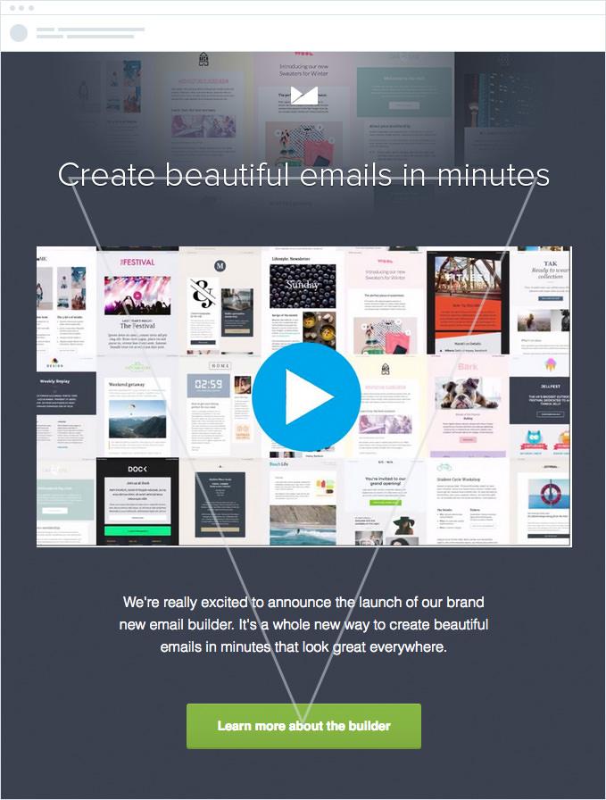
Your design hierarchy should always guide your readers to a single destination, not allow their eyes to wander aimlessly. One example of putting design hierarchy into action is through the use of the inverted pyramid. This design concept makes use of all the above-mentioned aspects to create an upside-down pyramid to help guide the reader’s eyes from the top of the email to the call-to-action (CTA).
Source: Campaign Monitor
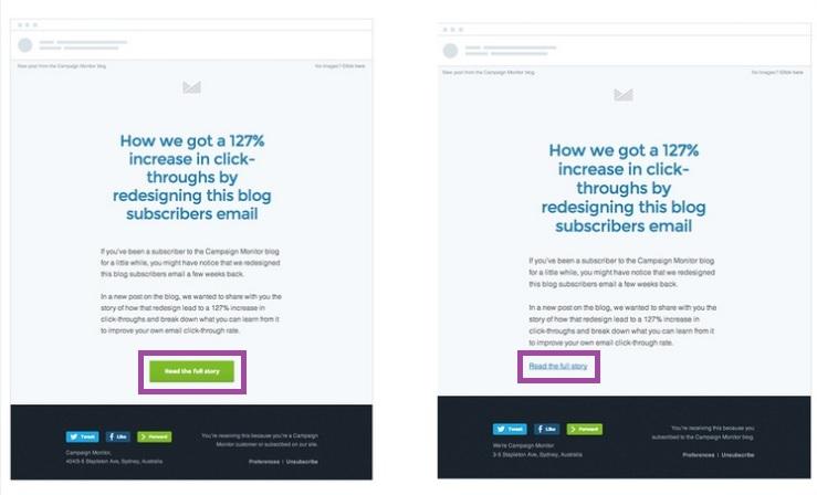
CTA buttons
Your CTA is absolutely vital when it comes to email newsletter design must-haves. This is the single item that is going to move your reader from the email to your desired location, whether it be a landing page, digital download, etc.
While many brands are still choosing a “click here” text option for their CTAs, research has shown that having an actionable CTA button not only makes finding the call to action simpler but increases overall click-throughs and reader engagement.
Source: Campaign Monitor
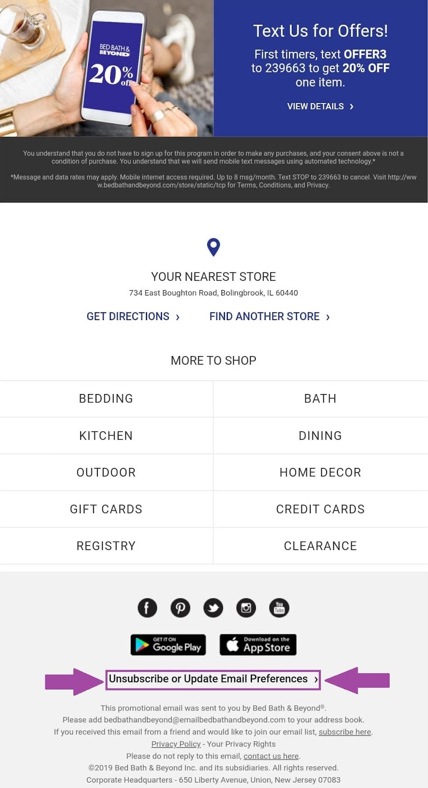
Preference links
By law, all email newsletters must include an easily identifiable way for readers to quickly unsubscribe from future contact, however, that doesn’t mean that you have to offer only the unsubscribe option.
Instead, your brand should be including a link or button that takes subscribers to an email preference center that allows them to change their personal preference. This not only helps lessen the chances of unsubscribes but will also ultimately lead to happier subscribers that are getting the content that they want.
This example by Bed Bath & Beyond includes an easily identifiable preference link option that gives subscribers the option to alter their preferences to their taste while still allowing them a way to unsubscribe if that is their wish.
Source: Gmail/Bed Bath & Beyond
3 real-world email newsletters worth analyzing
Knowing some of the email newsletter design must-haves is excellent, however, seeing them in action is even better. That said, here are three real-world email newsletter designs that can help spark your team’s creative side.
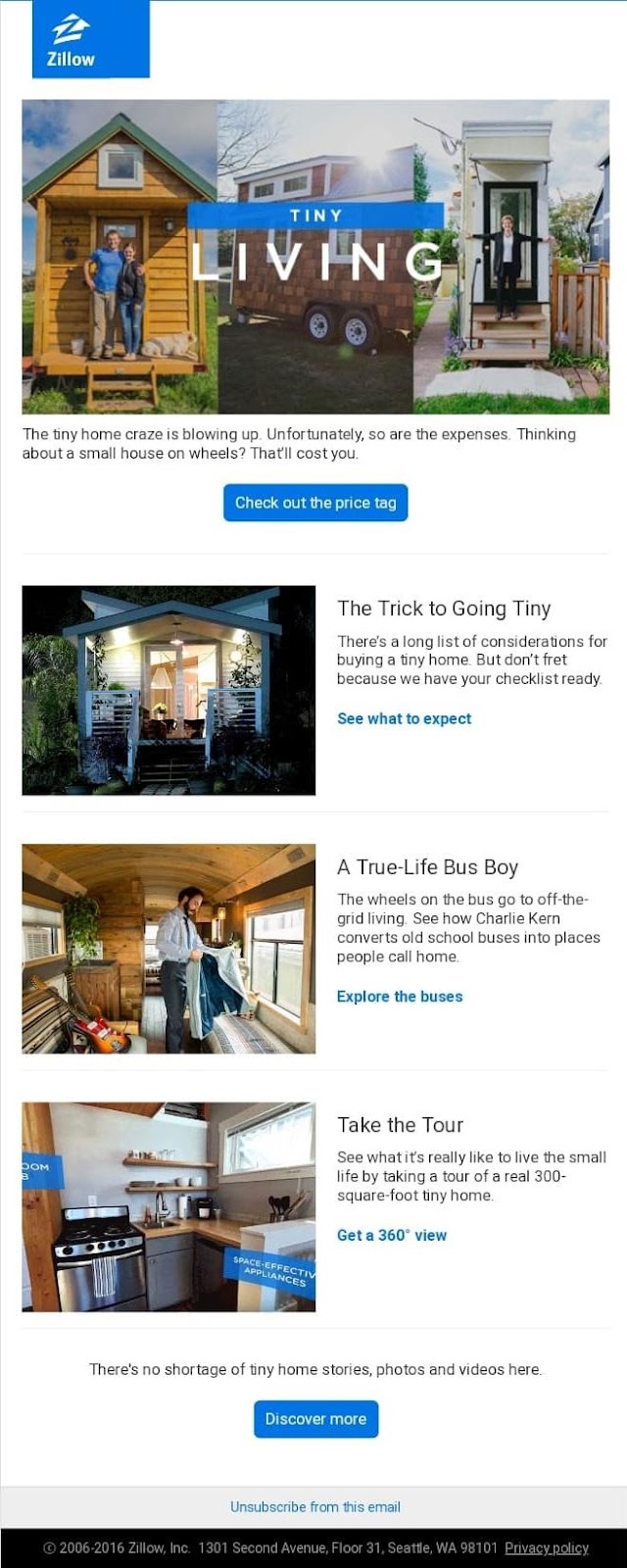
1. Zillow
If you’re looking to take a new spin on the more standard email newsletter design, then this example by Zillow is a good one to learn from. Some of the email newsletter design principles that stand out in this email include:
-
A clear hierarchy defined by their use of various text sizes, headers, and colors.
-
Interactive material in the form of not only clickable links hyperlinked to relevant anchor text but also with the use of GIF’s alongside their stock imagery
In the live view of this email, the final image is a GIF showing off a 360 view of small living spaces. This is great because it gives readers a taste of the material that is included within the full text that is linked throughout the newsletter.
Their calls-to-action also stand out in both their buttons and their hyperlinked text because they kept their overall design simplistic, allowing for their brand color (blue) to stand out amongst the white space. This gives readers a clear message to “click here” without having to say it.
Source: Liveclicker
2. Nerdery
In this email newsletter by Nerdery, readers get to see multiple design principles at work: design hierarchies, the inverted pyramid, and clear CTAs.
What stood out the most in this example is the fact that each piece of this email newsletter is both included and yet is set apart—making it easy for readers to scan quickly to find the material that piques their interest the most.
Each section is highlighted with a lighter background color, indicating that it is its own section, yet they all blend together in the broader view of the email, which keeps it clean and concise.
Then, the hierarchy begins with the use of an image, followed by a clear, bolded heading and summary text that flows in a clear inverted pyramid.
This design pulls the reader’s eyes right to specific CTAs, and because Nerdery chose to highlight their CTA text with a bright red line, they didn’t need to make a massive button to make their CTAs stand out.
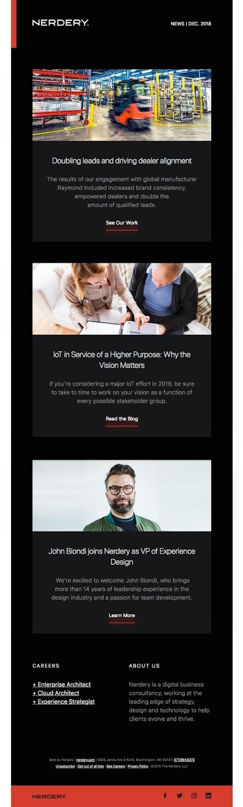
Source: Really Good Emails
3. Homestyle Magazine
What made this email newsletter stand out design-wise was their apparent use of brand colors to divide up their newsletter in a way that makes it easy to skim through as well.
Their CTAs are clearly defined by the pink bubbles and “click here” text, and their article summaries are easy to read against their light grey background.
Each of their social buttons also stands out nicely against their pink headers, and each section is clearly identifiable due to the added whitespace between each section.
Is this a simple setup? Yes—and it works for their readers! This is why A/B testing is so crucial because sometimes simple is better and will net your brand the results you want.
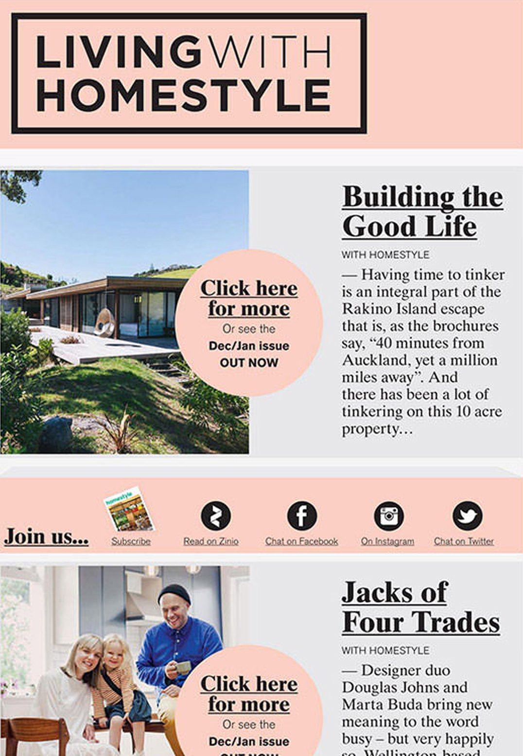
Source: Campaign Monitor
Standing out in a crowded inbox is difficult, but when done right, having the right email newsletter design can help you get the results you desire. Need help in jumpstarting the creative process? Make sure you include the following must-haves:
-
A responsive design
-
Properly formatted header information
-
A clearly defined design hierarchy
-
Actionable CTAs
-
Subscription preference center
Need more guidance on designing email newsletters your subscribers will want to read? Them make sure to check out our simple how-to guide!