
The point of any marketing message is to get a response, and to get a response you need the coveted trifecta of email marketing:
- A strong subject line to entice readers to open your email
- A solid offer to hold their interest
- A clear call to action (CTA) to get them to click
So you’ve inspired them to open and you’ve held their interest— now it’s time to point everything toward clicking.
Fortunately, there’s plenty of science, best practices, and secrets of the trade to turn your subpar CTAs into powerful converters.
Call-to-action FAQs
What is a call-to-action?
A call-to-action (CTA) is a button or link prompting readers to click.
Think back on the emails you receive from the brands you support. How do they entice you to read further? Perhaps with captivating images and compelling copy—but they also almost certainly have a precise call-to-action button or link that shows you exactly where to click for more information, or to take action.
How does a CTA prompt someone to click?
CTAs generally use bright colors and thoughtful placement, but the best ones use precise, actionable verbiage to attract attention. A few examples:
- See the new looks
- Start my trial
- Register now
- Take 50% off
Why should I use a CTA button?
Buttons are eye-catching and clean, making them a simple way to improve conversions. We recently did some testing and learned that using a button-based CTA increased our click-through rate by 28% over a link-based CTA.
5 call-to-action copy tips
1. Use action-oriented text.
They’re called calls to action, so be sure to use striking, actionable text to draw readers in. Skip boring words like submit, enter, and even click here in favor of more compelling verbs like get, read, and try, then couple those with text relating to your specific offer. Here are some examples:
- Get the discount
- Reserve your spot
- Try it out free
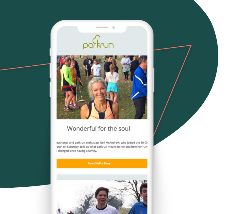
This parkrun example shows a picture of Nell, gives an intro about her, and has a CTA that says “Read Nell’s Story.”
2. Make your button text large and legible
Your call-to-action button text should be large enough to read easily, but not so large to be considered obnoxious.
3. Keep it short
We’ve already mentioned including large, action-oriented text, so this one seems like a no-brainer. If you’ve got large, actionable text, you’ll need to keep the copy short. Two or three words is best but no more than five or six.
4. Try using the first person
Unbounce shared a study showing that changing button text from the second person (“Start your free trial”) to the first person (“Start my free trial”) resulted in a 90% increase in clicks. Those results are dependent on the product and personality, but numbers like those certainly warrant a test.
Try changing your CTA button to the first person:
Reserve my spot, Get my freebie.

5. Create urgency
Including a sense of urgency in your CTAs helps garner those high click-through rates. Even just adding the word “now” builds some urgency.
Here are some examples of button text with extra urgency.
- 50% off today only
- RSVP now—8 spots left
- Shop now
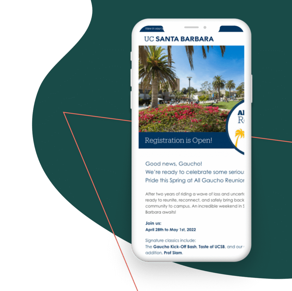
This email from University of California – Santa Barbara uses a “Register Now!” button with an exclamation point to instill a sense of urgency.
1. USE BRIGHT COLORS
Button colors matter. You want something that’s eye-catching without being too distracting. While green and orange buttons are said to perform best, your button colors will depend on your brand. Use a contrasting color to be sure your call to action stands out. Not sure what color to choose? Testing is your best bet.
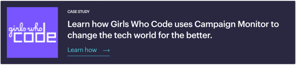
Learn how Girls Who Code uses Campaign Monitor to change the tech world for the better.
CASE STUDY
2. ADD WHITE SPACE
Be sure to include a healthy bit of white space around your CTAs.
The extra white space helps create a visual break and draws the reader’s attention right where you want it. It’s a clean, simple way to make that call-to-action button stand out. The extra white space works best for your mobile readers, too, as it allows a clear area for fingers to click.
This page from the Emma website uses white space to make the CTA button “pop” off the page.
3. KEEP IT ABOVE THE FOLD
You’ll want to make sure to have a call-to-action button near the top of your email so users never miss it. It increases the scanability of your emails and calls attention to your main message or offer.
Vital information—like your CTA—should always be above the fold.
4. WATCH YOUR HIERARCHY
Sometimes you’ll have other links, images, and buttons that aren’t your main call to action. Be sure those extras are not distracting.
The entire goal of your email is to get someone to click on your primary CTA button, so any other details need to take a back seat. Try using gray-scale buttons or matching colors for any secondary CTAs.
Your main call to action should be the biggest and brightest, and less is usually more when it comes to choices.
5. FOLLOW A NATURAL PROGRESSION
We read top to bottom and left to right, which creates logical places for CTA buttons: buttons placed toward the bottom or to the right of content tend to outperform other placements. This makes sense
from a messaging standpoint, too.
For example, you’d want to put a Register now button in a spot where a user would find it after reading about your event—not before, as it would make no sense for users to register for something they know nothing about. Besides, you never want to make users backtrack to take action.

Before we go:
Test your buttons.
Your calls to action are what draws people in and makes them click, so it’s vital to get them right.
If you haven’t done much in the way of A/B testing, call-to-action buttons are a great place to start (even small changes can have dramatic effects). After all, there’s no ultimate button that works best all the time. So go for it: Test color copy, placement, and style.
Remember, if you can question it, you can test it!
Improve your calls to action
Call-to-action buttons are the number one driver of click-throughs in your emails and on your website.
Marigold’s tools make it easy to create great-looking buttons that work across all devices — but the copy, design, and placement of these buttons are all up to you.
Keep our tips in mind as you create and test buttons to nail your upcoming campaigns.

Where relationships take root.
Marigold’s approach to Relationship Marketing stands alone in a world of one-size-fits-all marketing technology companies. Our solutions are designed for your specific size, industry, and maturity, giving you the technology and expertise you need to grow the relationships that grow your business, from customer acquisition to engagement to loyalty. And, with a team of strategists that provide insights into what’s working, what’s not, and what’s changing in your industry, you’re able to maximize ROI every step of the way.
Great marketing isn’t just about conversion, but true connection. Learn why 40,000 businesses around the world trust Marigold to be the firm foundation they need to help relationships take root.
Find out more at MeetMarigold.com
