Why does email accessibility matter?
When we talk about email accessibility, what we’re really talking about is inclusive design.
Inclusive design means designing your emails so everyone can easily understand your message, regardless of disabilities or assistive devices. You already put a ton of energy and thought into your email content, so why not take the extra step and make sure everyone can understand it exactly the way you intended?
Before getting started, put yourself in your audiences’ shoes. Remember that not everyone is interacting with email the same way that you are. Consider the audio experience for those that have limited to no sight, or how the email may appear for someone who is colorblind. Consistency between the audio and visual email experiences is huge, and perfect vision should not be a prerequisite for being on your mailing list.
Just because it’s pretty doesn’t mean it’s good design. Your design is all about function, so here are a few tips to ensure your email provides a great experience for every subscriber.
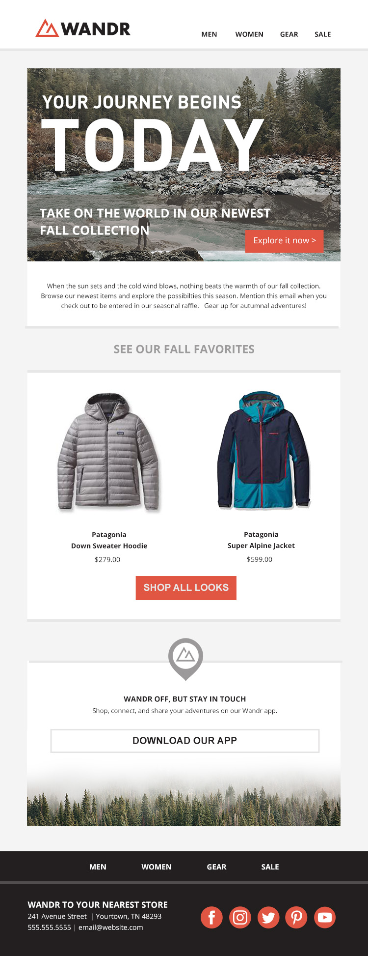
With just a few small tweaks, this email is now more accessible!
A Designer’s Email Accessibility Checklist
✅ Establish a clear focus. Declutter your layout and make sure that the focus of the mailing is unambiguous. This is especially important for those with ADD/ADHD.
✅ Incorporate tried and true design fundamentals. Designing for accessibility doesn’t mean you have to start from scratch. Foundational design principles like hierarchy, white space, font styling, and straightforwardly descriptive calls-to-action all play into an inclusive design.
✅ Use live text. Live text, in contrast to text as images, can be easier to read and retains its size on mobile. Make sure all your most important information is live text so that it will appear even if images are turned off or slow to load.
✅ Use alt text. Alt text, or alternative text, is the text that appears if an image does not load. This is also the text that screen readers will read, so it’s especially important for those listening to email. Make sure whenever you use an image, that you think through how to use this area, as it's your best opportunity to describe the image to the listener or reader. Here are some things to keep in mind with alt text:
• If your image has text on top of it, make sure that all of that information is included in this space. Again, this will be the text read in the audio version.
• If there’s no text, make sure you’re describing the image. What information would I need to know about it if I couldn’t see it?
• Don’t just repeat the caption. If you have a caption on the image, make sure your alt text adds information, not just repeats it.
• If you feel that all of your information is included in the caption, you can leave the alt text blank. Also, if your images are purely decorative like a divider or icon, you can leave it blank. Just make sure you could still understand the message if those items were removed.
• If you’re coding your own email, make sure you don’t delete the alt attribute (alt=” ”). If you decide to not use this space, keep the attribute but leave it blank. If the entire attribute is removed, the screen reader will read the image name instead, which could be a confusing experience for the listener.
✅ Use large text. Don’t be scared of increasing your font size. Bumping it up just a few points can make a huge difference in someone’s experience and help increase comprehension and legibility. Our rule of thumb is a minimum body copy size of 14 pixels and larger headlines to help establish hierarchy.
✅ Avoid centering text. Centered or justified text can be difficult to read, especially for people with dyslexia. My rule of thumb is no more than three or four lines of centered text, and you should cut out justified text in email altogether.
✅ Use bulletproof buttons. They are way easier to engage with and will load even if images are turned off. Learn more about bulletproof buttons here.
✅ Use color intelligently. Use color as needed to support your message, but make sure that you’ve tested the contrast between elements. You’ll want a high color contrast to ensure that the two colors aren’t blending together and hiding the message. Make sure you test text on colored backgrounds, calls-to-action, and images or graphics with thin line weights (like logos or icons). Here’s an easy-to-use color contrast ratio tool.
✅ Test, test, test! Send yourself a test of the mailing and try experiencing the email in a few different ways. For example, listen to the audio version of the email on a smartphone or screen reader, run a colorblind test, and test for mobile optimization.
Small tweaks can make a huge difference in the way your subscribers experience your email. It doesn't take much additional work to design accessible emails, so don't be a jerk, and keep these considerations in mind when developing campaigns for your own brand.
MOST RECENT ARTICLES
Want to engage your audience and grow your brand? Try Emma's robust easy-to-use product today.
