Here’s the truth: There’s no big secret to creating a winning email layout.
A great email is like a symphony. Dozens of pieces work together – some behind the scenes, some visible – to create a stunning and functional experience.
Your layout can have a direct impact on your bottom line, too.
A third of people say bad design is their biggest email complaint. Meanwhile, 66% of people say running into problems like poorly designed emails, generic content, or emails that aren’t optimized for mobile will stop them from spending money with a brand.
Let’s get back to basics. In this post, we’ll go over email layout best practices and trends for 2020 so you can wow your subscribers and boost conversions.
13 Email layout best practices to impress your subscribers in 2020
Email layouts can be complicated, so we broke things down into digestible tips (with examples).
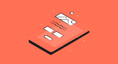
1. Mobile is a must
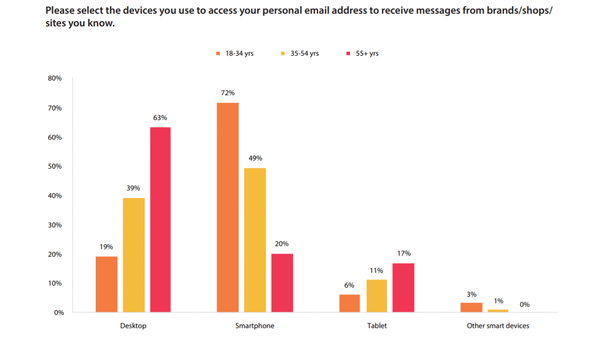
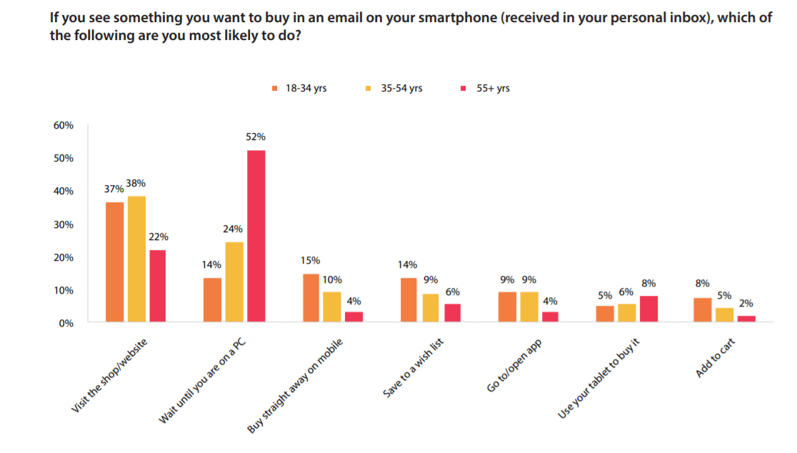
About 54% of all emails are opened on mobile devices, but different age groups have unique habits.
Source: DMA
As you can see, people under 35 tend to open emails on their smartphones – while the 55-and-up crowd prefer laptops and desktops.
Even then, people often open the same email multiple times across different devices. For example, a wide majority in all age groups don’t click through the call to action (CTA) to complete a purchase. They either wait until they’re on a desktop or navigate directly to the brand’s website.
Source: DMA
To create a seamless experience, you’ll have to decide if you want to create mobile-friendly emails or responsive emails.
It’s important to know the difference between the two:
-
Mobile-friendly emails look the same on every device, but they rely on features like single-column layouts
-
Responsive emails are dynamic – the layout changes based on where a subscriber opens the email
2. Prioritize email layout accessibility
Roughly 12 million people over 40 in the U.S. suffer from some kind of vision impairment. Meanwhile, 8% of men and half a percent of women suffer from color blindness or a color deficiency.
It’s important to make your layouts accessible for everyone. Consider these tips:
-
Avoid flashing images for people with epilepsy
-
Segment your subscriber list based on age, and design unique emails for over-40 and over-65 age groups
-
Use large text and plenty of space between each line
-
Avoid complicated vocabulary and long sentences
3. Don’t neglect subject lines and preview text
People tend to consider subject lines and preview text as part of their copy – but these two elements also play a heavy role in layout.
For example, mobile screens will cut off your subject line after 30 or 35 characters.
Most email service providers let you write your own preview text as well, so don’t neglect it. Otherwise, subscribers will just see the first sentence or two of your email in their push notifications.
Here are some highlighted examples of preview text. Notice the highly-personalized and actionable subject line from Google AdSense as well.
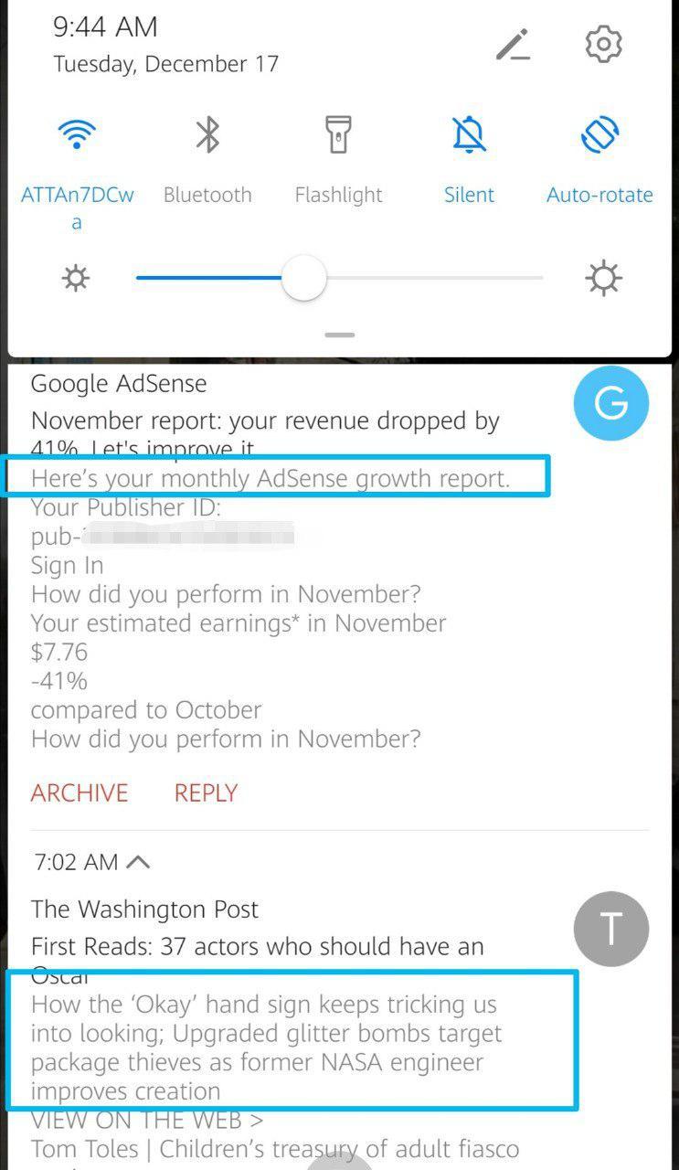
Source: Gmail
4. Use a seamless “flow” in your email layout
Going way back to high school photography class, think of some basic composition strategies. Create an email layout that guides your recipient’s eyes down the page to the CTA as they scroll.
You have two main options here:
1. Inverted pyramid
2. Z-shape
UNICEF managed to use both styles effectively in this email.
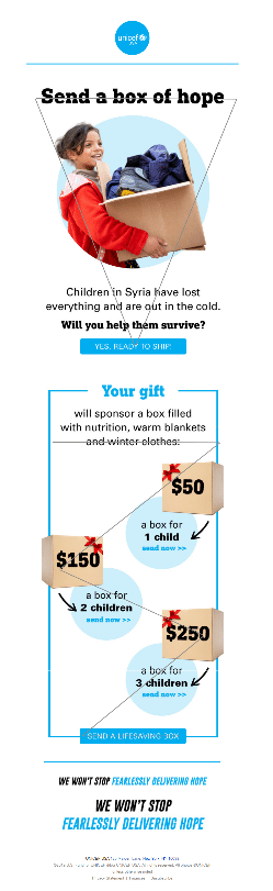
Source: Gmail
5. Remember colors and branding
The trick here is to mesh your brand colors with pops of bright contrasting colors.
Big brands plan far ahead of time with which colors they’ll use in marketing material for seasonal holidays, CTA buttons, and unique splashes.
Consider color psychology here. Bright pink or neon might work well for conveying urgency during a sale, but muted blues or greens are better for creating a calm vibe with newsletters, for example.
Look at UNICEF again. While they typically stick to the “USA blue” that all U.N. agencies use, they also have an extended palette with bright colors to grab attention.
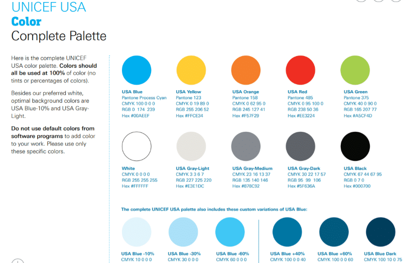
Source: UNICEF
Again: Don’t forget to consider accessibility for those with visual impairments or color deficiencies.
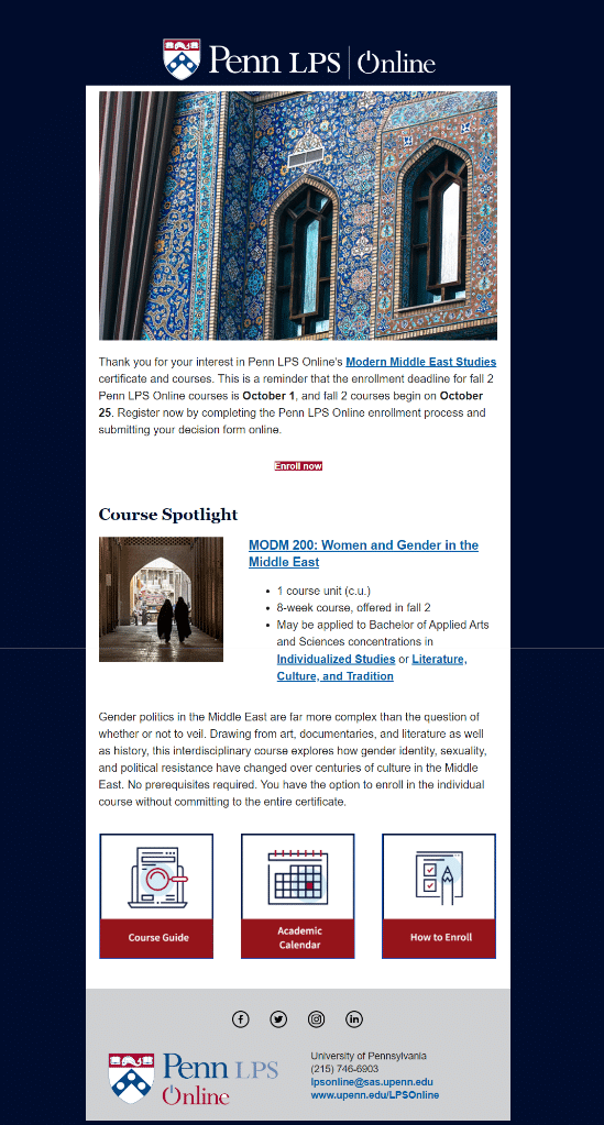
6. Choose relevant images
Images matter on many levels. The graphics you choose can help grab attention, explain your message, and relate to recipients.
Avoid including images just for the sake of it. The design experts at Nielsen Norman found that email subscribers get confused or frustrated when brands and organizations include random images – even high-quality ones.
Instead, choose images that relate directly to your product or the concept you’re trying to convey in your message – like Penn LPS Online did below.
Source: Gmail
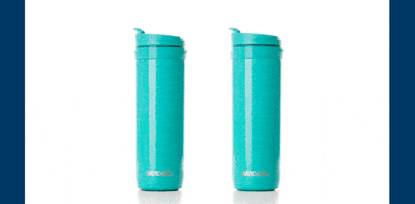
7. Grab attention with GIFs
Videos are great for boosting engagement in emails – but unfortunately, most email clients don’t support embedded play capabilities. GIFs offer a perfect alternative to video.
GIFs make it easy to explain complex subjects and they can even boost your ROI by 109%.
When you create GIFs, make sure they don’t slow down your email speed—this isn’t ideal for mobile readers. Also, keep in mind that old school email clients might not support GIFs.
DavidsTea used an effective GIF to explain how their bottle works.
Source: Really Good Emails
8. Consider a dynamic email layout
You don’t have to send the same email layout to everyone. In fact, it’s best if you don’t. 67% of people expect brands to offer personalized content and 42% get annoyed when content isn’t personalized.
Luckily, email clients like Emma let you send dynamic emails that are unique for every subscriber.
Dynamic content takes data you’ve collected on your subscribers and uses it to send hyper-personalized campaigns. For example, if your subscriber tends to open emails on Gmail for Android and responds best to blue CTA buttons, they’ll get campaigns coded especially for them.
On the back end, you only have to design one email. Artificial Intelligence (AI) takes control of the challenging work.
Here’s a snapshot of what dynamic content looks like.

Source: Emma
9. White space is your friend
Big blocks of text tend to scare readers away.
Use white space to break up your copy and help guide readers around the email.
Not only does white space make emails easier to read, but it compensates for the idea that people scan content (rather than read every word).
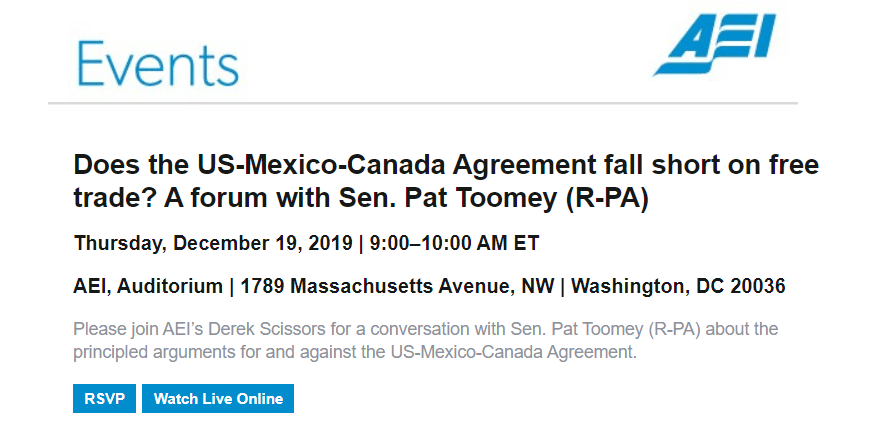
10. Use a clickable CTA button
Hyperlinks can be difficult to click on mobile screens – especially if your text is small or the links are too close together.
Instead, design an email layout with one clear CTA and a big bright button.
Nielsen Norman Group found that contrasting colors are important as well. Your CTA button shouldn’t blend in.
They also note that the CTA button copy matters. “Get started” is too ambiguous and often feels misleading to readers. Instead, choose clear actionable words like “RSVP now” or “Shop here.”
American Enterprise Institute offers two clear CTAs so there’s no question about what’s behind the link.
Source: Gmail
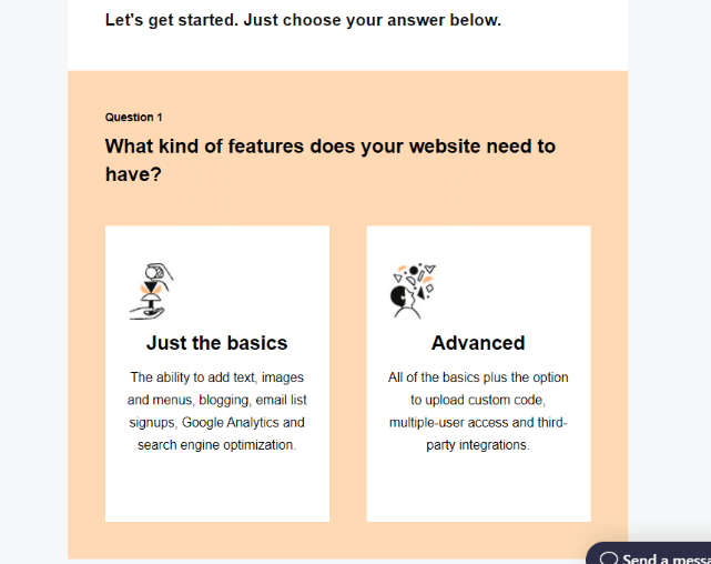
11. Include interactive content
Interactive content is useful because it lets subscribers click around without navigating out of the email – which boosts engagement.
You can use interactive content for reviews, games, quizzes, and more.
Here’s an example of an interactive quiz from GoDaddy. As you click the answers, it takes you through different questions.
Source: Really Good Emails
12. Don’t forget about landing pages
A lot of marketers forget to optimize their landing pages with the same layout and design as their emails.
Subscribers expect a seamless experience once they click any CTA button or link in your emails. If you can, take advantage of accelerated mobile pages that open at lightning speed.
Don’t forget to use the same voice, tone, and colors you used in the email layout. It’s equally important to make sure that the content on your landing pages lives up to the expectations of the button or link.
In other words, avoid clickbait and clearly explain what’s on the other side of the link to build confidence.
UNICEF had a mobile-friendly landing page ready to go behind their holiday donation email.
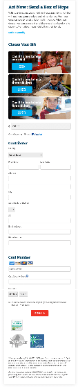
Source: Gmail
13. Run plenty of email layout tests
Finally, the only way to ensure your layout looks perfect for every subscriber is to run tests.
Emma lets you run tests for different email clients as you design your layout so you’re never guessing.
Next, you’ll want to run A/B tests to see which types of layouts perform best across different segments of your audience. What you learn might surprise you.
Wrap up
Email layout involves several moving parts – sometimes even literally. For the best experience, remember to:
-
Prioritize mobile experience and accessibility
-
Make your CTAs clear and visible
-
Create a seamless flow and experience (including your landing pages)
-
Run tests for different email clients and subscriber preferences
Want to kick your emails up a notch? Learn more about Emma’s dynamic content and make your emails as unique as your subscribers.