
When subscribers read calls-to-action (CTAs) in an email from their favorite brand, they rarely think about what goes into them. Not marketers. They know there’s psychology behind a great CTA.
Unfortunately, many marketers still neglect their CTAs, both on their websites and in their email marketing content. Studies show that only 47% of businesses properly use CTAs in their online content, and that typical CTAs are not cutting it anymore.
So, what’s a brand to do? How do you write a CTA that works?
It’s simple. Polish up your knowledge on CTAs.
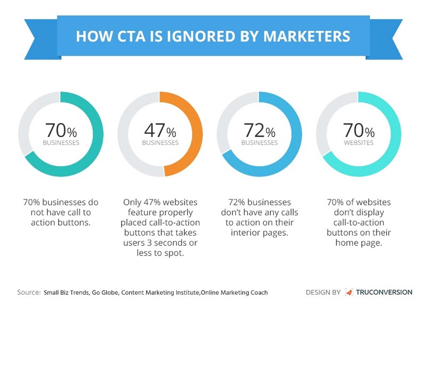
Source: TruConversion
Let’s face it: It doesn’t matter how good your email copy is. If you don’t include a CTA, your consumers have no way to take action—and no action means no conversions.
Now, before you start haphazardly throwing CTAs into your email content, take time to study CTA best practices and review examples from other brands. If you aren’t sure where to start, we’ve done the heavy lifting for you. Let’s start with best practices.
Call-to-action best practices you need to know
Marketers know that a good CTA drives action, which drives conversions. So, what does it take to create a perfectly clickable CTA? Take note of these CTA best practices.
Avoid hyperlinks and create a button
Many marketers choose plain text emails. But studies have shown time and time again that clickable HTML buttons provide better results (as far as click-through and conversions go).
For instance, our friends over at Campaign Monitor recently did some testing of their own and learned that using a button-based CTA increased their overall click-through rate by 28%.
In one of their tests, simply redesigning an email CTA from a text link to a clickable button showed a 127% increase in click-throughs.
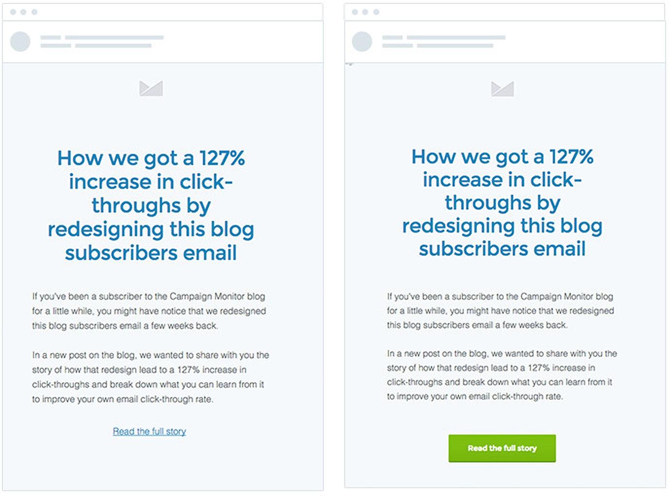
Source: Campaign Monitor
Buttons increase click-through rates for several different reasons—although studies have shown that your subscribers aren’t reading your messages word-for-word. Instead, they’re likely scanning for the most critical information.
While hyperlinked text can stand out, readers are more likely to notice a button thanks to the:
-
Size
-
Design
-
Color
-
Whitespace around it
With those factors in mind, read the following tips.
Keep your call-to-action short and sweet
Your CTA needs to be short, sweet, and to the point. In fact, marketing expert Neil Patel says if it takes more than six seconds to read your CTA, then it’s too long. That doesn’t leave you much room to work with.
So when designing your CTA, you should keep it below four to five words. Here are a few examples:
-
Reserve your seat
-
Count me in
-
Start your free trial
-
Hear her story
-
Shop birthday deals
-
Get 50% off now
Use action words (and avoid friction words) in your call-to-action
With the limited word count in a CTA, you should be really picky.
Remember when we mentioned traditional CTAs don’t work anymore? That’s because the typical CTA uses friction words like:
-
Download
-
Submit
-
Order
-
Buy
These are friction words because they imply your reader needs to do something they don’t necessarily want to do. Think about it: You don’t necessarily want to “buy now” if you’re simply browsing for ideas.
For instance, take this example from Unbounce. They tested two CTAs with only a single word variation:
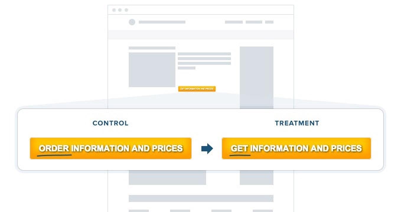
Source: Unbounce
This resulted in an almost 15% increase in conversions.
So when it comes to writing your CTA, remember to use action words. These won’t demand from your consumers.
Here are a few examples of action words:
-
Learn more
-
Get started
-
Join us
-
See how
Personalize your call-to-action
You already know that personalization is key to getting your subscribers to open your emails. But did you know that personalization in your CTA is just as important?
This study proved that personalizing a CTA with the use of the first-person could increase your overall conversion rate. They altered their CTA language from “your” to “my.”
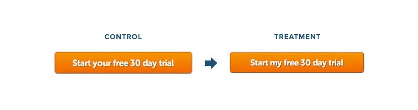
Source: Unbounce
The result? A 90% increase in conversions.
Altering the language of your CTA works—so don’t neglect it.
Color matters when designing your call-to-action
Believe it or not, 85% of people say that color is the main reason they purchase a product. That said, the color of your CTA button plays a significant role.
When it comes to the importance of color, keep in mind that:
-
Orange encourages immediate action
-
Lighter blues build trust and security
-
Green promotes relaxation and growth
-
Yellow grabs attention while creating a lower level of anxiety
-
Red increases energy and a sense of urgency
Here’s another way to look at the various colors that can be used for an email CTA:
Source: Forbes
Test your call-to-action before you send
When it comes to creating CTAs that convert, you must be A/B split testing before you send your email campaign.
Remember, the only way to know what works best with your subscribers is to test several combinations. By sending variations of your CTA to two small sampling groups, you’ll see which CTA gets the most clicks. Whichever gets the most conversions is the one that should be sent.
4 calls-to-action that work
Now that you’ve got an understanding of best practices for clickable CTAs, it’s time to look at examples that get results. We’ve gone through our inboxes and scoured the internet to find these for creative CTAs that stand out.
1. PetSmart
PetSmart did a fantastic job of making their CTA suggestive, and not demanding.
Instead of using a more typical “read now,” they opted to say, “read stories.”
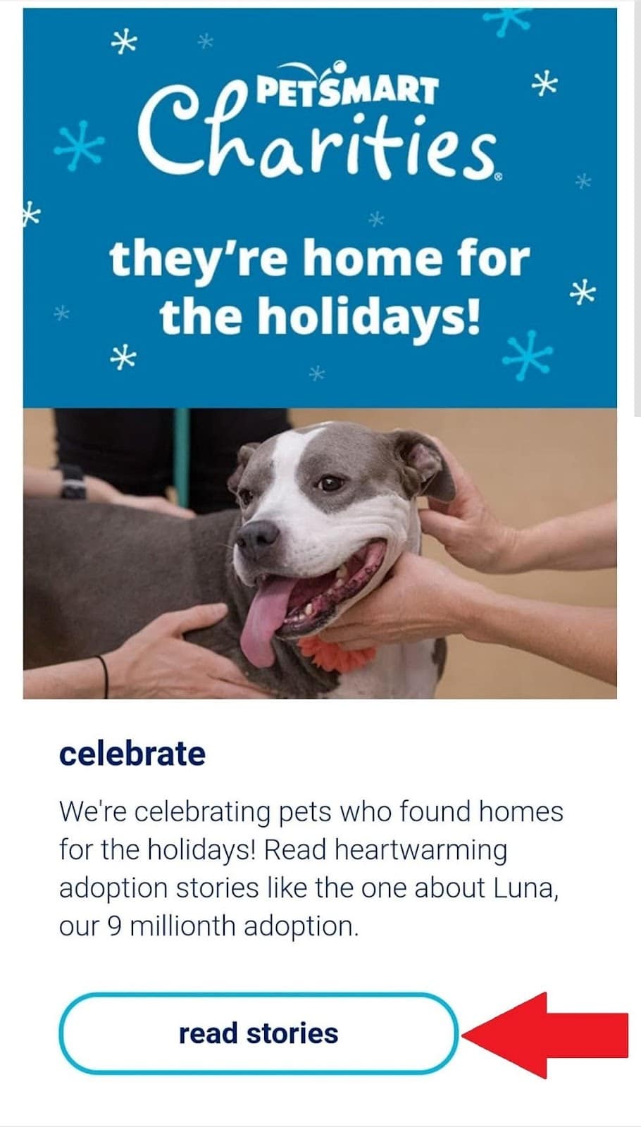
Source: Gmail
This is an excellent choice for brands that want to spread awareness. In this case, PetSmart highlighted the many pets that found homes thanks to the charities that support them.
2. Michaels
While many brands opt for a “shop now” CTA, Michaels took a different approach with their “get coupon” CTA.
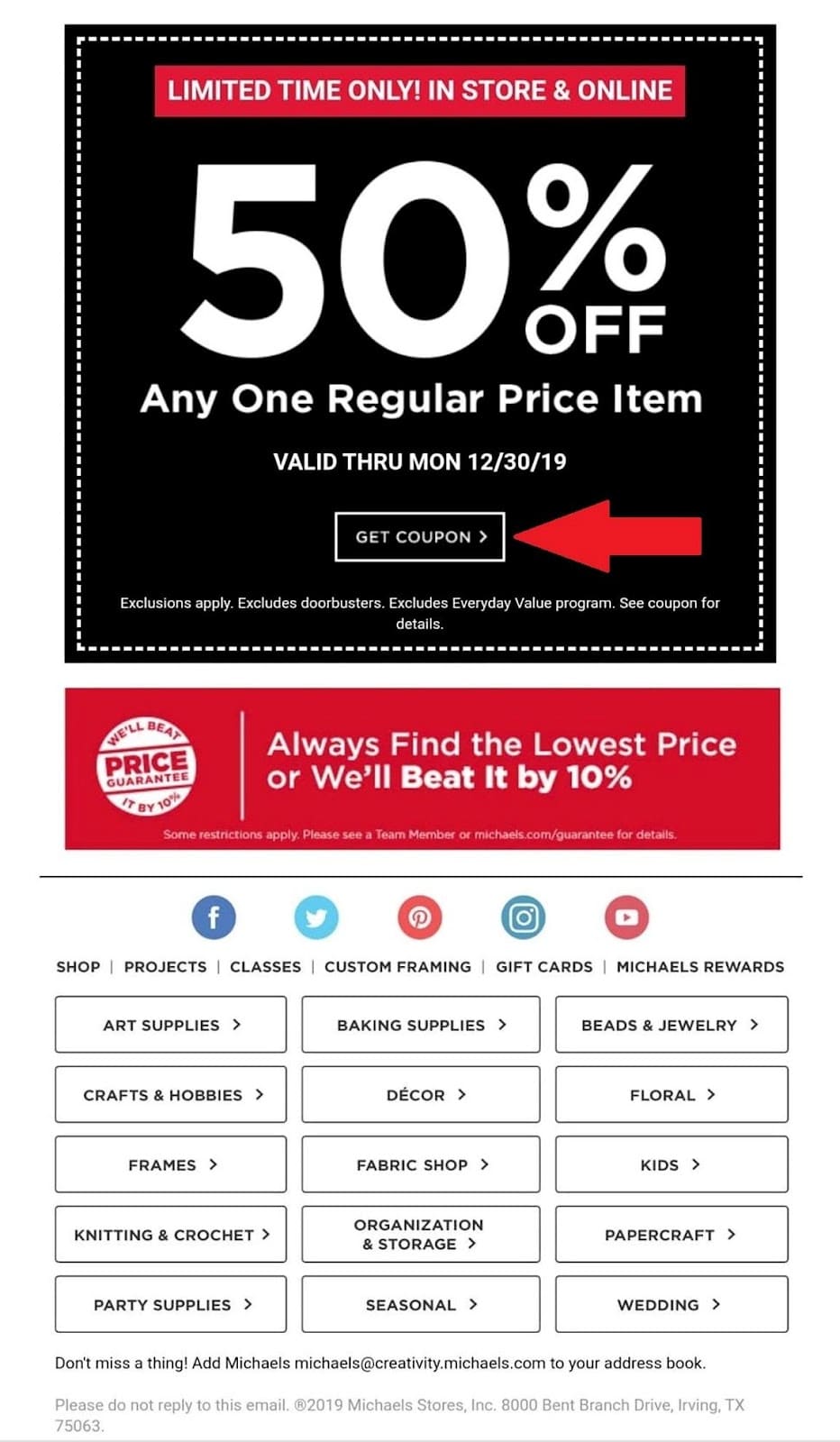
Source: Gmail
This CTA works well because the brand isn’t demanding the reader “shop now” or buy something. Instead, they invite them to take advantage of the special offer.
3. Domino’s
We really enjoyed this CTA example from Domino’s because they use first-person phrasing in their CTA.
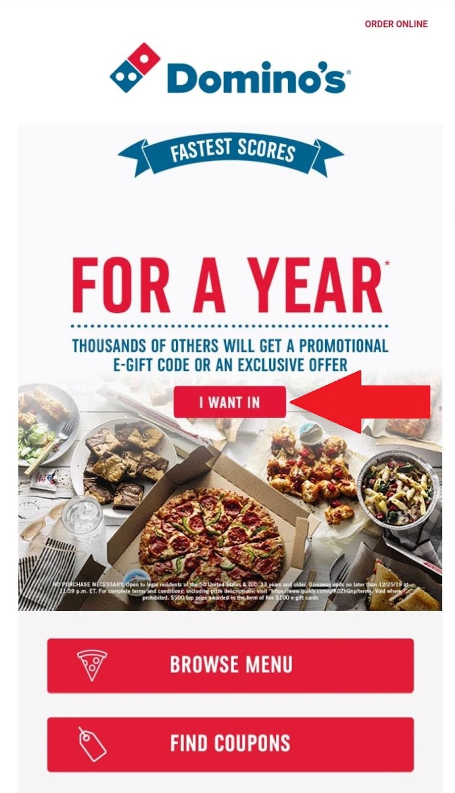
Source: Gmail
Instead of coaxing the reader with a more traditional “learn more,” they personalizes this with the phrase, “I want in.”
Remember, first-person is shown to drive conversions. So, by using “I want,” readers might be intrigued to find out why exactly they would want in.
4. Walgreens
This email from Walgreens stood out because of their creativity.
The goal of this email is to get the reader to purchase unique gifts for their loved ones. Instead of encouraging them to “shop,” “browse,” or “buy now,” they encourage their consumers to “create now.”
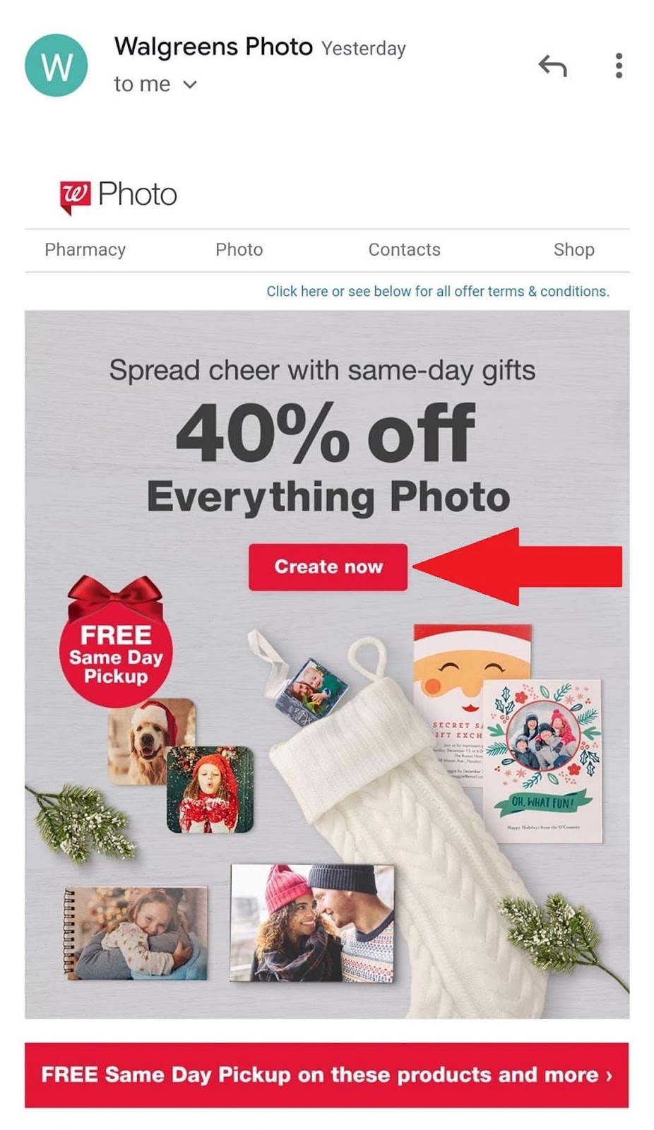
Source: Gmail
This makes subscribers want to act instead of demanding that they do. Besides, who doesn’t love to get creative and share a handmade gift with a loved one?
Wrap up
No email is complete without a proper call-to-action (CTA). The CTA examples we covered are only a sampling of the many options out there, so don’t limit yourself during the planning process.
As you start writing your CTAs, remember these tips:
-
Avoid hyperlinks, create a button instead
-
Keep them short and sweet
-
Use action words, avoid friction words
-
Personalization matters
-
Color matters
-
Test before you send

