Email Showdown: Shake Shack vs. Sonic
Sonic Drive-In is one of the largest fast food chains in the US, with over 3500 locations scattered across the country. However, they're now facing competition from Shake Shack, the brainchild of Union Hospitality Group's Danny Meyer. While Shake Shack has far fewer locations than Sonic, they've developed a cult following and are expanding rapidly into key markets. In fact, we're about to get one right here in Nashville!
Since the opening is still a few months out, I thought I'd investigate how the two restaurants compete in another one of my favorite areas: email marketing. Both Sonic and Shake Shack have fairly robust email marketing programs, but who does it best in the inbox? Let's find out.
SHAKE SHACK
THE SIGN-UP PROCESS
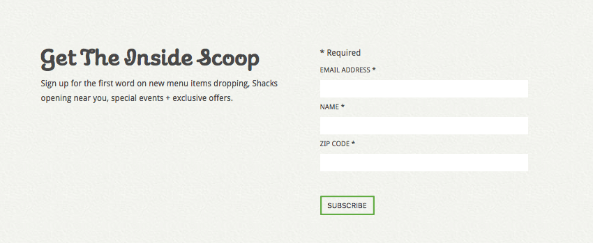
Shack Shack's signup form sits at the bottom of their homepage and includes three fields: email address, name, and zip code. Usually, I'd think that was a bit much for an initial signup form (every field you add reduces signups by 25%, according to our friends at Privy), but since they actually explain how they'll be using your information, it feels fine in this situation.
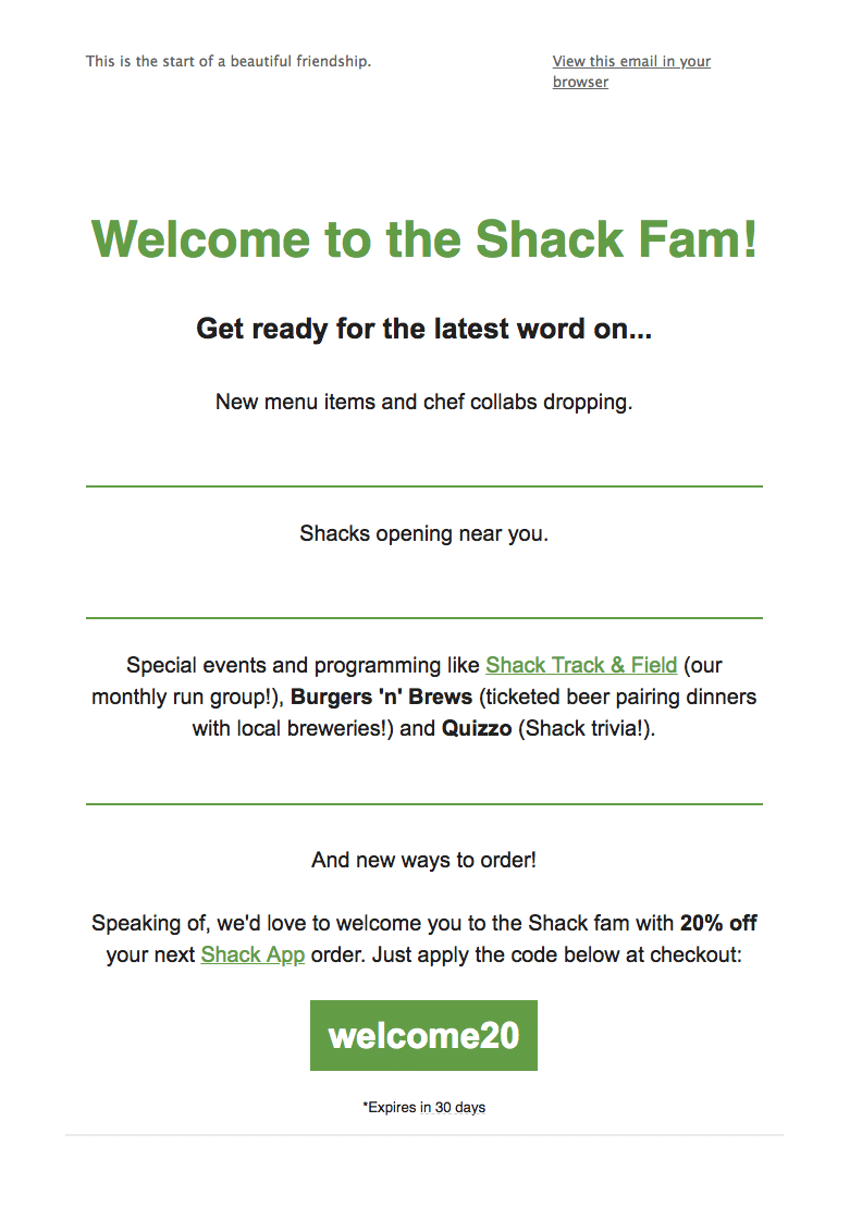
After signing up, new recipients are greeted with this automated welcome email...
1. THE WELCOME EMAIL
Subject line: Welcome to the Shack Fam!
Preheader text: This is the start of a beautiful friendship.
This exemplifies exactly what a first-touch email should be. The email:
• Greets new subscribers with a warm, branded welcome.
• Tells them exactly what to expect from future emails.
• Offers an exclusive discount for joining their list.
Then, after you've received this welcome, you're thrown into their regular send cadence. Here are a few examples of the types of emails recipients can expect...
2. THE PROMOTIONAL EMAIL
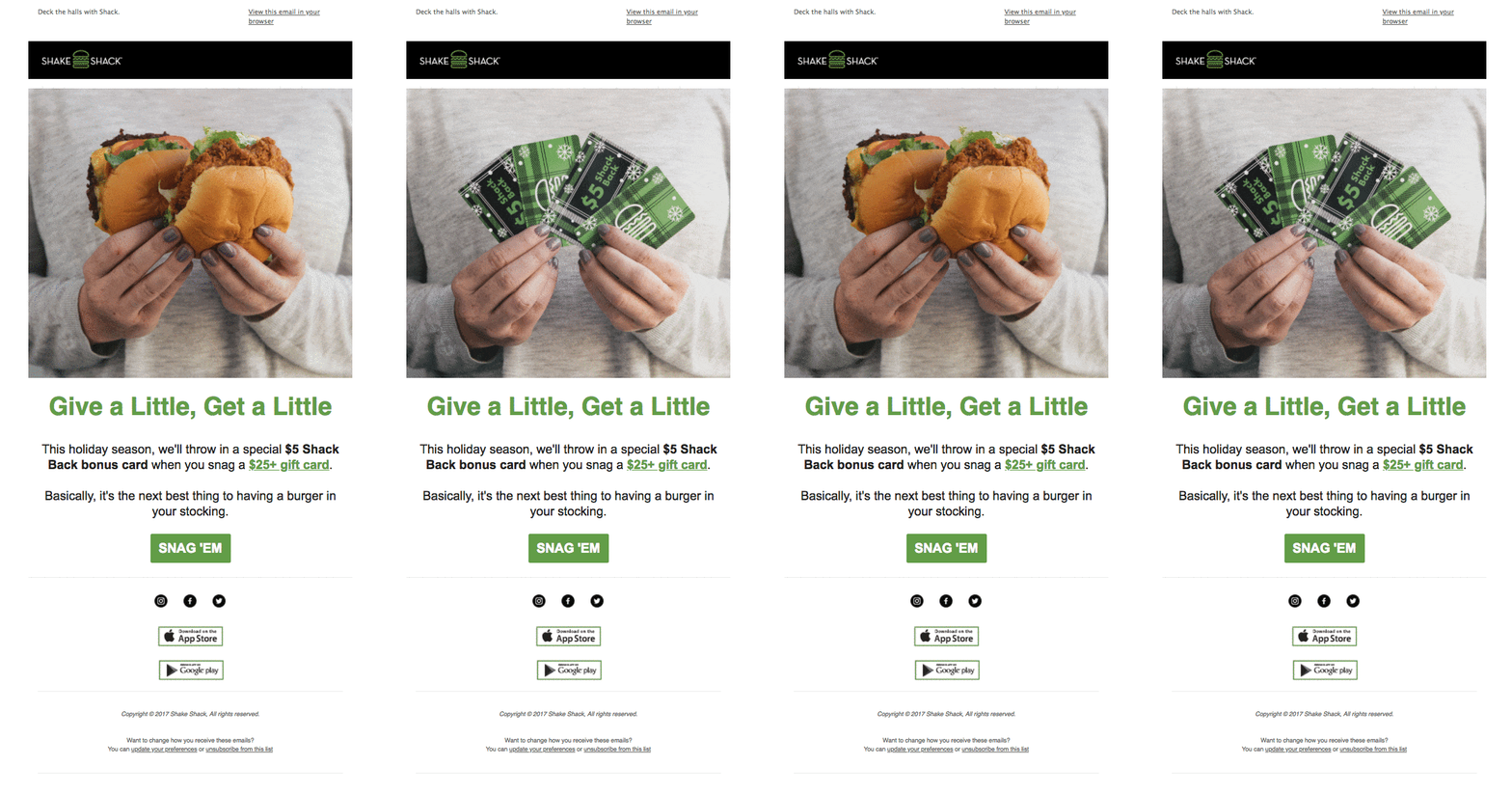
Subject line: Give a Little, Get a Little
Preheader text: Deck the halls with Shack.
Shack Shack does a great job of making straight-up promotional emails feel engaging. For instance, this holiday campaign features an amazing GIF up top that grabs your attention and helps quickly convey the point of the message. It follows the same recipe as the rest of their emails, featuring a branded header, some sort of hero image, a headline, short copy, and a single CTA. Developing that sort of templatized system is a great way to scale your marketing across a lot of sends.
2. THE SURVEY EMAIL
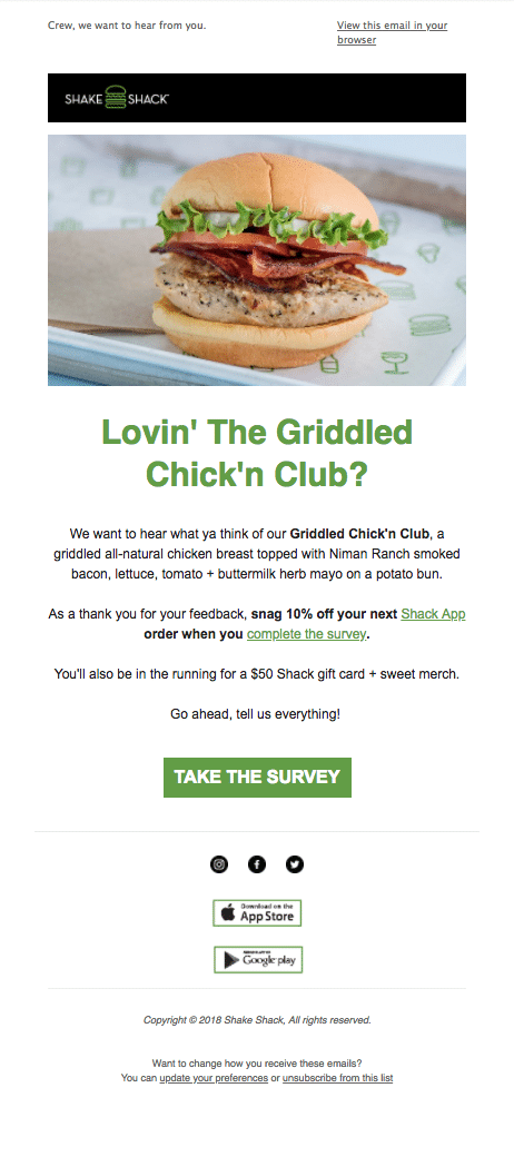
Subject line: Penny for your thoughts?
Preheader text: Crew, we want to hear from you.
While the concept here is good—audience feedback is an incredibly powerful asset—the messaging didn't quite hit the mark. You see, I've never actually eaten at Shake Shack before... so their request to review a very specific menu item felt off.
Rather than mass blasting something like this out to your audience, brands should segment out only those who have purchased the item and send specifically to them. If you don't have that data, don't send the email until you find a way to gather it. Not only will it help you get more reliable feedback, you'll avoid sending irrelevant messaging to your other subscribers.
3. THE TIMELY EMAIL
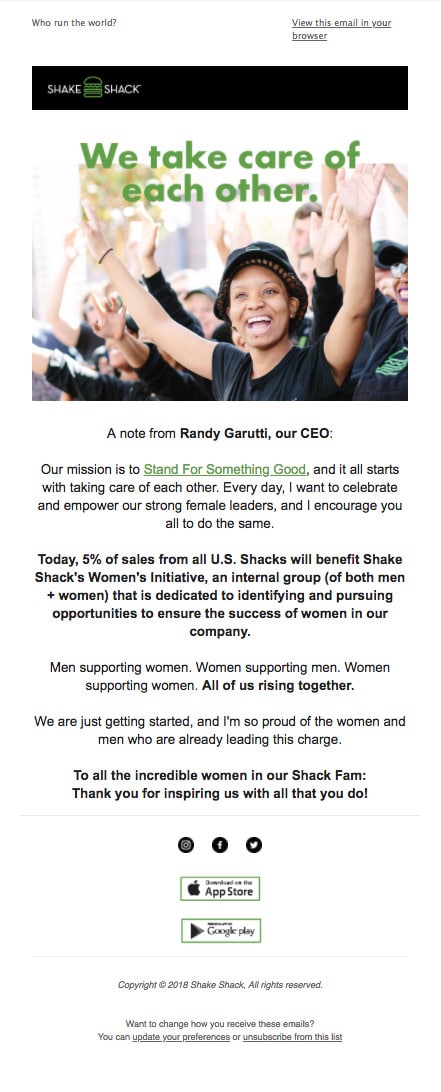
Subject line: All of Us Rising Together
Preheader text: Who run the world?
Since Shack Shack primarily sends promotional emails, I was pleasantly surprised to receive this email about International Women's Day. It isn't about sales or menu items: Instead, it's a note from their CEO about empowering female leaders. It's always nice to see a brand support a cause and— perhaps more importantly—not turn it into an excuse for a misguided sale (e.g. "Get a free drink in honor of women!").
Sometimes, it's ok to send an email that has nothing to do with conversions. In fact, it's a great way to build brand advocates and audience loyalty.
4. THE APP PROMO
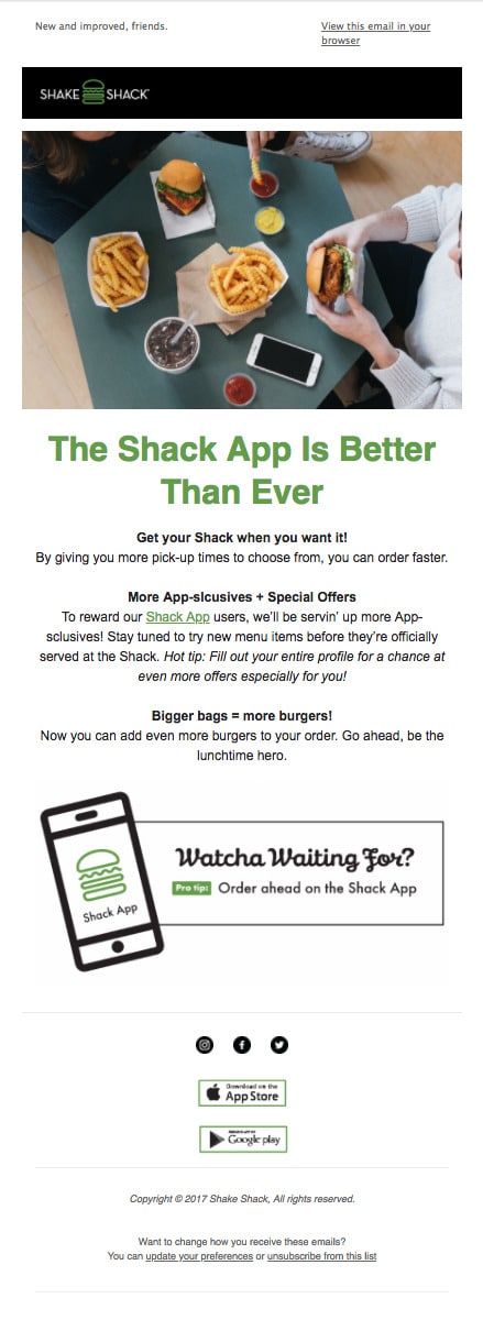
Subject line: You Asked, We Listened
Preheader text: New and improved, friends.
Shake Shack goes heavy on app promotions, pushing subscribers to download it every few emails.
I completely understand why they'd want to increase the user base for their app, but this is an excellent use case for a suppression list. They collected my zip code at signup and know there isn't a Shake Shack anywhere near me yet. They also know there's no point in me downloading an app to order food if I don't have a Shake Shack to order from.
So instead of sending me these app promos, they could suppress me (and anyone else not within driving distance of a Shake Shack) from those types of campaigns until a new location opened near me. Then, they could promote the app alongside the store opening.
Relevance, guys. It's powerful stuff.
SONIC
THE SIGN-UP PROCESS
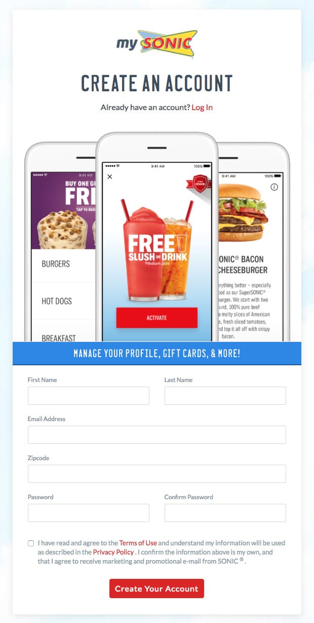
I'm a diehard Sonic fan, but I'm going to have to be honest here: They make it downright impossible to sign up for their emails. On their homepage, it's easy to find the path to subscribe to SMS alerts, but there's no option to receive their emails. In fact, the only way I was able to finagle my way onto their list was to sign up for a My Sonic account...
Which includes a ton of fields and isn't even framed as an email signup, although by signing up, you do make it onto their list. I appreciate that the checkbox isn't pre-checked (hello, GDPR), but since they do send such great emails, it's odd that they wouldn't want to find ways to get more people on their list.
Unlike Shake Shack, they do not send a welcome email. Instead, you're dropped into their regular send cadence, which includes emails like these...
1. THE PROMOTIONAL EMAIL
Subject line: Guess What's Half Price ALL DAY Tomorrow?
Preheader text: N/A
Sonic sends about 1-2 times a week, and their emails don't appear to be segmented by demographics like location, even though they collect that data at signup. However, they do a great job of capitalizing on timeliness, often running promotions tied to current events. For instance, I recently got this email promoting half-price burgers in honor of Tax Day.
It's a pretty email, right? Plenty of white space, a single column for easy scrolling on a phone, nice, tappable buttons. Except...
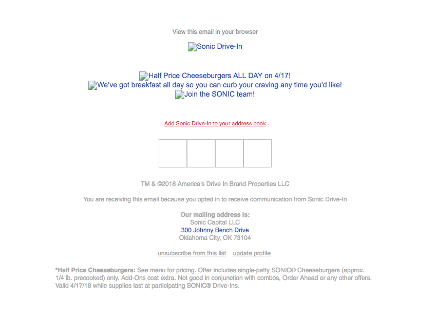
It's all images. So when someone happens to view it with images turned off (as many people do), the experience isn't so nice. Now, to be fair, they do use alt text, which helps preserve the message. But for comparison, here's what that Shake Shack welcome email looks like with images turned off...
Since they use live text instead of images, the majority of the experience is preserved. Plus, they included a bulletproof button—a pro move that allows your button to display even if your recipient can't see images.
As you can see, there are ways to optimize for the images-off experience, and Sonic misses out on those opportunities.
2. THE SMS PUSH
Subject line: Because We You!
Preheader text: N/A
Similar to how Shake Shack is all about their app, Sonic goes heavy on SMS. Here, they do a good job of demonstrating the value you'll get from opting into their text messages, and the focused message helps keep the call to action as clear as possible.
I also like that they played around with an emoji in the subject line. While it won't work for every brand, it's a great thing to test and see if it resonates with your audience.
3. THE INFLUENCER SPOTLIGHT
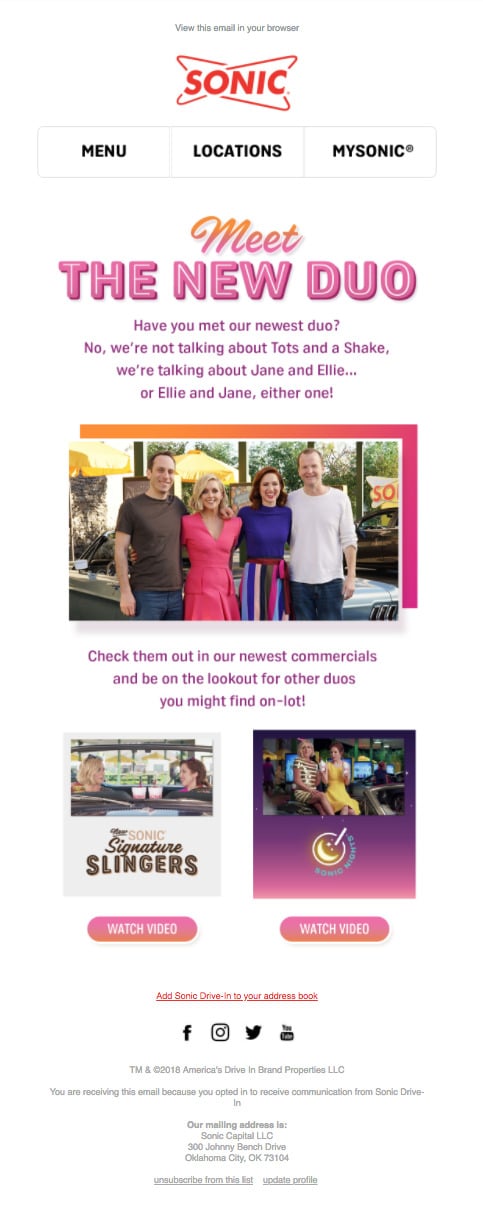
Subject line: Say Hello to SONIC's Newest Duo
Preheader text: N/A
For restaurants, it's easy to want every single campaign to be focused on menu items and deals. However, this example showcases how you can use content to boost interest and engagement. Sure—not every brand has highly produced video content and celebrity endorsements to work with. But even if it's as simple as a spotlight on your chef or an interesting blog post, adding content marketing to your email strategy can do wonders.
4. THE SOCIAL CAMPAIGN
Subject line: Show Us How YOU SONIC!
Preheader text: N/A
One of the best things about email is how well it supports other marketing channels, like your website and social. Here, Sonic utilizes email to promote a social campaign they're running. The more audience touch points, the better, so always remember that email doesn't need to be its own silo.
THE VERDICT?
So, who wins out here? While I absolutely love the way Sonic utilizes content in their email marketing and ties email to their other channels, their design choices and lack of signup opportunities signal that email is a bit of an afterthought for the brand.
For Shake Shack, however, their very intentional email design, the inclusion of a welcome email, and frictionless signup form show that they're truly invested in email marketing. While they could be doing more with segmentation and personalization, they've developed a solid email program overall.
WINNER: SHAKE SHACK
MOST RECENT ARTICLES
Want to engage your audience and grow your brand? Try Emma's robust easy-to-use product today.
