The modern marketer knows they can’t succeed without having a robust email marketing strategy.
In fact, email marketing is taking the lead as the marketing channel of choice. And no wonder as it has the highest engagement rates of every other channel.
But a successful email marketing campaign is not just a matter of sending a few simple emails and then playing the waiting game. A successful email campaign takes work to pull off. You have to master the art of persuasion and the science of conversion.
In short, you need to know how to drive action through your emails. And a critical component of your email that achieves that is the call-to-action. That’s why you need to master call-to-action design techniques that increase conversions.
A call-to-action is linked text or a button in your email that directs and encourages your readers to take a desired action. That action could be anything from downloading a case study to purchasing a product to signing up for a trial of a service.
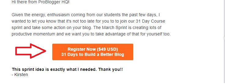
Image Source: Problogger
If your call-to-action design is done well, it has the power to inspire your subscribers to engage with your emails.
If left to themselves, your subscribers will likely not engage with your emails if there is no call-to-action. It may be due to them not knowing what to do next or simply because they lack the motivation to take further action.
If you’ve never paid attention to your call-to-action before, it could be the reason your audience isn’t either. The days of a simple “Click here” are long gone. You’ll want to put more thought into your call-to-action design if you’re to enjoy the benefits email marketing has to offer.
Are you ready to re-engineer your call-to-action to be more efficient? Here are a few tips to help you out. These are tips that have been used to help readers take the right action in some of the most successful email marketing campaigns.
1. Make sure your CTA is prominent.
In order for your call-to-action to be its most effective, it has to be prominent. In other words, it has to clearly stand out from the rest of the copy and images in your email. The best way to make it stand out is to have a call-to-action design that features white space around the CTA.

If, however, your email template has a colored background, you can employ the power of contrast to help your CTA to stand out.
Another way to increase the prominence of your CTA is to unclutter the area around it. By putting other elements close to your CTA, you’ll be distracting your readers from the most important aspect of your email.
2. Opt for a button wherever possible.
If possible, your call-to-action design should take the form of a button. This is because people are accustomed to buttons—they click or press them in nearly everything they do in life.
In fact, pressing a button is becoming part of our inherent nature. And because of that, when your subscriber sees a button in your email, they’ll instinctively want to click it. Research actually shows that CTAs in the form of buttons enjoy a 28% boost in conversions.
Sure, you may have linked text as your call-to-action in various places in the email body, but your primary call-to-action will convert better if it’s in the form of a button.
Plus, buttons add to the visual appeal of your email.
3. Use color psychology to your advantage.
Color psychology deals with the way different colors affect our emotions and influence behavior. When it comes to your call-to-action design, you’ll want to ensure your CTA button features colors that inspire action and urgency. Most bright colors do a great job of this.
However, when it comes to button color, contrast is the most important factor to take into consideration. Give this design aspect consideration because a CTA that stands out draws attention—and curiosity.
 Image Source: Really Good Emails
In the above example, the bright green call-to-action button is hard to miss—and certainly begs to be clicked.
Also be sure to keep your email’s color scheme as close to your brand’s color scheme as possible. This will not only make your emails easily recognizable by your loyal subscribers, but it also helps make it easier to find a contrasting color for your call-to-action.
4. Size does matter.
Bigger may not always be better in many areas of life, but when it comes to call-to-action design, bigger is always better. You’ll have to find your sweet spot as far as CTA button size is concerned, you don’t want it so big as to be obnoxious. And you definitely don’t want it to be so small that it’s easily missed.
What you should be concerned about is your call-to-action design being big enough to stand out, both the button and text.
The best way to find your sweet spot is by playing around with buttons and testing which size works best for your emails and, most importantly, your audience.
5. Pay close attention to your CTA copy.
It’s impossible to talk about effective call-to-action designs without talking about the copy.
As much as a beautifully designed CTA is important, the well-crafted copy is equally important. After all, it’s usually the text in the call-to-action that elicits a response, the button is a visual cue.
So what makes for high-converting call-to-action copy?
-
Short and precise. Your call-to-action copy must be short and precise, yet conveys your message clearly.
-
Use strong action words. Verbs don’t just show action. They inspire action. Words like “Learn More,” “Get…” and other strong verbs help drive conversions.
-
Highlight the benefit. Your call-to-action copy should be clear and straight to the point about the benefit your subscriber will get by clicking the CTA.
Be personal. Use first or second person language in your call-to-action text. Phrases like “Tell Me More” or “Get Your Discount Here” make your reader feel like you are speaking directly to them.
Image Source: Campaign Monitor
These are just some of the tips you can use to make your call-to-action copy stronger. Getting your copy right will definitely boost conversions as people generally need to be told what to do.
6. Place your call-to-action strategically.
When considering call-to-action design, you have to plan where you’ll place your CTA carefully. While your call-to-action may physically be a small part of the overall design of your email, its placement has big ramifications on how your subscribers will engage with your email.
While some advocate for above-the-fold placement in order to catch those who don’t scroll to the bottom, others are of the opinion that it should be closer to the bottom. The reasoning behind the latter is that readers need to read the full email to make an informed decision. Others advocate for the call-to-action to be on the right side to take advantage of the way the eyes flow when reading.
So which is the best location for your call-to-action?
Location is another much-debated area when it comes to call-to-action design. This is a case where you simply have to experiment and test to find the location that converts better for your emails.
7. Use visual cues.
Another great way to increase the chances of your subscribers clicking on your call-to-action is by using other elements of your email to point to it. Here’s a classic example:

Image Source: Campaign Monitor
Notice how the toe of the shoe is pointing at the CTA button. This visual guides the eye down to the button, making it difficult to miss and even easier to click on.
You can use many other cues to lead your reader’s eyes to your call-to-action, like text that narrows down to the call-to-action, for example. Visual cues are powerful as they not only direct your reader’s eyes to the CTA but initiate a flow in their mind that will hopefully end with a click.
Wrap up
Call-to-action design is often neglected when it comes to designing high-converting emails. The norm is to simply stick one anywhere as long as it is included in the email.
Unplanned CTA design is sabotage.
If you truly want your emails to convert well, you’ll have to take time to ensure that your call-to-action design plays a prominent role in driving those conversions. When planning design, remember:
-
Use contrast or white space to make your CTA prominent
-
Use buttons whenever possible
-
Put color psychology to work
-
Decide on the size of your CTA
-
Always deliver the CTA with great content
For more inspiration and tips on how you can use call-to-action design to inspire your readers to cross the finish line, check out our collection of the best calls to action from 2018.