7 effective CTA examples (and why they work!)
You’re doing everything right with your email marketing: You’re writing compelling copy, nailing it with stunning design, optimizing for mobile… but your click rates still aren’t where you want them to be.
So what can you do? Well, a great place to start is to take a good, hard look at your calls to action. Though every element of your email contributes to whether or not your recipients will ultimately decide to click, your CTA is one of the most powerful weapons you have to convince them to do so. So if you want to improve your click rates, you should do everything you can to optimize your CTA – whether that means the color, copy, placement, or all of the above!
Here, we’ve gathered seven great examples of super effective CTA buttons, along with the strategies that make them work so well. Check them out!
1. Birchbox
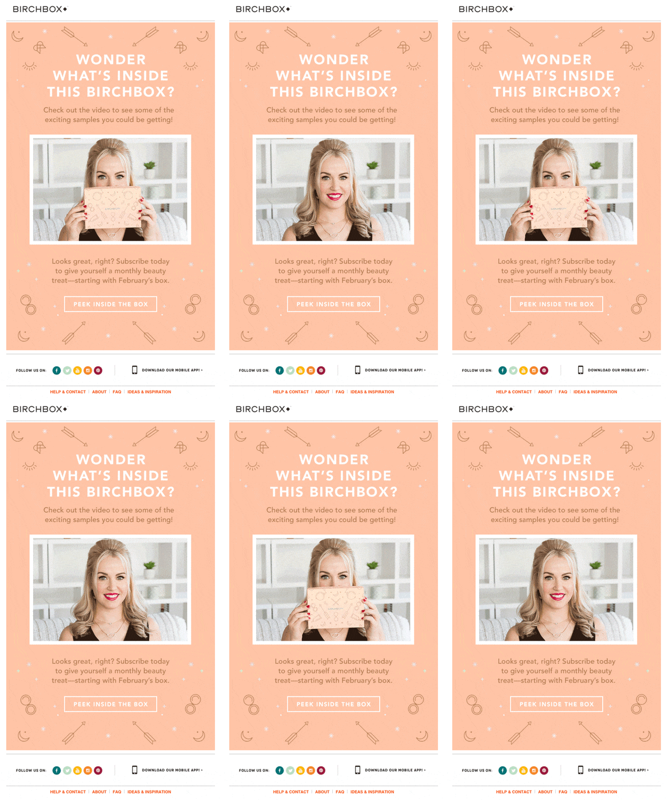
There’s just something about seeing an unopened box that makes you completely desperate to know what’s inside. But those subtle arrows pointing directly at the CTA in this email? What a clever way to compel subscribers to click. Come on… you know you want to!
2. TinWings
Even if you aren’t a fan of baby kale salads (we wouldn’t blame you), this email makes it pretty difficult not to place an order with TinWings. Your eye is instantly attracted to that bright purple button. Even though it works well with the overall email design, the bright contrast and bold arrows still make it the first thing you notice – and the first thing you want to click!
3. J. Crew
These days, marketers and email recipients alike are fully embracing the scroll. So in this email, J. Crew plays with that trend by providing two CTA options: A smaller, more subtle one at the top of the email and a big, bold one you have to scroll to reach. Either way, you win. The first option makes you feel as if J. Crew is doing you a favor by saving you some time and effort, and the second option makes you feel as if you’ve worked for a reward.
4. OrderUp
Hot. Chicken. Please. Anyone promoting hot chicken delivered straight to your door instantly has our hearts (or, more accurately, our stomachs), but this is a perfect example of a CTA button that works because of its killer copy. It’s relevant, active, and creates a sense of urgency – the trifecta of a great CTA.
5. Twist
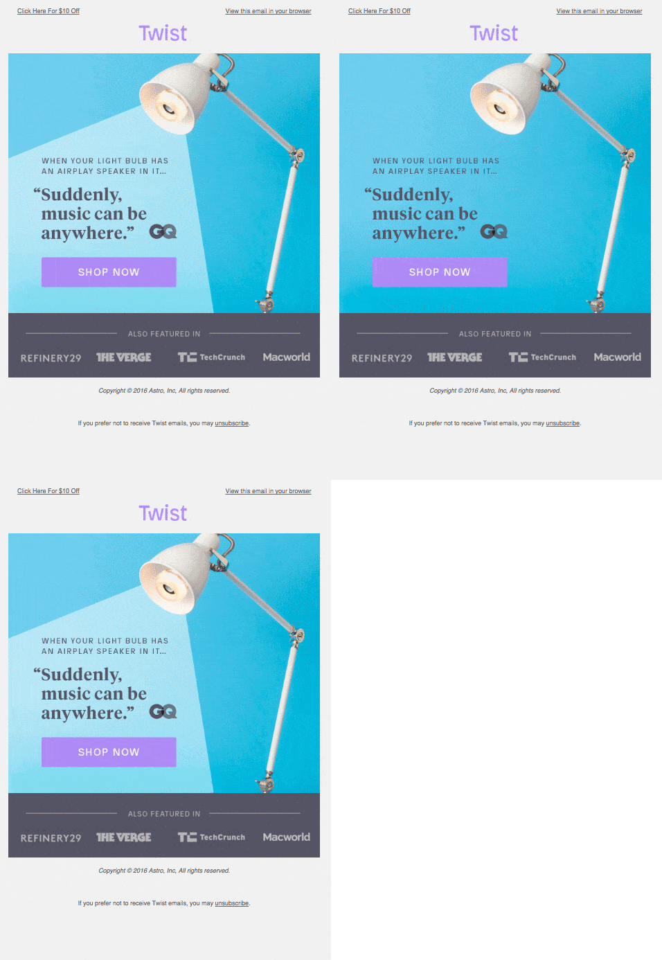
GIFs can be a great asset to help draw attention to your CTA button. Here, Twist literally lights theirs up and draws your eye to the exact place they want you to click. That sort of movement subconsciously tells your eye where to go – a smart tactic that truly works.
6. Slides
This is a creative take on the CTA button we hadn’t seen before: A “play” button. It’s a really smart idea, because we’re pretty much programmed to click a play button when we see one. It instantly stood out in the inbox and, out of pure curiosity, we couldn’t help but click it. And while something like this may not work for your brand, it’s a testament to how trying something new and standing out from the crowd can boost your conversions.
7. charity: water
Here, charity: water shows off the power of eye-tracking. If you have a person in your email, try putting your CTA button wherever they’re looking. Our instinct is to follow other people’s gaze, so it’s an incredibly effective tactic for drawing people to your CTA. And if you combine that with a contrasting color for your button that really makes it pop (like in this email)? High click rates, guaranteed.
Note: We found the last three examples via our friends at Really Good Emails... check out their site for more A+ emails!
MOST RECENT ARTICLES
Want to engage your audience and grow your brand? Try Emma's robust easy-to-use product today.
