4 Ways to create colorful emails your subscribers love

You’ve got a solid email marketing list, but your conversions have been down lately. You’ve tried everything you can think of—crafting new subject lines, changing your call-to-action, and A/B testing your send times.
It may feel like you’re out of options, and that there’s something you’re missing in the marketing puzzle.
Well, there is. You’re missing colorful emails that pack a punch.
Let’s face it—boring email design is a great way to lose potential customers. Sometimes your email campaigns need a hue refresh.
So, we put together this blog with some stats and examples that show just how important a cohesive color scheme can be for your email marketing campaigns.
How colorful emails can lead to higher click rates
Color psychology looks at how color impacts the way people think, feel, and act. Not unsurprisingly, this is a crucial part of the design and it’s something you shouldn’t overlook when putting together a comprehensive email campaign.
Studies show people respond to brand identities and how they use color. People who think color doesn’t align with a brand’s message are less likely to respond as positively to the marketing efforts of that organization.
Color can impact the way people view a brand in a number of ways:
-
Emotions: Colors convey emotions—in fact, an entire field of study is dedicated to this. Red, for example, can represent passion or love, as well as anger. Blue, on the other hand, can convey peace, but also fear. What message do you want to send? How do you want people to feel?
-
Brand recognition: Think about your favorite brands—places at which you like to eat and shop. Now think about the primary color of their logo. What feelings come up when you think about your favorite brand’s visuals? This is exactly what you want to get across to your customers: recognition.
-
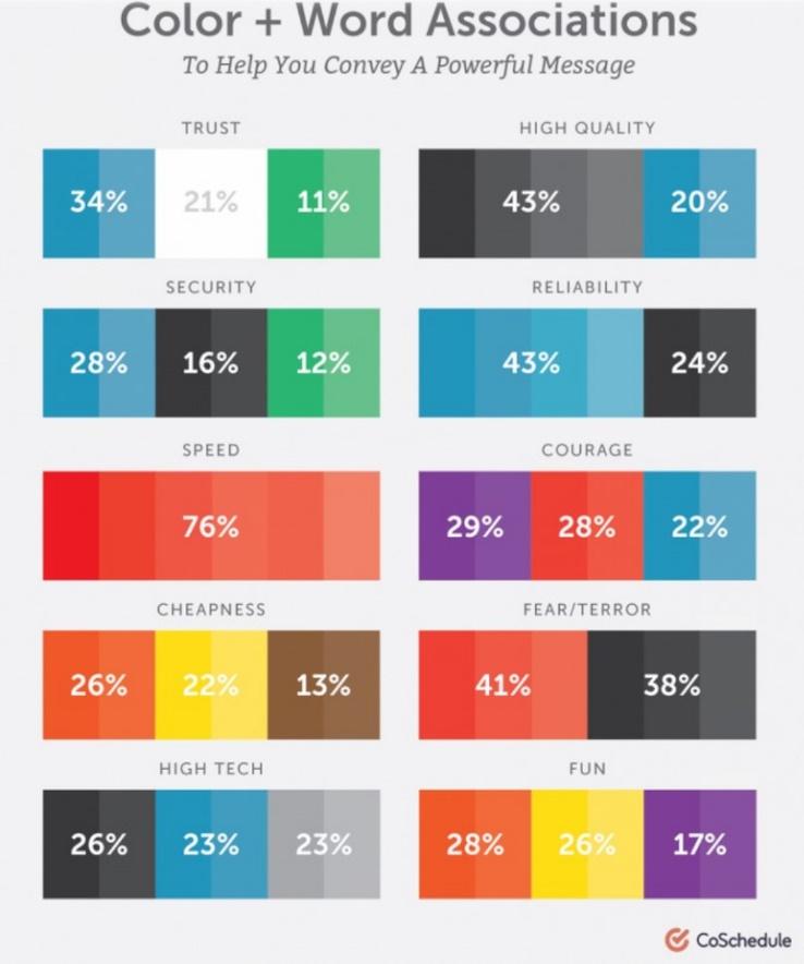
Word association: Yes, you can experience color through words. Studies show that the colors blue, white, and green impart feelings of trust among consumers. Cheapness, on the other hand, is seen in orange, yellow, and brown colors.
-
Gender: We’re going to look at primary colors in this guide. In general, cool colors are popular among all genders, and the color blue is the clear favorite.
Source: CoSchedule
There’s no need to go through every color, emotion, and word combination possible. We’ve put together some examples of colorful emails and what they’re doing right.
4 colorful email examples to inspire you to create better-looking emails
Crafting colorful emails isn’t just about embellishing your CTA or switching up your visual scheme for the holidays (though that’s a good idea). Colorful emails need to be cohesive and eye-catching, without making people feel overwhelmed.
1. Use bold colors that flow seamlessly with your content
What’s the goal of your email? Are you trying to get people to watch a video, sign up for your podcast, or buy something from your store? Do you just want them to check out a landing page?
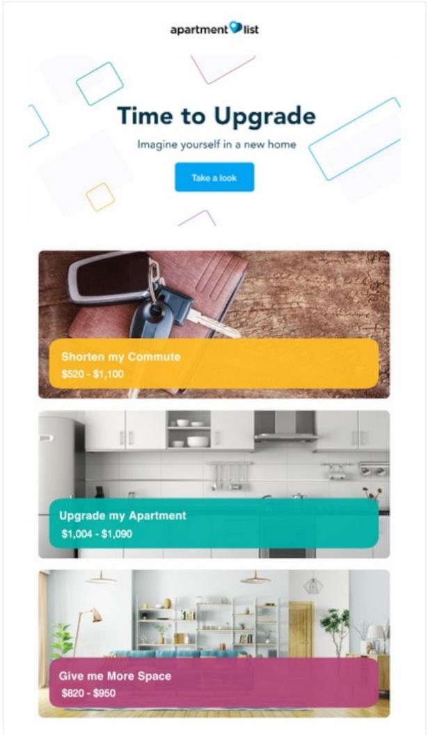
Start with a simple email design and add pops of tone to key features in your message. Take a look at this example from Apartment List.
Source: Really Good Emails
With a simple header, a quick tagline, and a catchy CTA, the email starts off pretty bare. Then it showcases examples of new apartments, and uses bold, primary colors to draw attention to certain details.
2. Let your color palette play on people’s emotions
What’s the tone of your email? Do you want your brand to appear playful or stoic? Are you trying to convey a specific emotion or feeling to your customers?
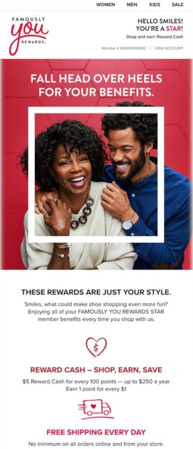
Rather than using several colors, stick with a monochrome color palette —this will catch the eye of your reader and make your email consistent. See this example from Famous Footwear.
Source: Really Good Emails
Red can convey love, and Famous Footwear used it—and the cliché about falling head over heels—to pull their email design together. They kept the color scheme consistent throughout the email, even adding hearts to boost the “love” factor.
3. Bright colors evoke positive feelings from people
Not every email needs to advertise a promotion, or have a “buy now” button. Sometimes, send emails to remind your customers that you’re there—or show them what the brand did this year.
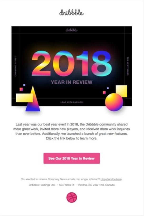
And when you just want to send a fun email that makes your customer feel special, step outside the box and choose an extra vibrant palette. Check out this example from Dribble.
Source: Really Good Emails
They started with a black background and used bold shades to entice customers. They keep the email simple with a short paragraph and a bright pink CTA (asking their customers to see the year in review).
4. Choose colors that complement the season
Sending out holiday emails is a great practice because it not only reminds your customers you exist, but it also spreads cheer and makes people want to click into your emails.
Whether you’re sending out an email for a holiday sale or a holiday workshop, like the following example from Havenly x Orly Khon, think about how the colors you use reflect the season.
Source: Really Good Emails
Requesting an RSVP to their Holiday Workshop, Havenly x Orly Khon uses festive images of an elegant Christmas display paired with an evergreen background. This is topped with a subtle, complementary light pink CTA that pops.
Create emails that convert with these color combination tips
Our examples use some aspects of color psychology and color theory. But not everyone designing email has a keen eye for what goes together.
We’ve put together a few tips to help you create colorful emails using unique combinations (that don’t clash).
-
Complementary colors: We all know the saying, “opposites attract.” Well, that’s very true in color theory. Without getting into the nitty-gritty, just know that blue is complementary to orange, red is complementary to green, and yellow is complementary to purple. These combinations are a great place to start with basic email design.
-
Analogous colors: If you look at a color wheel (and we highly recommend you pull one up online when you get ready to design), analogous colors are those that sit next to each other. In a basic color wheel, for example, blue-green sits on one side of blue and blue-violet sits on the other. You can pull together simple, subtle combinations this way.
-
Monochromatic colors: Like in the Famous Footwear example above, a monochromatic color palette consists of one color and its various shades, tints, and tones. It’s even more subtle than an analogous color palette, but you can draw attention to your CTA by using a complementary color to make it pop.
Beyond the three basic color combinations here, there are a number of other ways to combine colors—like split complementary, or pulling colors from “shapes” made around the color wheel (like a rectangle, square, or triangle).
Be careful with the more complicated color palettes if you’re just dipping your toes in. Without extra diligence, those color palettes can be loud and overbearing.
Wrap up
Color theory and color psychology are incredibly powerful marketing tools, because you can convey many different emotions and words. However, make sure to keep these tips in mind when creating colorful emails:
-
Complement your brand. While it can be fun to try something new, don’t stray too far from your brand’s style and color palette that it confuses your customers. Use different combinations to accent your logo and brand marketing material.
-
Convey the right message. Use color to direct how you want your customers to feel. Use bold, vibrant shades if you want your message to be fun, and stick with subdued primaries and pops of color for a more professional message.
-
Create seasonal templates. Looking to spruce up your emails around the holidays? Create seasonal templates that complement your brand and convey the right message.
You can craft brilliant, colorful emails with a little bit of practice. Getting the right palette can be tricky, but sending the right message is worth the effort.
Looking for a tool to improve your email marketing? Emma’s helped many boost their click rates and conversions—and Emma could do the same for you. Schedule your demo today.
MOST RECENT ARTICLES
Want to engage your audience and grow your brand? Try Emma's robust easy-to-use product today.
