

The Modern Marketer’s Field Guide
With so much data available, so many new channels and so much competition, it can be tough for today’s marketers to find their way through it all.
That’s why we created this trusty field guide. It helps you explore the world of modern marketing (with email at the center) and identify those tools that make forming a genuine, helpful connection with your customers a whole lot easier at every location. No GPS required.
AUTOMATION • MOBILE DESIGN CALLS TO ACTION • SUBJECT LINES LIST GROWTH • DYNAMIC CONTENT
63% of companies who are outgrowing their competitors use marketing automation (Lenskold and Pedowitz Groups).
Automation
ROBOTICO MAXIMUMRESULTIS
BEHAVIOR
You know you’ve found automation when you come across a feature set that schedules email messages in advance to reach contacts with the right message at just the right time.
Some marketers might be hesitant to embrace automation because it seems too complicated or impersonal. But really, automation is an easy (and approachable) way to both save time and send more personalized messages. It’s a win-win.
It thrives when fed smart audience data it can use as a trigger. This is how automation, despite the images of robots and machines it evokes, actually becomes a more personal way to reach your audience.
The simplest example of this is a thank you email. If someone makes a purchase or downloads a piece of content, that triggers an automated email thanking them for doing so. Savvier marketers will also build in an extra discount or special offer based on what the customer purchased to keep them engaged (and buying).
But really, automation is an easy (and approachable) way to both save time and send more personalized messages.
Subscribers who receive welcome notes show 33% more long-term engagement with that brand. (chiefmarketer.com).
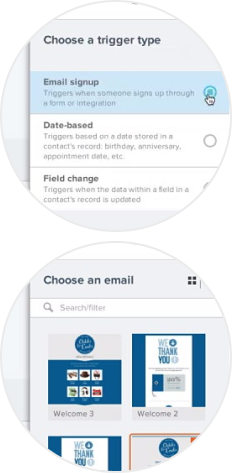
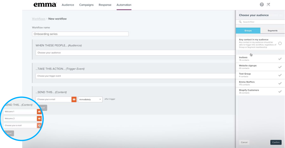
Automation can be effective when exhibiting both solitary and pack behavior. Solitary automated emails typically fire in response to a specific contact milestone, such as birthdays, anniversaries or when someone spends or donates a certain amount of money.
But it can also organize itself into packs called automated series. A prime example of an automated series is a welcome series. When a new subscriber fills out your signup form, that serves as the trigger to launch the welcome series. Your series could look like this:
The Welcome Series
- EMAIL 1. Thanks for signing up and a special discount.
- EMAIL 2. Invitation to manage customer preferences.
- EMAIL 3. Best-selling products and new arrivals.
- EMAIL 4. Last chance to save with special discount.
It’s such an easy way to make a great first impression—and it gets long-term results. Subscribers who receive welcome notes show 33% more long-term engagement with that brand (chiefmarketer.com).
FUN FACTS
Automation gets 152% higher click rates than broadcast emails (Epsilon).
Marketers who automate see up to 50% conversion rates (eMarketer).
Relevant emails drive 18x more revenue than broadcast emails (Juniper Research).
WHY FRANCHISES LOVE IT
Saves tons of time.
Sends more targeted content.
Boosts engagement and results.
Mobile Design
RESPONSIVIUS OPTIMIZIUM
BEHAVIOR
The importance of mobile design is impossible to ignore in the modern marketing ecosystem. 80% of people will simply delete an email if it doesn’t look good on a smart phone (Blue Hornet)—a result no marketer wants to see.
But if the same email looks beautiful on a smart phone, tablet and desktop, then you’re in the presence of mobile design.
Mobile design is all about making emails easier to scan and engage with on a mobile device. It feeds on content that’s large, easy to see and simple to consume, so it loves big, bold images, large fonts and tappable call-to-action buttons (see Section 3: Calls to Action).
When in doubt, design for the small screen first. An email that looks gorgeous on a smart phone will also look good on a tablet or desktop. Or to save time, use an email template that’s already responsive. It automatically adapts to look great regardless of the device that your audience is using to view email.
But don’t stop with just your email. Most email drives your audience to do something else, like visit a website, make a purchase or watch a video, so make sure those landing pages are also mobileoptimized. You don’t want to lose them right when they’re ready to do what you’re asking them to do because it’s too hard to see on their phone.
Here are some ways marketers can create a mobile-friendly habitat for their emails:
- Arrange content in a single-column layout.
- Incorporate plenty of white space for easy scanning.
- Organize content into sections with clear dividers and headings.
- Use at least a 16-pixel font size for readability.
- Add buttons instead of text links for your calls to action.
- Keep it clean and simple. A bunch of crammed-in content will get ignored.

FUN FACTS
People check their phones up to 150 times a day (kpcb.com).
54% of email is opened on a mobile device (Litmus).
By 2018, 80% of email users are expected to access their accounts via mobile devices (Radicati).
1. Make informed decisions based on science and data.
2. Produce consistent & systematic improvement.
3. Enable actionable processes.
80% of people will simply delete an email if it doesn’t look good on a smart phone —a result no marketer wants to see. (Blue Hornet)
WHEN IN DOUBT, DESIGN FOR THE SMALL SCREEN FIRST.
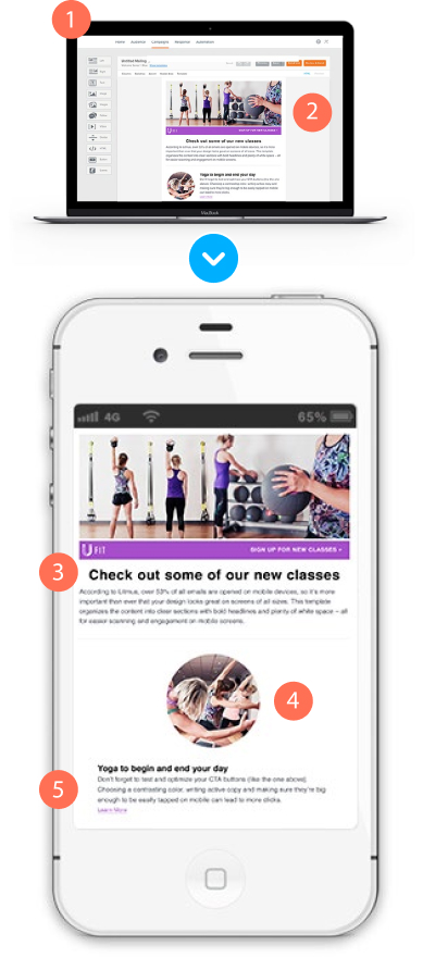
1 – Mobile-optimized emails also look great on desktop.
2 – The simpler the design, the better. Busy emails are too tough to scan.
3 – Use large fonts and plenty of white space for easy reading.
4 – Big, bold and tappable images attract the eye and boost engagement.
5 – Chunk content into sections with headings for those skimming on the go.
WHY FRANCHISES LOVE IT
Boosts click rates.
Helps your audience engage with content when they’re on the go.
Increases credibility for your brand.
“Automation helps us provide immediate value to our guests, bring them into the restaurant and get them fired up for our emails.”
Automation in the Wild
A CASE STUDY WITH FIREHOUSE SUBS
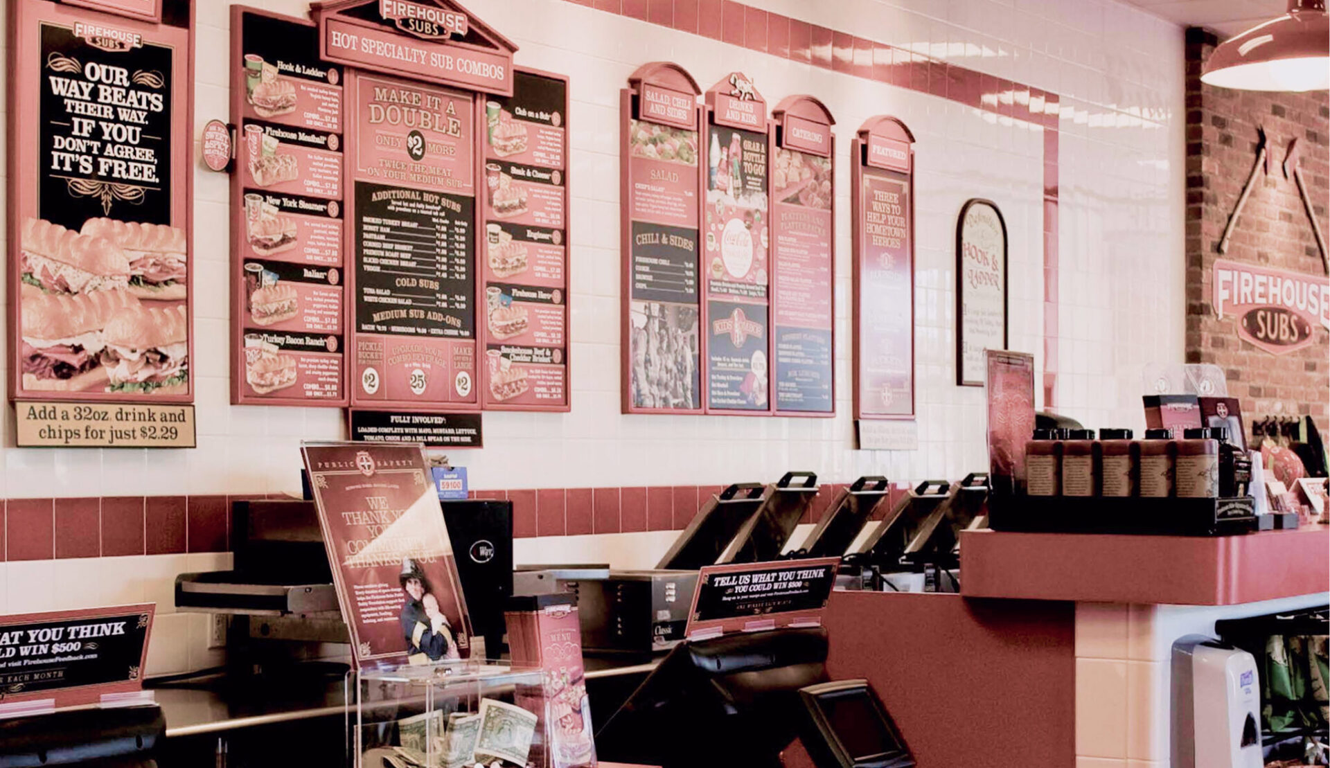
As senior manager of digital marketing at Firehouse Subs, Matt Olsen smartly uses automation, audience segmentation and strategically timed cups of coffee to keep Firehouse’s email marketing humming for the home office and all of its franchises.
Matt is well aware that welcome messages have 4 times the open rate and 5 times the clickthrough rate of normal emails, so he created an automated welcome email for anyone who joins the Firehouse email list. The welcome message gives subscribers an offer, and through creative use of personalization, automatically generates an expiration date two weeks from the day the person signs up.
He also uses automation to send a birthday message to subscribers reminding them to show their ID on their birthday at a Firehouse location for a free medium sub. After the initial setup, automation does all the work, engaging Firehouse customers without Matt having to give the emails a second thought.
They work, too. The birthday message has a nearly 50% open rate, and the welcome message has an astounding 76% open rate. Matt also used email automation during the Hearty & Flavorful Challenge, the campaign to introduce Firehouse’s under-500 calorie menu. Firehouse used their digital channels to post a series of healthy eating and fitness challenges. They asked people to register for the challenge using their email address and then post photos of themselves completing each challenge to the campaign’s website. Matt then set up a series of automated emails to send a special offer or health tip to each person who completed a challenge.

The campaign was a hit. There were over 5,000 photos uploaded from nearly 2,000 users, along with strong repeat engagement on the campaign website. Emails performed very well, too. The average open rate of the automated emails was 83%, and the average click rate was 48%.
Let us repeat that. Open rate 83%, click rate 48%!

Calls to Action
CONVERSIONEN SKYROCKETYX
BEHAVIOR
One of the smallest but most powerful parts of any email, effective calls to action (CTAs) have evolved from text links into buttons so fast that Darwin’s head is spinning. Why? Buttons are much easier to see (and tap) on a mobile device, and more people than ever are checking email on their phones (see Section 2: Mobile Design).
But not all CTA buttons behave in the same way— some attract way more clicks than others. Here are a few features of the most clickable CTAs modern marketers will encounter in the wild.
Not all CTA buttons behave in the same way—some attract way more clicks than others.
Why is color important? 85% of people say color is the main reason they buy a product (Kissmetrics).
COLOR
CTA buttons come in a variety of colors, and while researchers haven’t identified one color that gets more clicks than others, they have found some interesting trends:

ORANGE provokes immediate action.
GREEN is relaxing and symbolizes growth.
BLUE builds trust, safety and security.
RED increases energy and urgency.
YELLOW grabs attention and promotes positivity. So test out different colors that make sense for your brand—and your design.
So test out different colors that make sense for your brand—and your design.
“We know our audience is checking email on their phones, so we include large images that are easy to see and CTAs that are easy to tap. It’s resonating with our subscribers too—click rates in recent campaigns have ranged from 17-37%, which is well above industry standard.” -A3 Merchandise

COPY
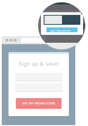
CTA buttons that just say “Click here” are being ignored into extinction. It’s general, meaningless and relatively passive. More clickable buttons have copy that’s short, specific and active—copy like “Shop now” or “Buy this outfit.” It’s tight, energizing and tells you exactly what’s going to happen when you click the button.


WHY FRANCHISES LOVE IT
Lifts click rates quick.
Easy to A/B test to get better results.
Improves conversions from mobile devices.

SHAPE
Rectangular buttons are by far the most common shape (you probably hit one to view this guide), but don’t be afraid to tr y out other shapes if they work for your brand. For example, a circular CTA just looks like a button that’s begging to be pushed.
CTA buttons that just say “Click here” are being ignored into extinction.
PLACEMENT
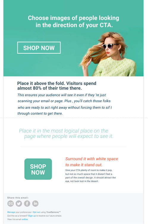
CTAs are solitary creatures that love attention. They can usually be found in highly visible areas of emails or landing pages without other content (or worse, other buttons) around them soaking up the spotlight. Surround them with plenty of space and place them above the fold or in the most logical place where someone would be looking to take action.
A last word about CTAs: No one button works best for every brand , so you’ll of ten see them engaged in click competitions (aka, A/B tests) against other buttons. Test CTAs with different colors, copy and placement to see what gets the most clicks from your audience.
FUN FACTS
Apple recommends buttons should be at least 44 pixels squared, the size of the human fingertip.
Add an image to your email of someone looking toward your CTA button. Eye-tracking studies show we’ll look where they’re looking.
SURROUND IT WITH WHITE SPACE TO MAKE IT STAND OUT.
Subject Lines
DETERMINIZE OPENORDELETEIS
BEHAVIOR
Subject lines are one of the most common elements in the modern marketing kingdom. They’re everywhere, stuffing every inbox. However, GREAT subject lines are a much rarer species. They ’re compelling and irresistible to open—like the biggest present underneath a Christmas tree.
But they also come in a darker, much more common form…BAD subject lines. Here’s how to tell them apart:
GREAT Relatively short. Anything over 50 characters can run the risk of being sent to the spam folder.
BAD An epic run-on that’s better off being the first paragraph of the email.
GREAT Specific to the audience, and the content that’s inside the email.
BAD Pulls the old click-bait and switch.
GREAT Compelling, but not too clever. People are only scanning their inboxes, so they might not take the time needed to get the joke.
BAD Any subject line that’s in all caps, has an abundance of exclamation points, or uses the word “free.” If you see these subject lines, run.
Subject lines are typically found hanging out with preheader text and the From name to determine your open rates. They’re the three pieces of information your audience uses when deciding whether or not to open an email in a typical inbox.
Preheader text continues the thought of the subject line and teases the content of your unopened email. It then disappears once the email is opened. It’s another opportunity for modern marketers to convince their audience to open their mailing.
They’re compelling and irresistible to open—like the biggest present underneath a Christmas tree.
The From name should always be recognizable to your audience. Using your brand name is a safe bet. Or if you want to use a person’s name at your organization, incorporate the brand name in the from name (e.g. Daryl Hall | Emma, Inc.) or in the subject line, so your audience knows right away where it’s coming from.
Subject lines are competitive by nature, so marketers should take advantage of this behavior by split testing them against one another. Split testing is when you send different subject lines for the same mailing to a small percentage of your audience. Then the best-performing subject line gets sent to the remainder of your list. It’s a surefire way to learn more about your audience and get the best open rates possible.
FUN FACTS
iPhones cut off subject lines at 32 characters.
Personalized subject lines are 22% more likely to be opened (Adestra).
69% of email recipients report email as spam based solely on the subject line (Convince & Convert).
WHY FRANCHISES LOVE IT
Split testing is an easy way to boost open rates.
Simple subject line changes can produce big results.
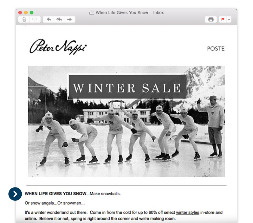
Peter Nappi recently sent an email with the subject line “When life gives you snow…” It’s intriguing, short enough for mobile phones, and—most importantly—super timely, since it landed in our inbox when half the country was buried by a winter storm.
List Growth
RAPIDUS ACCUMULATIO
BEHAVIOR
When encountering any successful marketing program, you can be sure to find a healthy email list at its core. So growing that list and keeping it healthy with more of the right kind of subscribers is critical.
In order to thrive, an email list needs to be fed by quality content that can attract new subscribers and daily promotion of its signup form. Here are some examples of smart list-grow th techniques that modern marketers are seeing out in the wild.
A healthy email list is at the core of any successful marketing program.

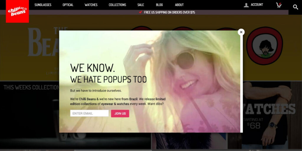
“We’ve seen a 700% lift in online email signups since adding a lightbox form.”
GATED LANDING PAGES
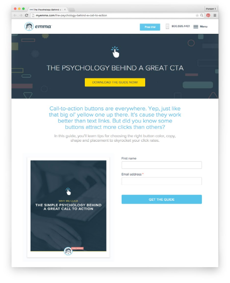
This is where quality content comes in—it serves as a magnet to attract new subscribers. Most people are willing to give their email address in exchange for high – quality and relevant content. So say you have a pre-sale, limited-time product or sneak peek at new arrivals, gate your content with a signup form asking folks to provide their email address in order to get it.
LIGHTBOXES
Once on the endangered species list due to overuse and irresponsible deployment, lightboxes (aka, pop-ups) have enjoyed a resurgence in recent years as a tool to keep email lists on the rise. Why? They work. Big time. Our email signups more than tripled after adding a simple lightbox form to the Emma blog. While some marketers worry they might annoy their readers, lightboxes don’t affect your site bounce rates. Just don’t overdo it, and make sure to give your site visitors an easy exit if they don’t want to sign up.
SOCIAL PROMOTION
By following you, your social media audience has already shown some interest in your brand. So encourage them to take the next step by promoting your email signup link on your social channels. Or show the value of joining your list by occasionally sharing your emails on your social channels after you send. Even better yet, tease the content of an upcoming email a couple days before you send. People love to be in the know, so they’ll sign up for fear of missing out on the big news.
And once someone signs up, be sure to give them an experience worthy of them inviting you into their inbox. A smart way to do this is through an automated nurturing series with content tailored to how they signed up in the first place (see Section 1: Automation).
For example, if someone signs up during the checkout process, you could follow up with this kind of series: thanks for your purchase; here are some related items
we think you’ll love; rate and review your purchase…you get the idea.
And once someone signs up, be sure to give them an experience worthy of them inviting you into their inbox.
FUN FACTS
The average email list churns by about 30% every year (industr y standard).
Lightboxes increased our email signups 371% (Emma).
List growth = business growth. The ROI of email marketing is 4,300% (Direct Marketing Association).
WHY FRANCHISES LOVE IT
Takes just a few minutes to set up most list growth tools and tactics.
Gets a wider reach for your communications and content.
Leads to more conversions, and ultimately, more revenue.
Dynamic Content
TARGETIA NEXTLEVLE
BEHAVIOR
Dynamic content is the chameleon of modern marketing—it can change itself based on the demographics or preferences of the person who’s looking at it. It can be tricky to spot, because when done right, the recipient just thinks the brand is really, really good at personalizing content. Sounds pretty cool, right? That’s because it is.
Dynamic content takes personalization to a whole new level by allowing marketers to target individual subscribers with different content from the same mailing. Here’s a simple demonstration of how it works.
“Dynamic content and automation help us ensure the right content is delivered to the right people at the right time.”
– SAM DRESSER, SCHOOL OF ROCK

DYNAMIC CONTENT TAKES PERSONALIZATION TO A WHOLE NEW LEVEL.
In this example from Nike, they created and sent a single email, but the image and copy changed depending on whether or not a male or a female opened it.
Here’s what men saw:
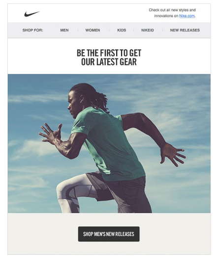
See how that saves a ton of time? Rather than having to set up, design and schedule separate emails for men and women, the Nike marketer just did it once (see what we did there?) and the email automatically adapted for each recipient. Plus, they’re getting all the huge results that come with sending highly targeted communications.
And here’s what women saw:
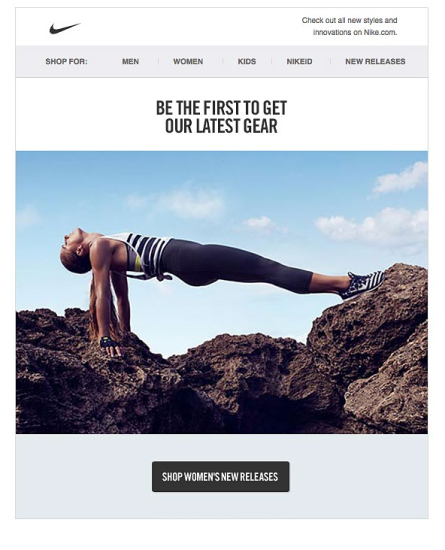
Dynamic content is super adaptable—it works with whatever data fields you’re capturing from your audience, whether that’s location, purchase history or spirit animal (sea otter, since you asked). It’s also easily trained—it only displays the content you tell it to in response to the data fields you assign.
FUN FACTS
56% of people unsubscribe from emails due to content that’s no longer relevant (Chadwick Martin Bailey).
61% of consumers feel better about a company that delivers custom content and are more likely to buy (Demand Metric).
Dynamic content can improve click-to-open rates by as much as 73% (Avari).
WHY FRANCHISES LOVE IT
Creates a tailored brand experience for each subscriber—wherever they’re located.
Gets major results.
Saves boatloads of time.
Just flat out fun to use.
