Email inbox previews
Hit “send” with confidence
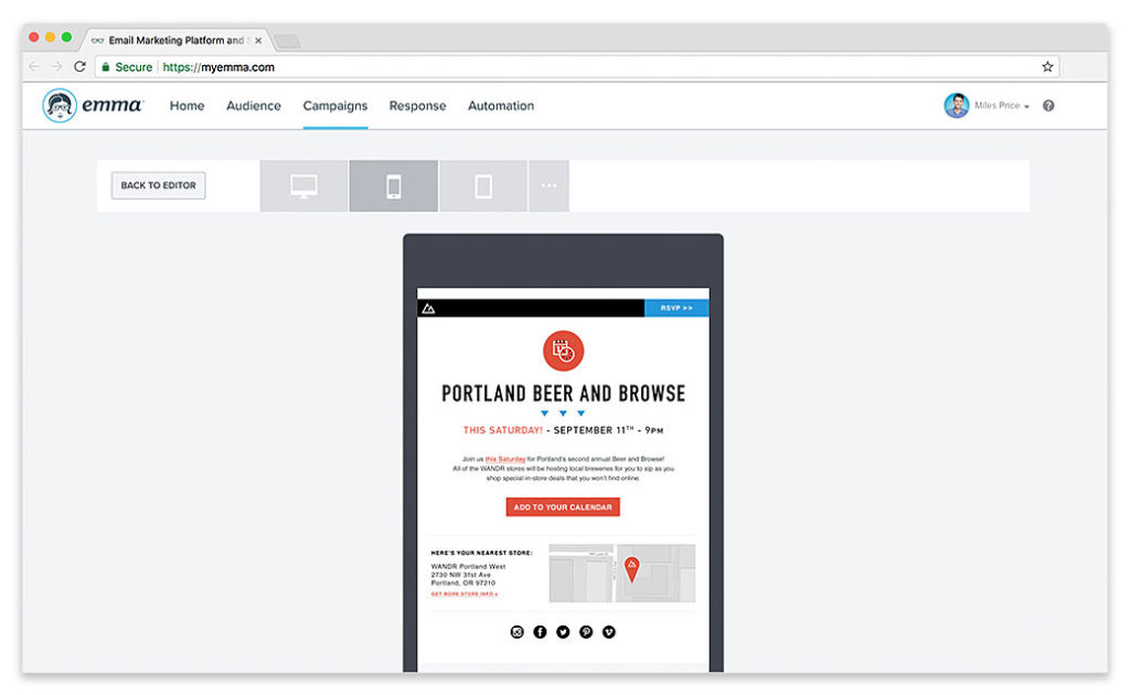
With over half of your subscribers opening email on smartphones and tablets, optimizing for mobile isn’t a luxury anymore – it’s a must. All of Emma’s templates are mobile-responsive, and our inbox preview tools make sure every email you design looks great on screens of all sizes.