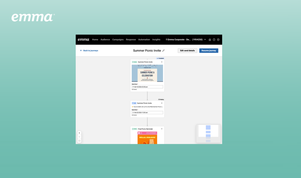
Introducing Journeys: Drip Campaigns
Multi-step email and SMS sequences have always been possible in Emma. Now…
Home base for all the latest Emma features and enhancements.
Upcoming product improvements and feature releases
This contains forward-looking statements that are subject to change at Marigold’s sole discretion. These forward-looking statements are not guarantees, promises, commitments to deliver, or agreements regarding future product features, functionality, or otherwise.
![]()
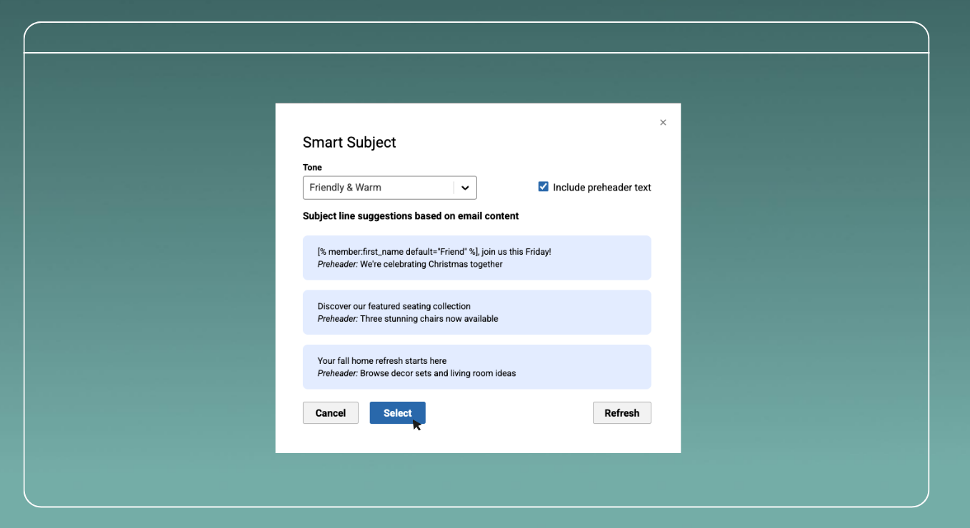
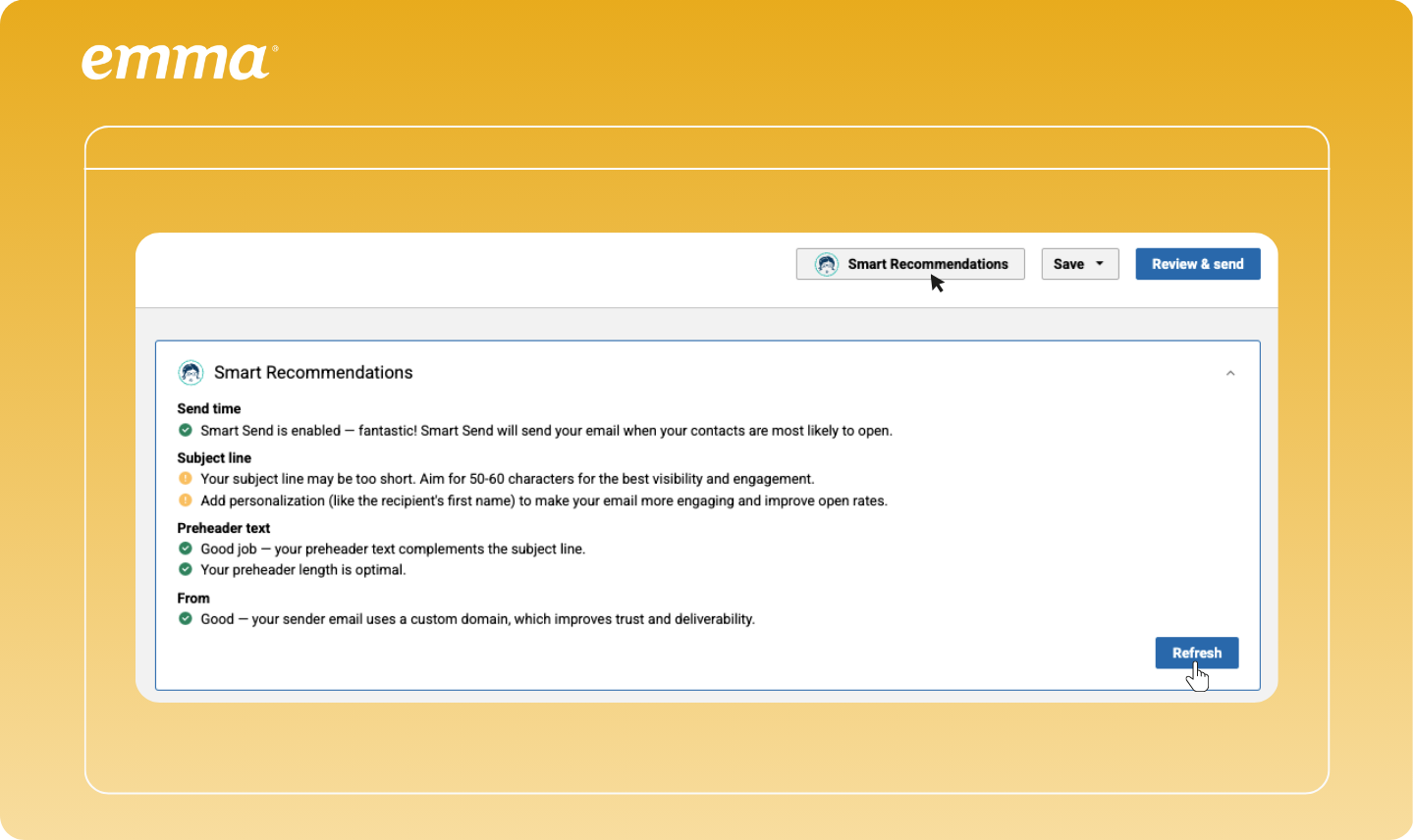
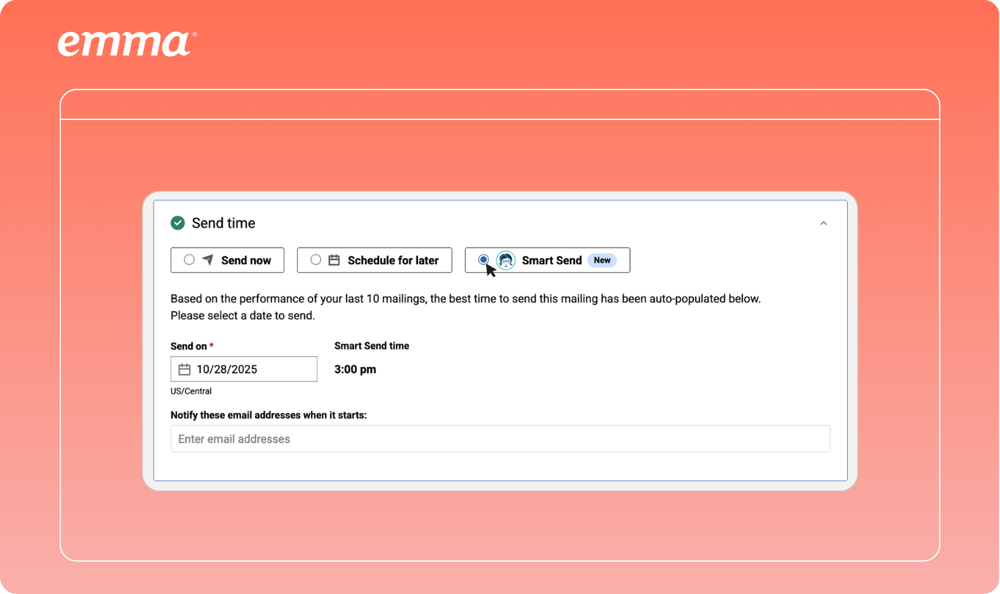
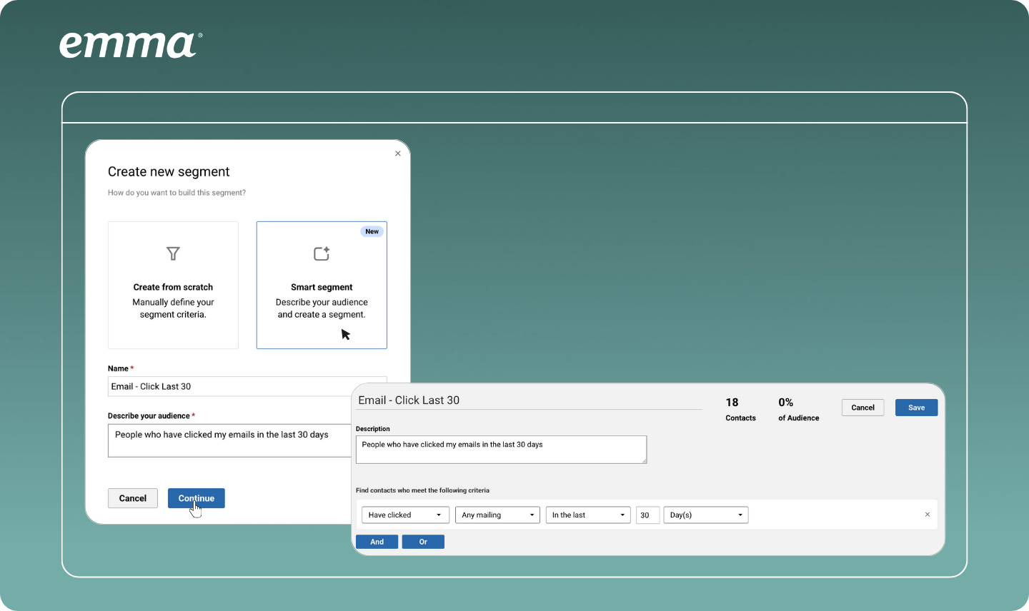
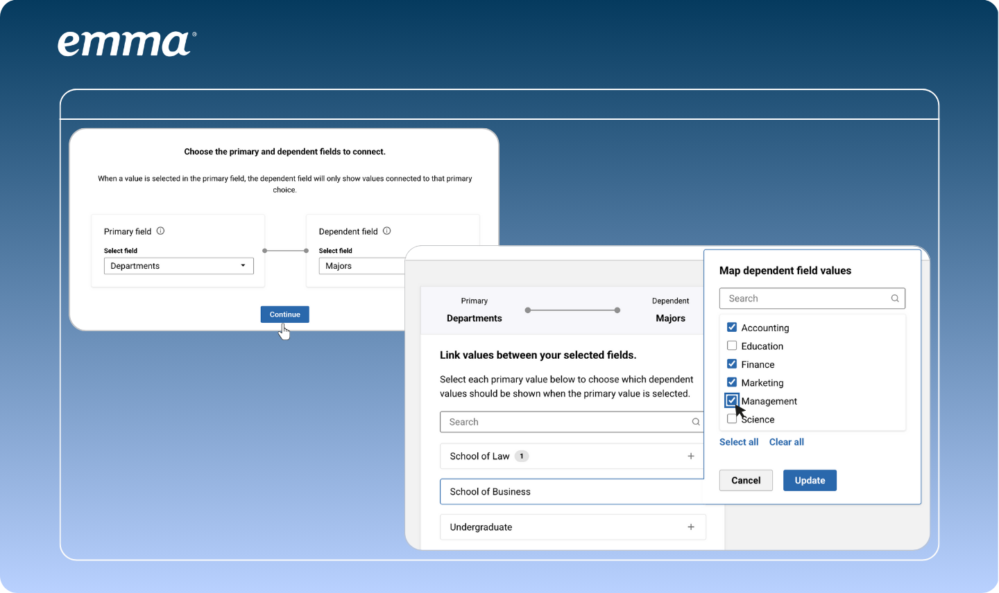
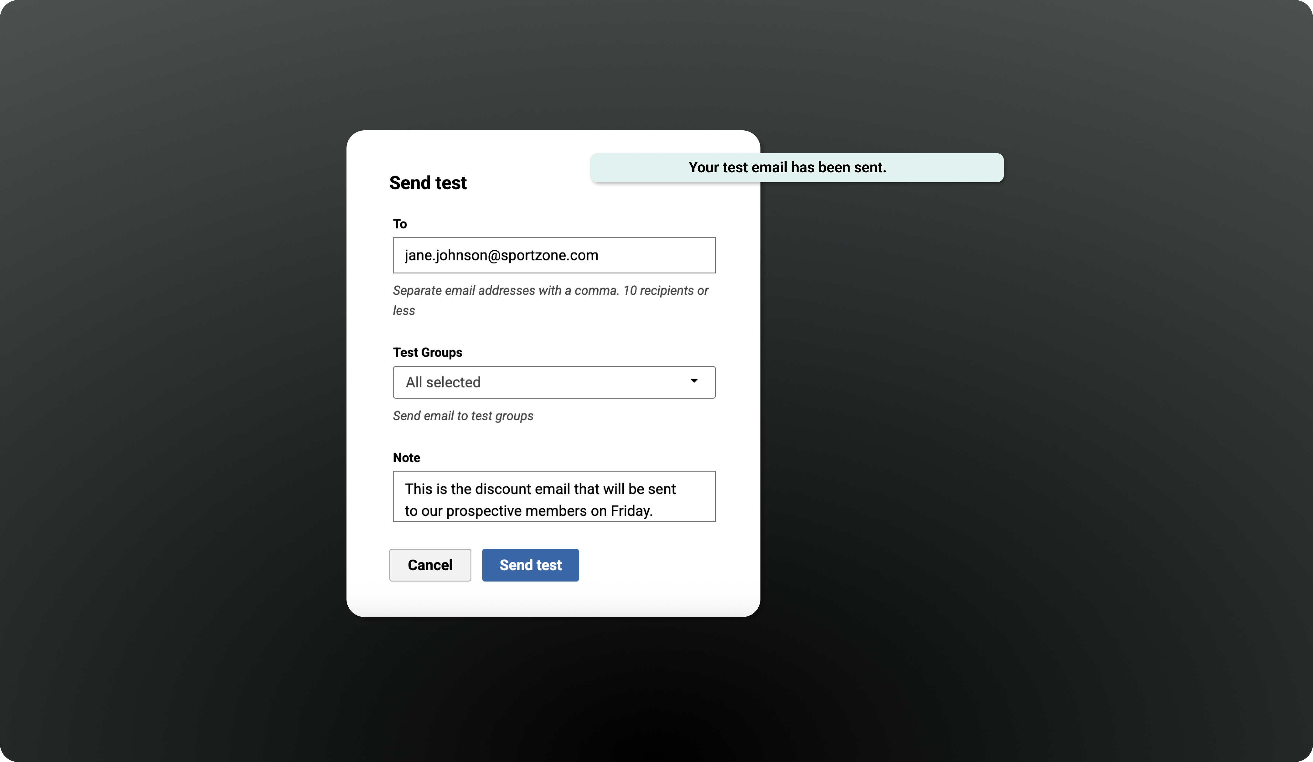
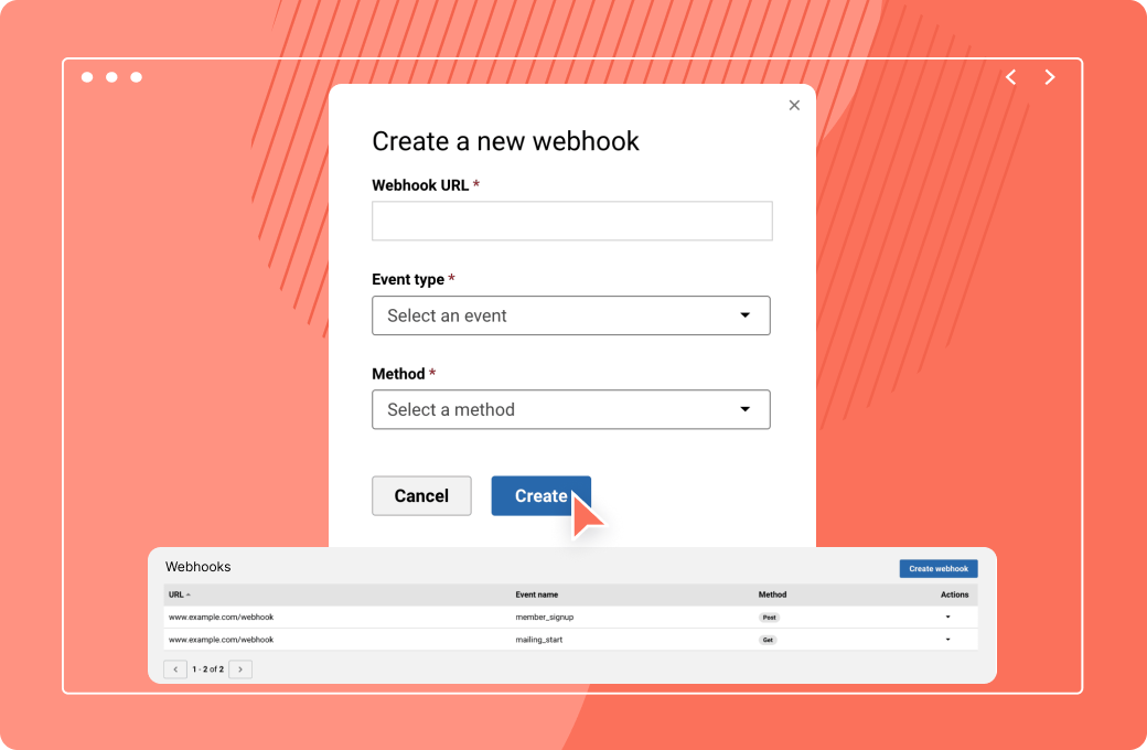
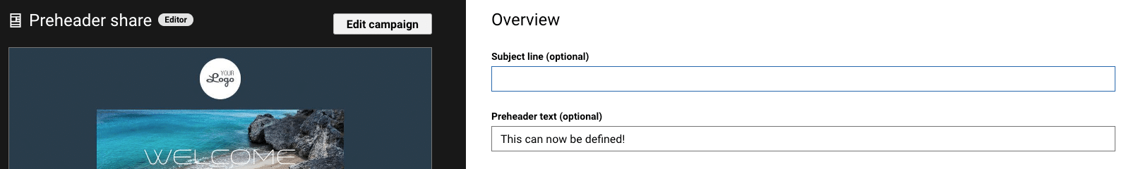
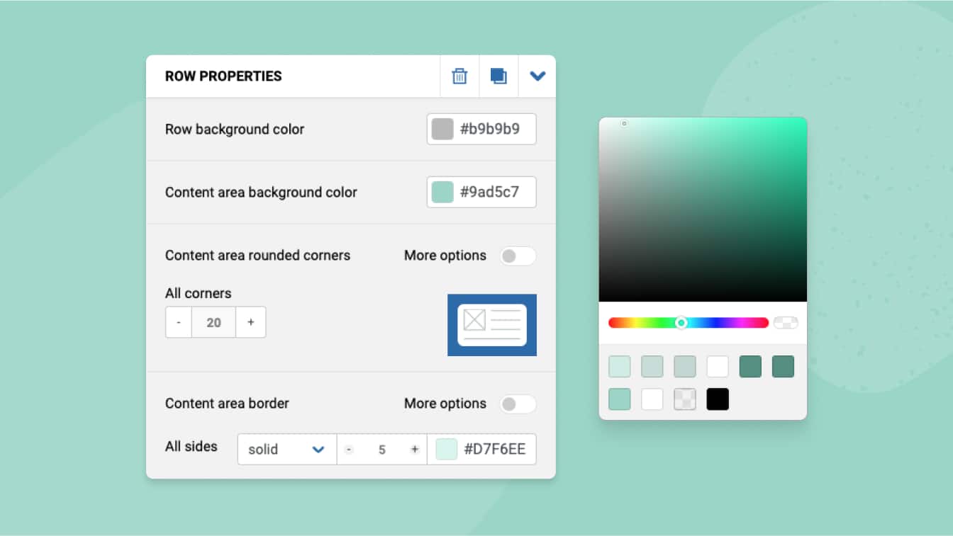
Simplify customer engagement with automated Journeys that will deliver personalized email sequences and triggered campaigns based on contact behavior.
![]()
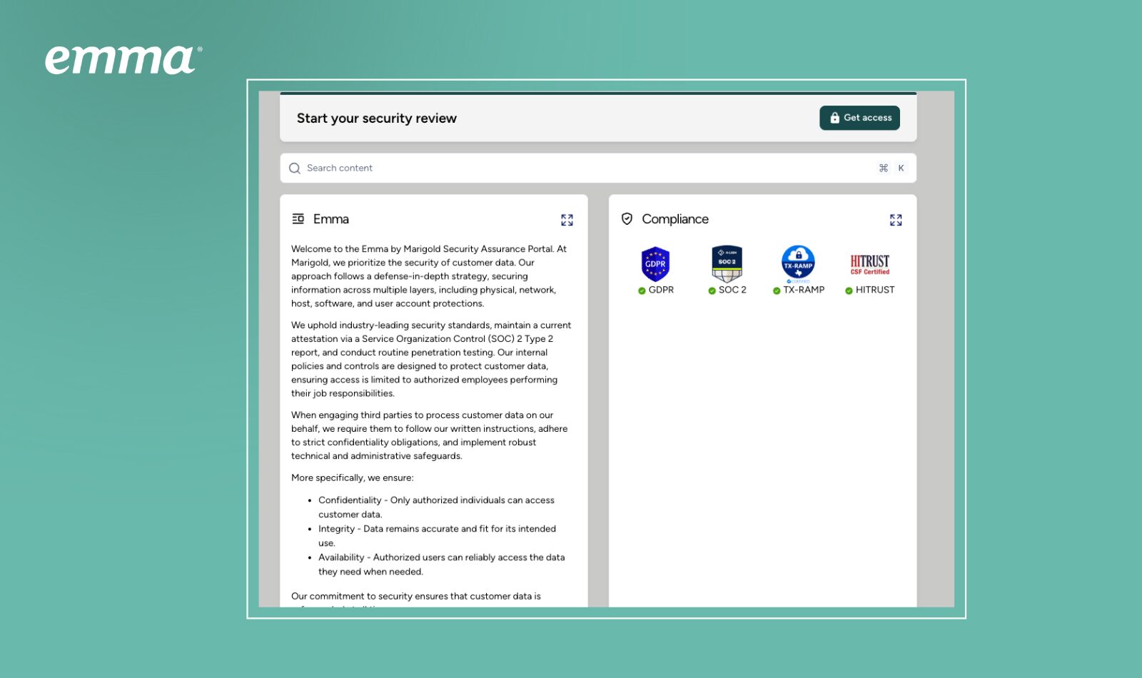
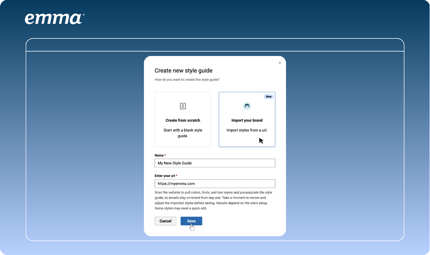
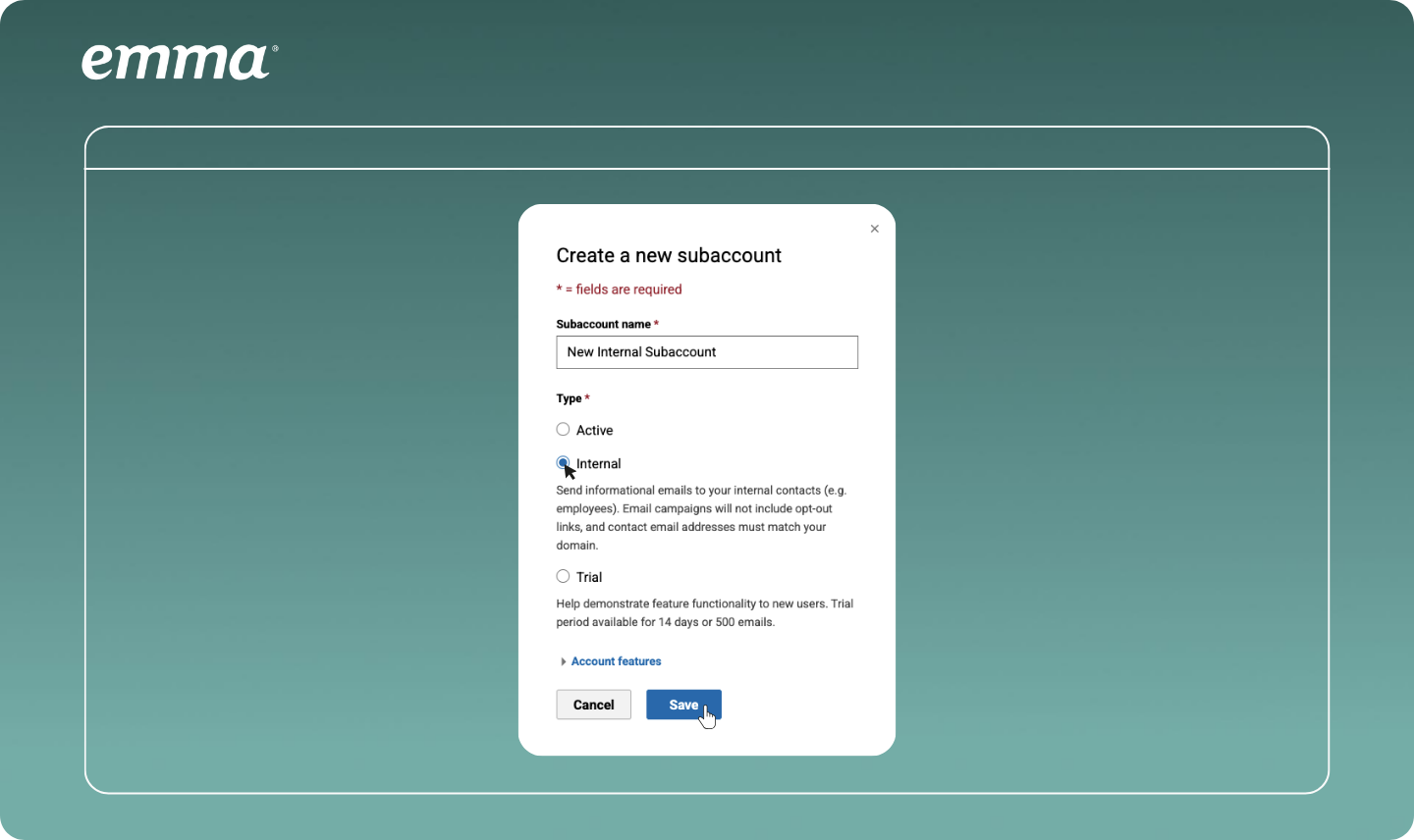
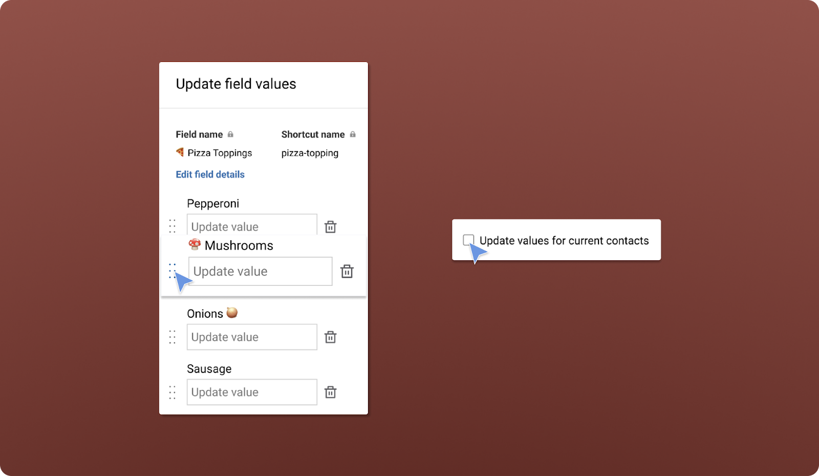
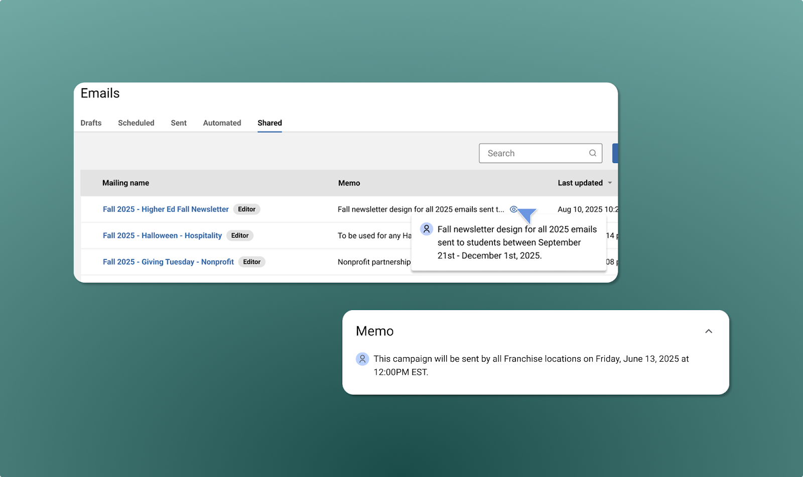
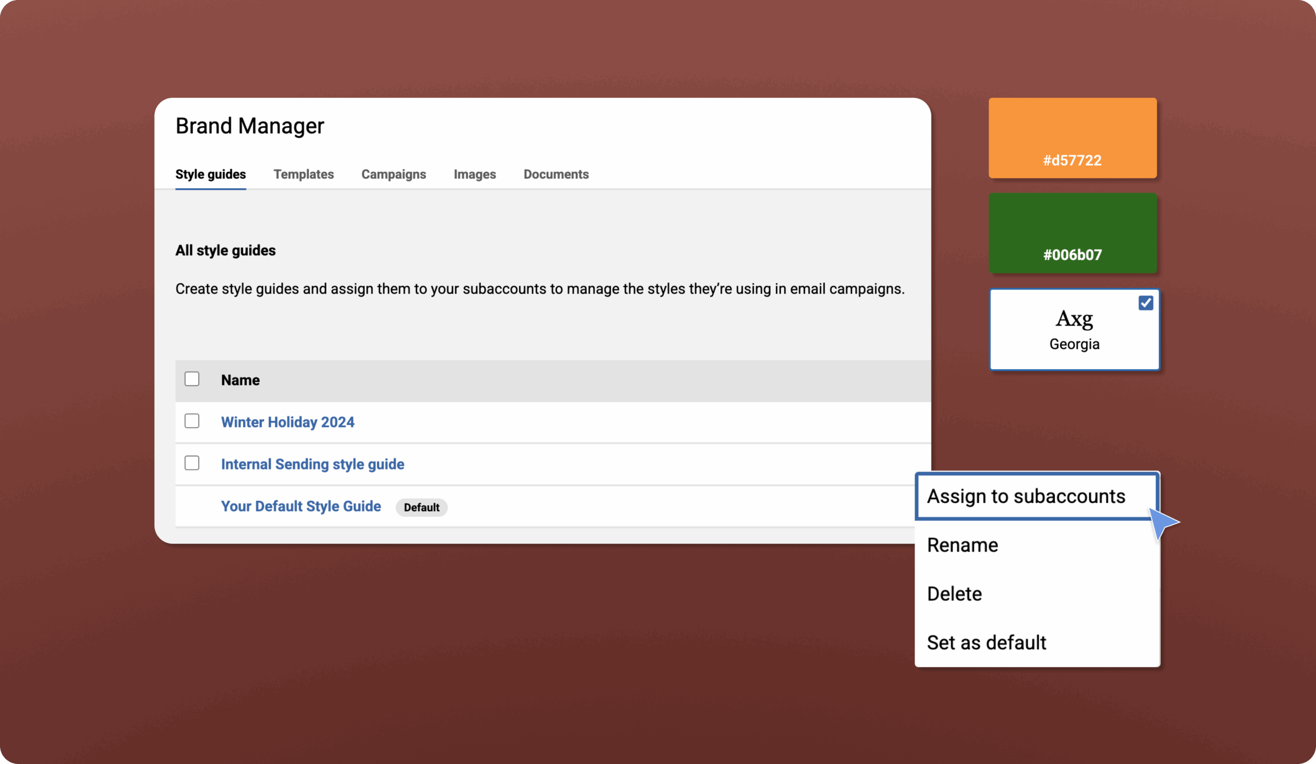
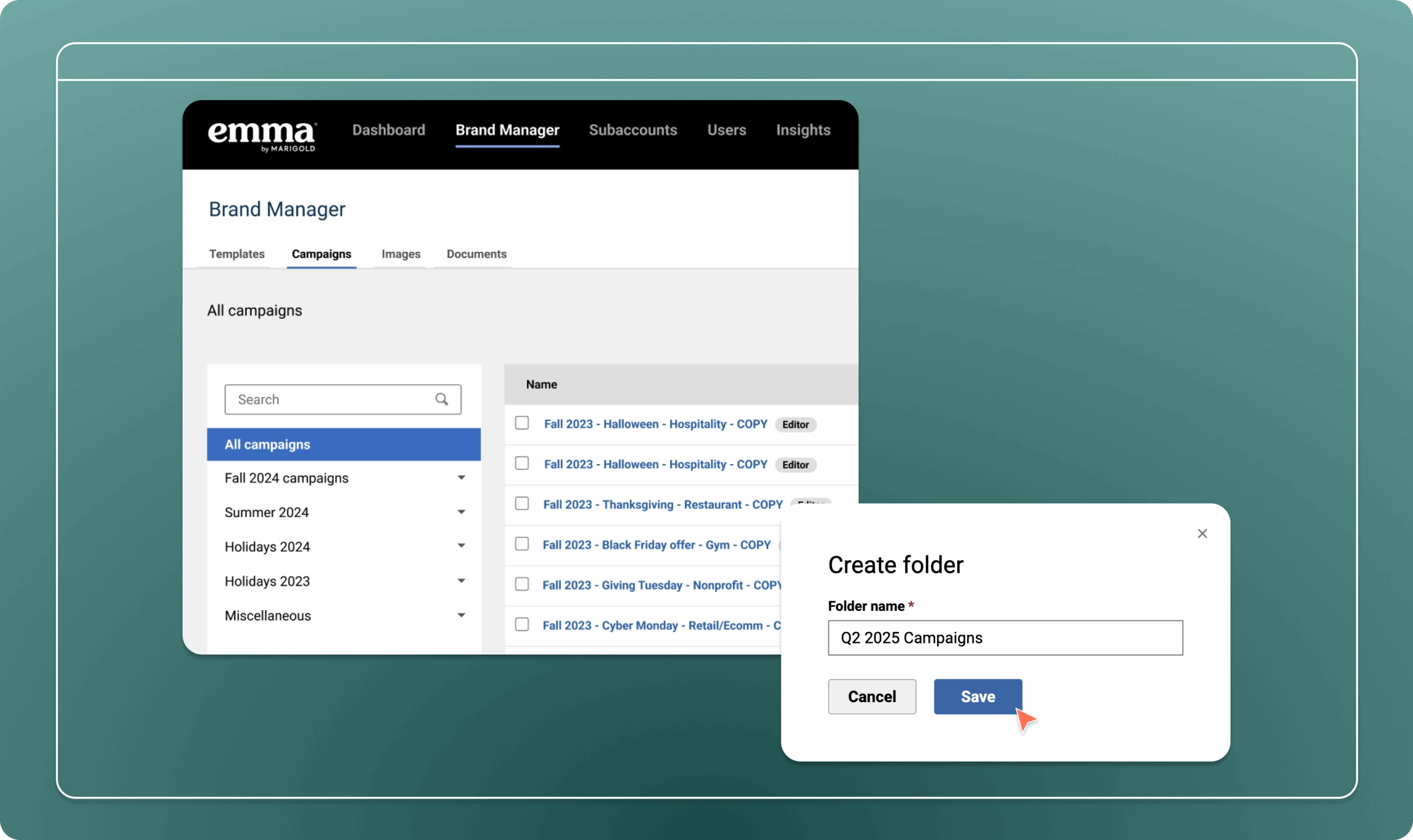
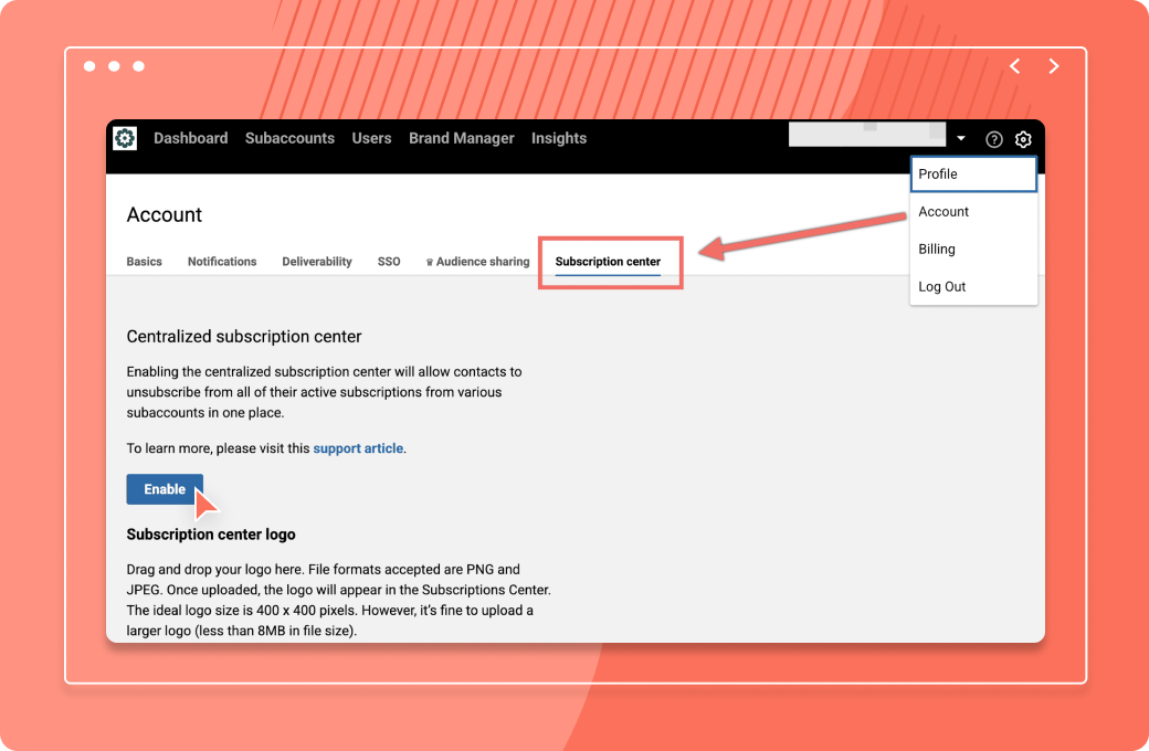
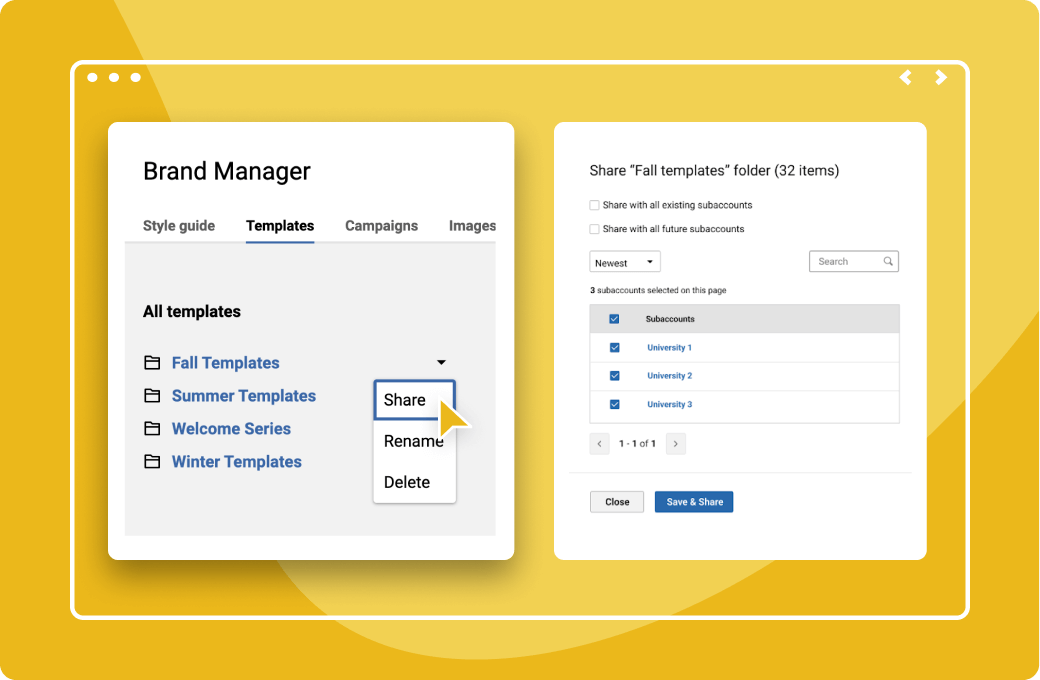
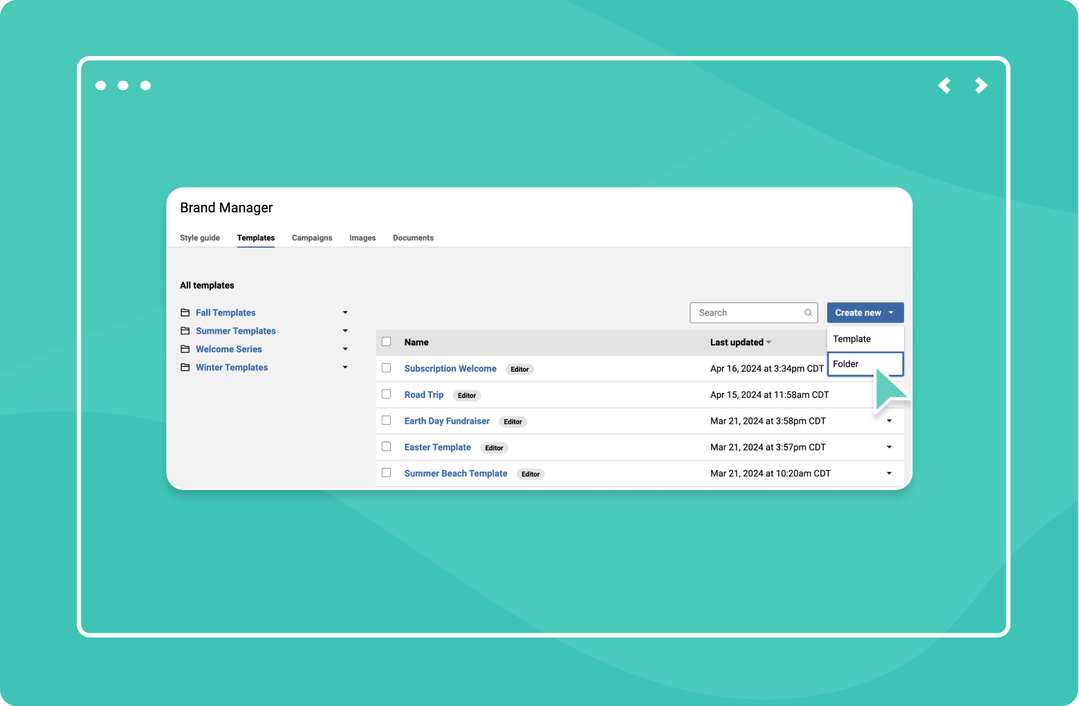
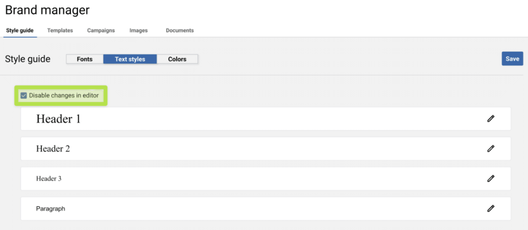
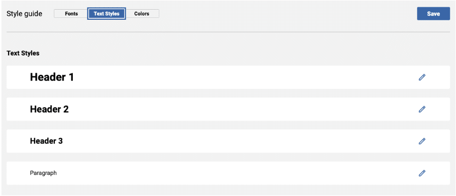
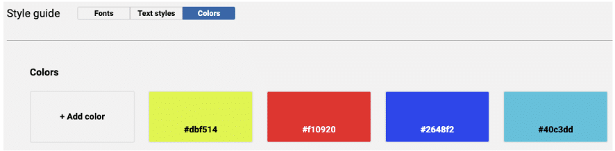
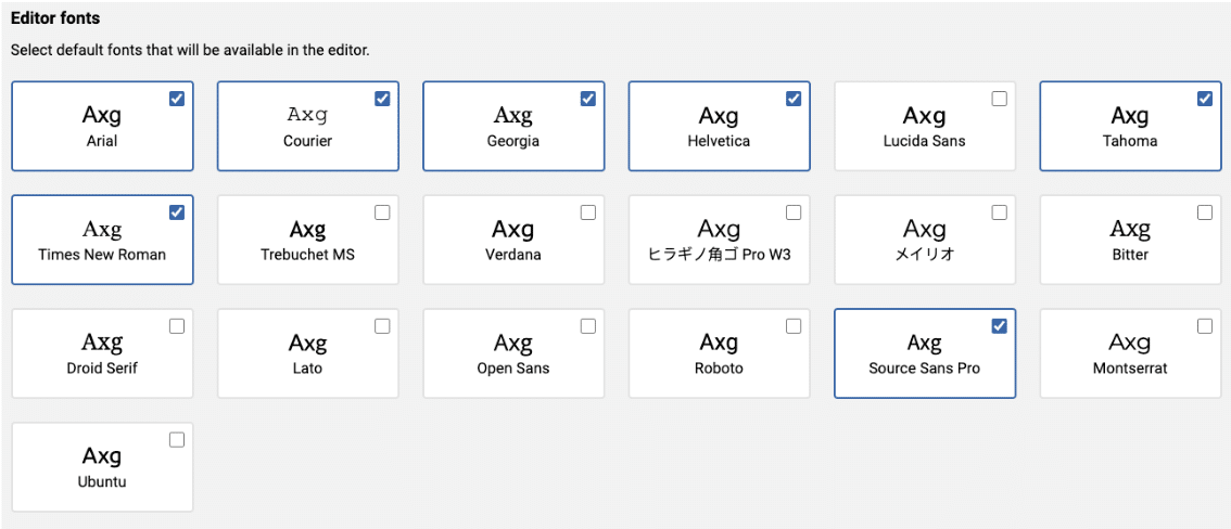
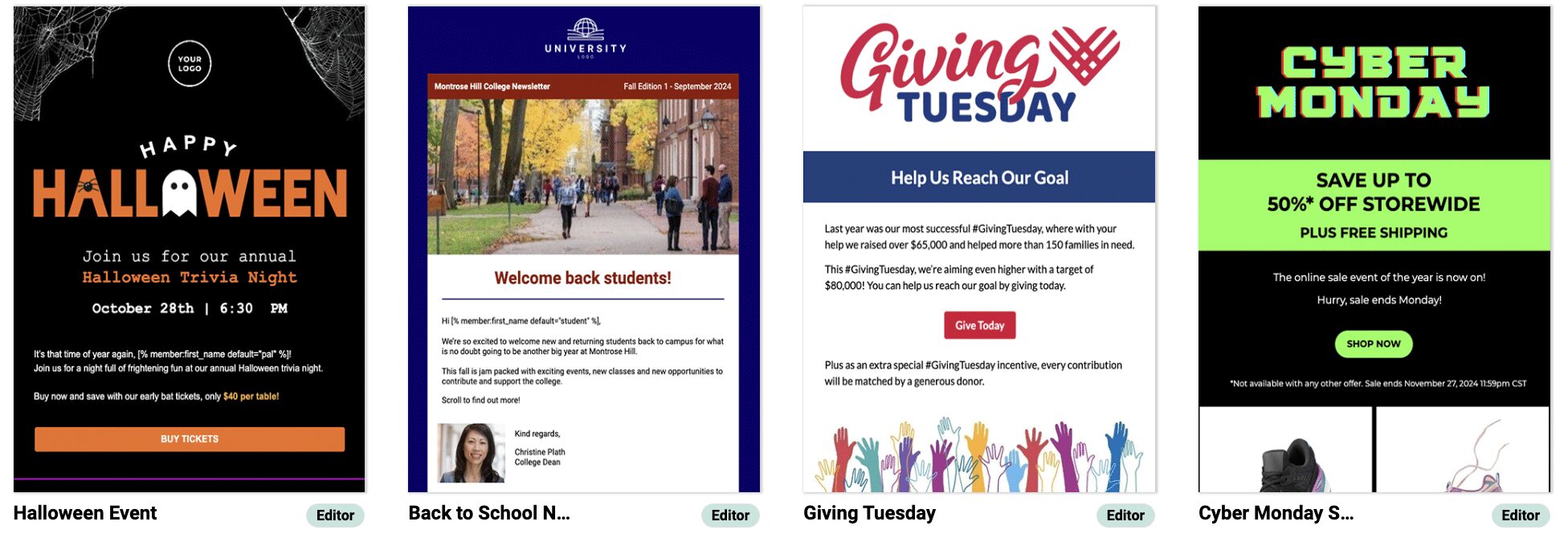
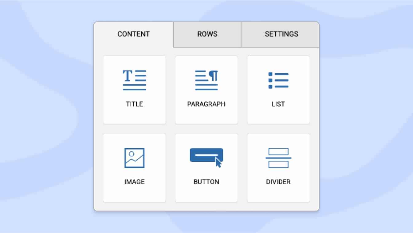
Tools for managing your marketing operations with our Brand Manager, enabling centralized storage, organization, and distribution of all your marketing assets.
![]()
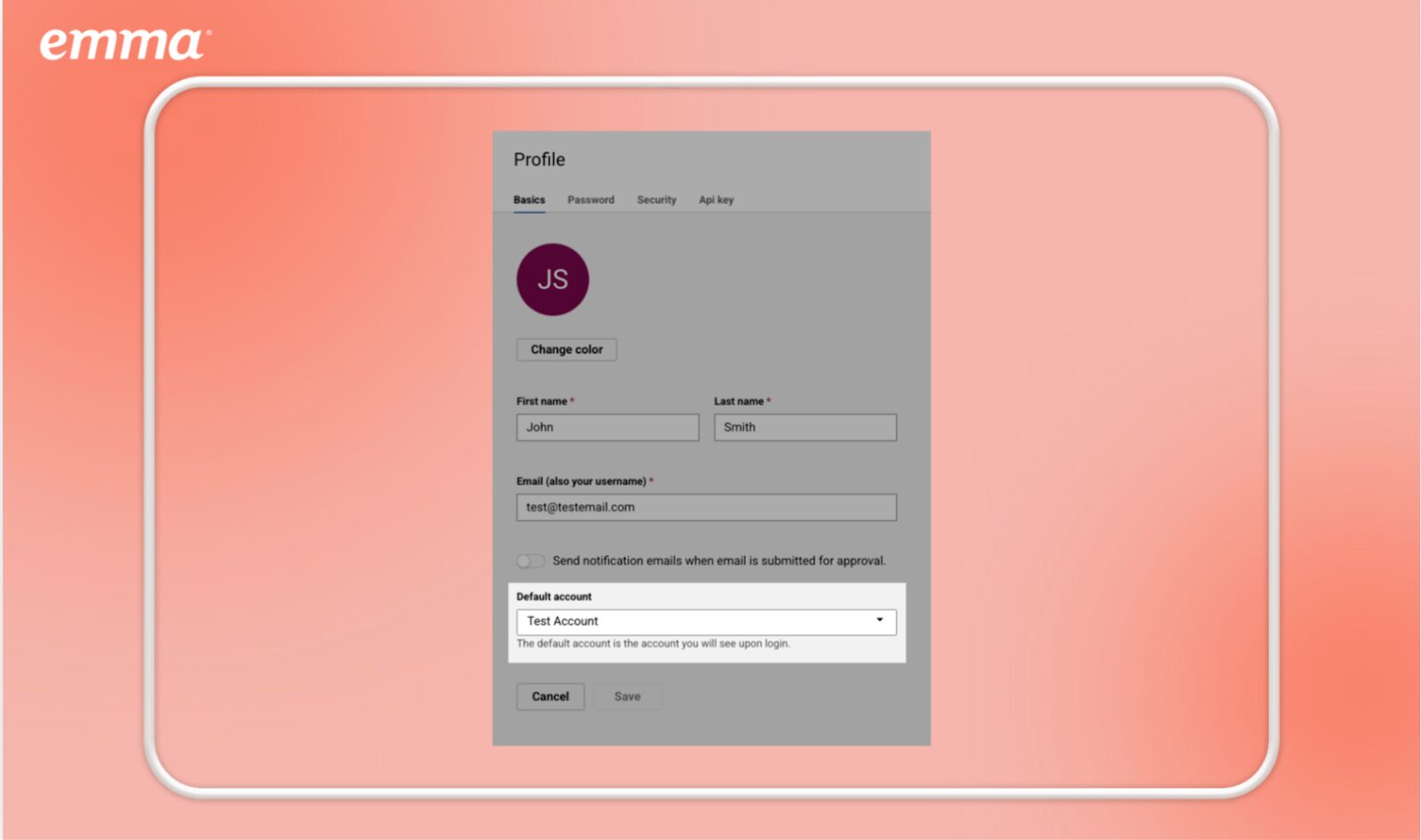
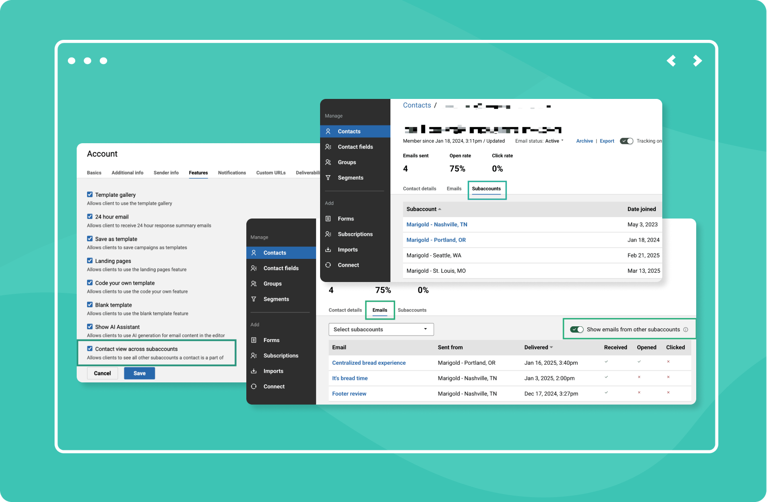
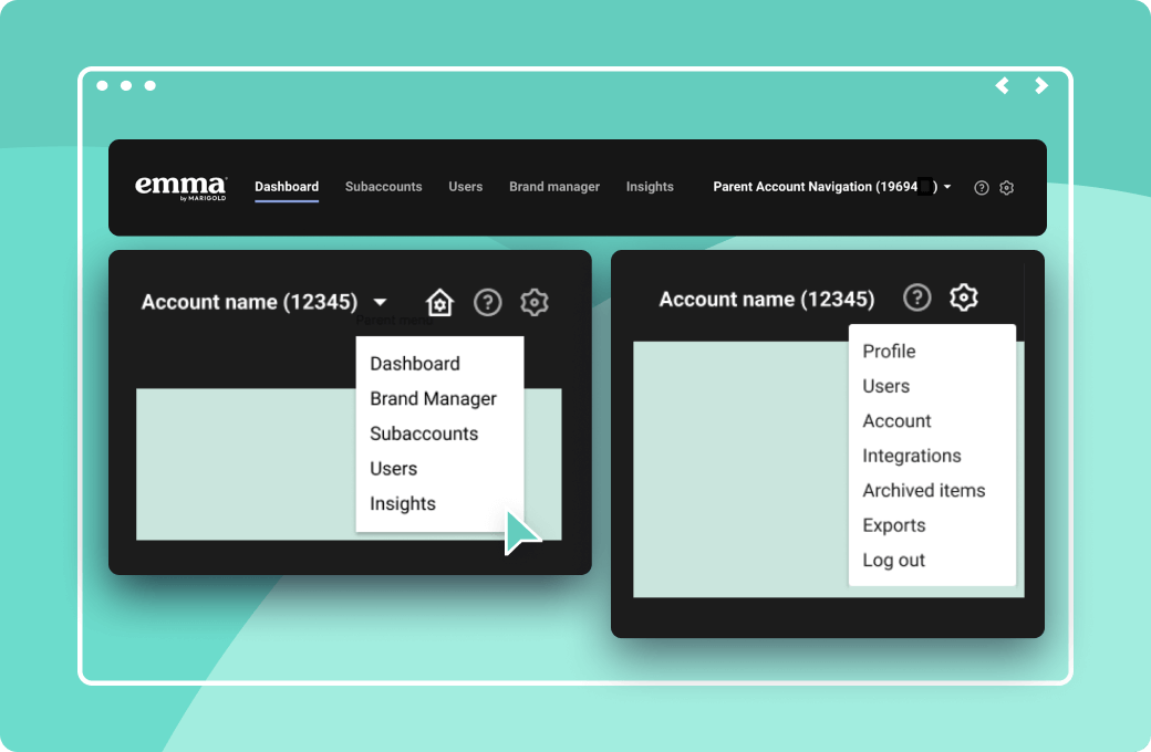
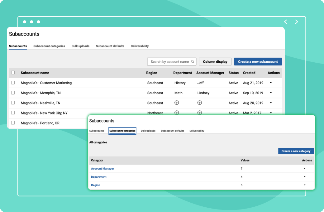
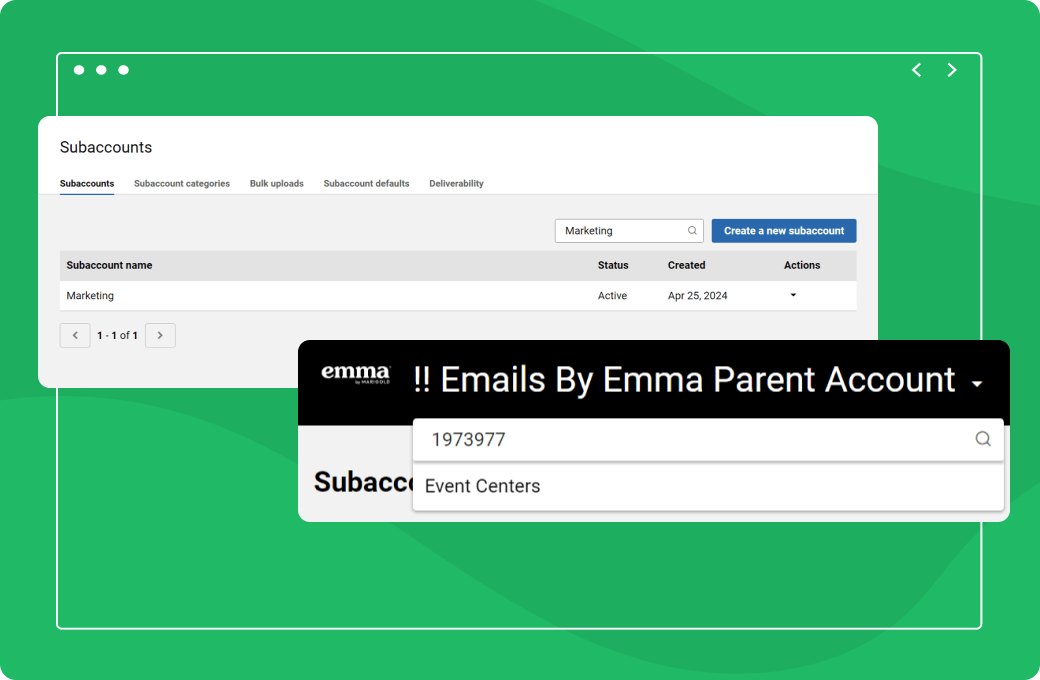
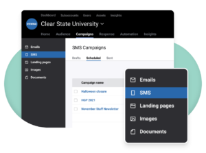
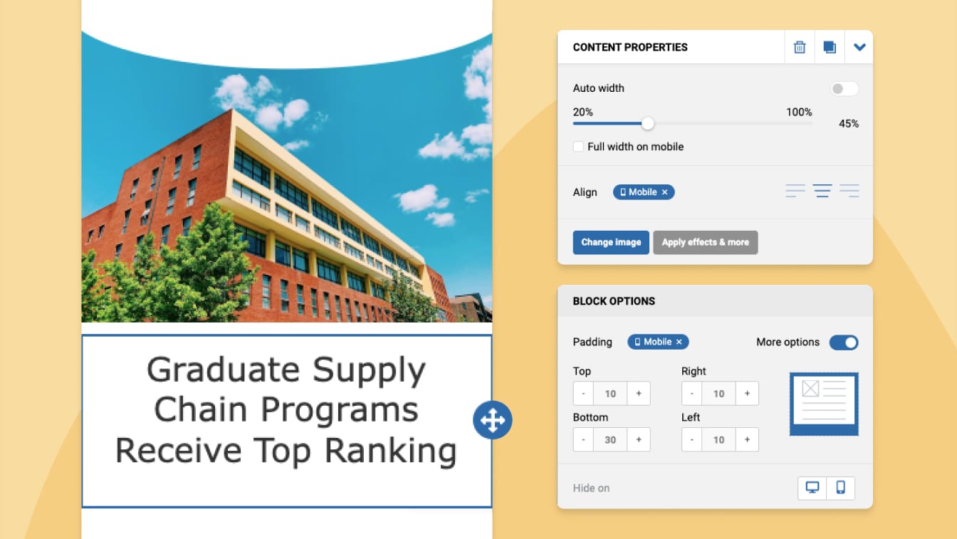
Gain greater control over your marketing with streamlined user management, allowing you to easily manage user access and permissions across your entire organization.
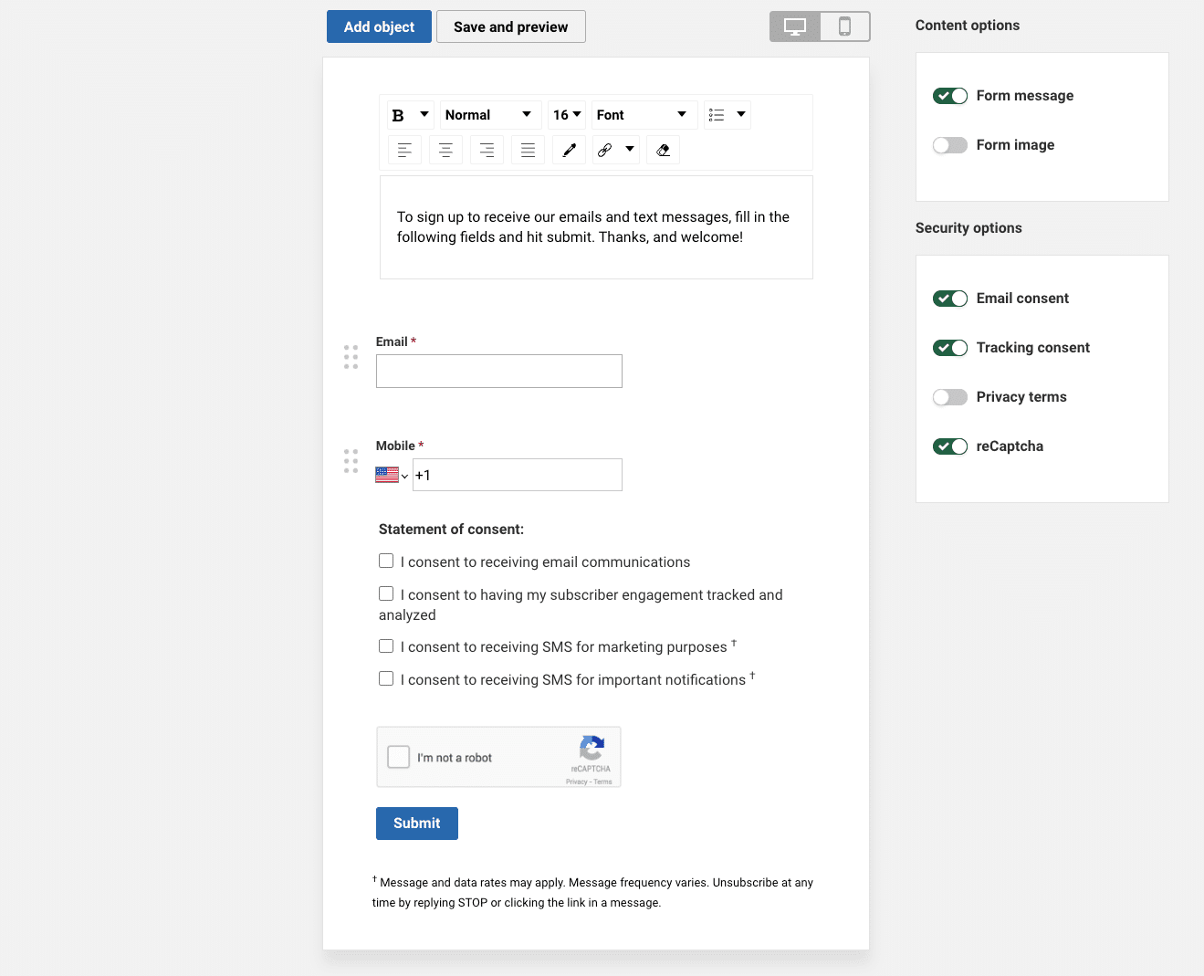
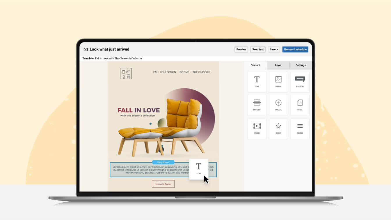
Emma makes it easier than ever for you team to drive conversions and revenue with email.