It’s no secret that style and design have been long-held values of the Emma brand, and, based on our recent newsletter survey, it’s something our readers love to learn about, too. Today, we’re excited to take you behind-the-scenes with the visionary behind every aesthetic detail that makes us who we are—Tylor Lopossser.
Tylor, thanks so much for joining us! Let’s start with the basics. What does good design mean to you?
Good email design is the synthesis of process, visuals, and experience.
Process: There are a lot of elements that come together to create a successful design, and the process is a big one for our team. From brand and content strategy to the creation of templates and A/B testing, I consider processes to be any practice we can scale to optimize our efficiency and success. For example, building out a quarterly or monthly content calendar helps by setting expectations, opening up opportunities for storytelling, and building out a customer journey. Always make time for testing and analytics to help guide growth.
Visuals: These connect the dots of the relationship between the email copy and your subscriber. Imagery has the ability to strengthen the messages, adding relatable and emotive elements that help your audience connect to your ideas. It’s also important to remember that everything down to fonts and colors have a perceived value or feeling.
Experience: Think about how your email can meet your subscribers exactly where they are when they’re reading it. Taking into account where they will be, the device they’re using, their abilities, and the mail client they use will help you think about how the email will affect them and how you can create an even better experience. Because email can be experienced anywhere—an office, train, or even in bed—It’s important to make it visually engaging and exercise brevity in the copy.
What does a day-in-the-life as an art director at Emma look like?
6:00 a.m. – Still Asleep
6:30 a.m. – Still Asleep
7:30 a.m. – After hitting the Snooze button twice, I’ve decided it’s time to wake up.
7:31 a.m. – I tell myself I should go on a bike ride, but ultimately decide “Nah…Tomorrow. That will be a better day to go on a bike ride”.
7:45 a.m – I take a shower and fully get ready (pants and all), even though I know people will only see me from the waist up and through a webcam.
8:40 a.m. – Coffee and Breakfast
8:50-9:00 a.m – It’s time to kick off my workday. This includes:
- Daily Coffee Meeting with the Creative Team
- Checking in with my weekly to-do list and Asana (Our project management tool)
9:00 am. – 2:45 p.m.
- Meetings with marketing and cross-functional team members
- Bouncing back and forth between Photoshop, Google Slides, Illustrator, Shutterstock, and spending countless minutes staring at a TextEdit note, trying to put my brainstormed thoughts down in a coherent way.
- An hour-long lunch which includes leftovers from dinner and, with working remotely being the standard now, perhaps an episode of a show that I am re-watching. Prior to working from home, lunch was the time of day I spent with coworkers outside of my department. I miss getting to see them!
- I’ll also spend time reading articles to help guide my process, and, of course, we can’t forget all those emails that I get to read and gain inspiration from.
2:46 p.m – Start thinking about what I should have for dinner, which often leads to a midday snack. My snack of choice is usually a slice of cake, Masala Chai Tea, or maybe just more coffee.
2:47 – 4:30 p.m.
- One or two more meetings
- Back to my work within Sketch, Acrobat, Google Docs, and writing a message to my coworker three different times before I finally hit “Send” in Slack. Then I wonder, Did I use the right Emoji?
4:30 – 5:37 pm – Get in a design groove that causes me to work late, but when my brain is working so smoothly, it’s worth it.
Is there a project you’ve been especially excited about lately?
We work with a wide range of industries, so the content in our newsletter is usually broad to appeal to all types of marketers. However, recently I was given the opportunity to design a newsletter that was for a segmented audience, subscribers who considered themselves to be in the higher-ed industry. When given the opportunity to create a series for a specific audience with curated content, I was more than happy to dive in. Having a defined audience allows us to make confident choices when designing a mailing because we know so much about their preferences and behaviors.
How did your knowledge of the higher education audience influence your design decisions?
For this particular audience, our content team gained the most from the data because they were able to curate relevant articles specifically for the higher education industry. However, there were a couple of things that design could also plan from this knowledge: Knowing that this is mostly a professional audience, they’ll mostly receive these emails on a desktop device. While we always design with mobile in mind, too, this knowledge helps us strive for an optimal desktop experience. For most people, checking email is a passive activity, meaning they are typically doing other tasks while going through their inbox. We made intentional decisions about image size, accessibility, and formatting to minimize distraction and maximize engagement. A lot of the solutions mentioned above fall under best practices for email that can be summarized as: Keep your message concise and create intentional calls-to-action. Our sending strategy was also influenced by knowing this audience. Since they typically open these mailings during business hours, we were able to determine our optimal sending times and days.
What are some of your favorite details found in The Higher Ed High-Five?
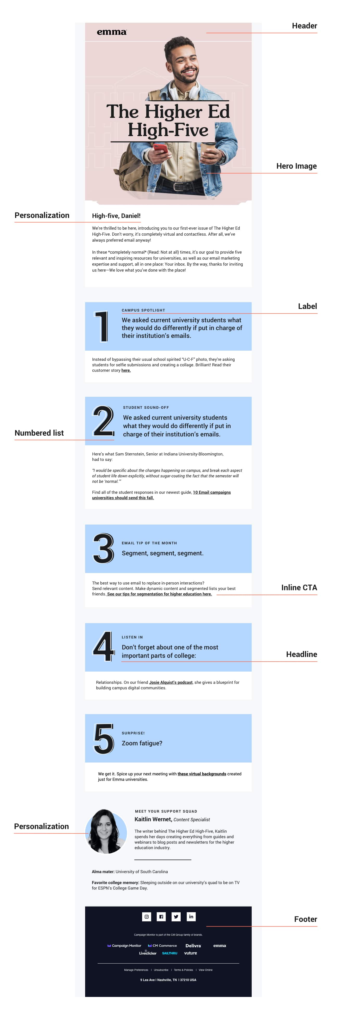
Hero image – We decided to use a larger-than-usual hero image and make it bold so that it would stand out in the inbox. This audience also receives our regular marketing tips and tricks newsletter, so we wanted this to feel truly different from the regular sends and personalized to this audience. This is a great tip for anyone sending different “styles” of emails to the same audience—Switch up elements like the header, hero image style, and color palettes to really keep subscribers’ attention.
Order – The main thing we wanted to share with this audience was a personalized, curated list of resources just for them. We re-enforced our personalization message with a “Letter From the Editor”-style intro. This allows us to address this audience personally and sets expectations for the rest of the email. The tone is informal and conversational and allows the human element of our brand to really shine through.
Numbered list – Numbered lists are an effective way to organize your content and create digestible and skimmable articles. There can also be a sense of accomplishment your reader gains from checking off items on a list. By turning the numbers into a graphic element of the article, we not only were able to cater to our readers’ preferences for lists, but we also created efficiency in production, meaning we don’t have to spend too much time finding images to pair with each article. Finally, the 70/30 layout split, placing the number to the left of the headline, reduces the length of this already long-format mailing.
CTA – We opted for hyperlinked inline text for this layout to highlight our calls to action because we thought having too many buttons could induce a choice paradox. We’ll also consider this option as an A/B test for future iterations as we strive to build the optimal experience for our subscribers. Here’s an example of two versions we could test: 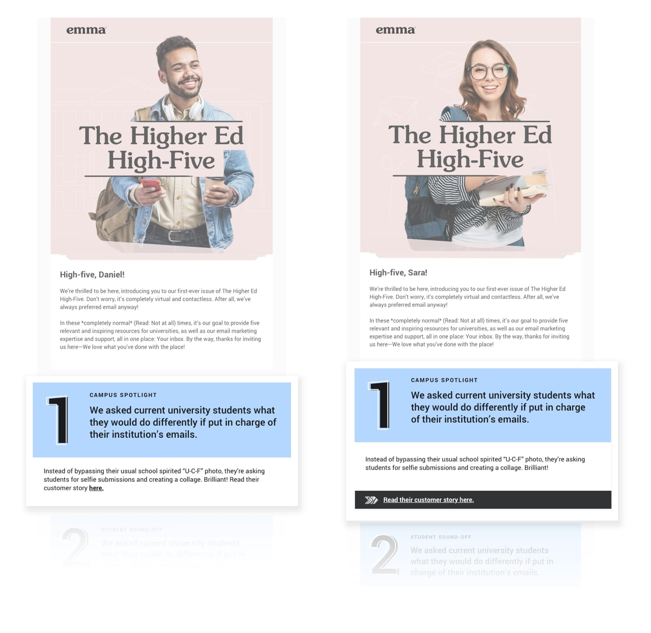
What advice would you give a designer who is just starting a newsletter?
Categorize and sort your content. Create an inverted pyramid of your newsletter content, starting with the most important pieces at the top and, as you work your way down the page, the priority decreases. If you emphasize everything, you will emphasize nothing.
Offer visual variances. To keep your audience engaged within every section, try different styles and sizes in your imagery. Try using large hero images or bold illustrations for your most important pieces, and thumbnail iconography for your secondary/tertiary messaging.
Spend time finding the best layout that works for both your subscribers’ and your organization’s needs. While trends may come and go, a good layout will always be in style. This helps to set expectations with your subscribers, showing them the content, design, and experience they can associate with your emails.
Create visual space for each content category. You can do this with colors, the typographic hierarchy, or even create actual whitespace with dividers or colored backgrounds.
Make room in your email strategy for surveys. It’s the best way to make sure you are creating a good experience for your subscribers.
Thanks so much for joining us, Tylor!
We hope this behind-the-scenes look at our art director’s process will leave you feeling inspired with fresh ideas for your upcoming sends. Remember: Good design is more than just a pretty email, and it requires knowing your audience, making intentional choices, and testing to see what works best.