8 Email design mistakes that are killing your conversion rate

Email marketing is considered the king in the marketing kingdom thanks to the fact that most marketing teams see an average of $44 for every $1 spent. For an email campaign to produce any return on investment, it has to not only be seen but also generate conversions.
If you’re noticing that your emails are being opened, but your conversion rate isn’t ideal, then it’s a good idea for you and your marketing team to sit down and rework the strategy behind the entire campaign, especially the email design.
Let’s face it, many brands have email designs that are simply ineffective and under (or over) whelming, and while we may open them thanks to their catchy subject lines, once a reader gets in there, it goes straight into the trash file—or worse, the spam folder.
Source: Business2Business
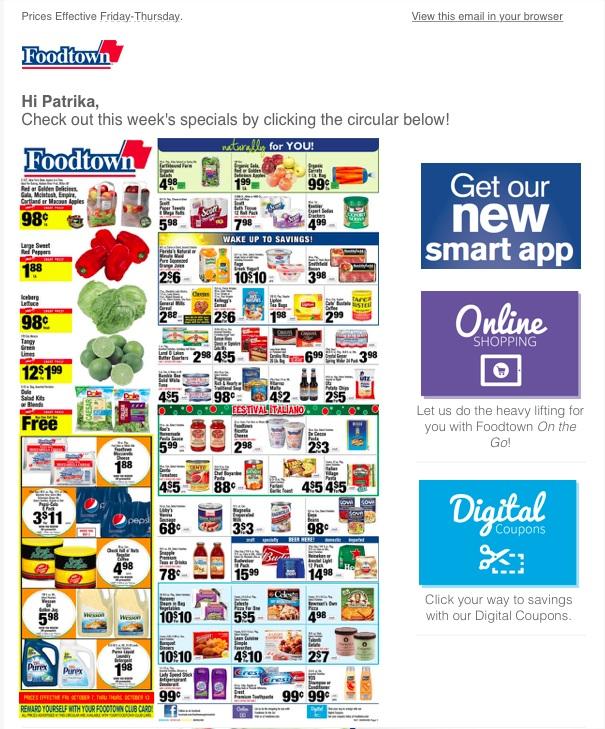
Okay, Food Town, we all like a good sale on groceries, but talk about advertisement overload.
The color scheme is all over the place, there are too many varieties in table designs, prices everywhere; this email is just overall a hot mess.
While content is vital for any email campaign, the email design is critical. If it’s not user-friendly, then it’s going in the junk file, which, in the long run, will result in little to no conversion.
That being said, we’ve compiled a list of eight email design mistakes to stop making immediately (or make sure you avoid) if you want to see conversion rates increase.
1. Stop with the image-only emails.
Here’s a fun fact: 43% of people have images blocked by their email provider. For those who are sending out image-only emails, their emails are not hitting inboxes the way they should.
Most email users aren’t going to take the time to unblock the images, especially if they’re on their mobile devices. So, unless your email design includes alternate text in place of the blocked image, then readers aren’t going to have a clue what your email is about.
2. Avoid overly complicated color schemes.
In today’s media trends, images are all the rage. Many brands stand out thanks to their unique color schemes. Think about McDonald's, if your brain doesn’t go automatically to the red background with those yellow arches, then we’ve gotta talk.
Then there are those brands who try to catch the reader’s eye and miss the mark entirely. Take this example by Cotton Bureau. Sure, it’s got a lot of eye-catching images and colors; however, the color scheme is all over the place.
Some may argue that it has a nice warm color scheme—and it does. The problem is the colors are blotted with random pinks and teals that throw off the whole “warm” and “easy going” vibe that this email design is trying to portray.
Source: Really Good Emails
Instead, an ideal color scheme sticks with three, maybe four colors and plays with the different shades and hues of those primary colors.
Now, don’t get us wrong; having a surprise pop of color that is the opposite of your traditional color scheme isn’t always bad. They just need to be well-placed, for example, in an essential call-to-action button.
3. Don’t settle for a non-responsive email design.
With everything moving to our mobile devices, it’s imperative that email designs adopt responsive design.
A responsive email design template is one that’s built to look and function correctly across any device. With an average of 54% of emails being opened on a mobile device, it is vital to creating responsive email templates.
Making a responsive email design will allow it to be opened not only on mobile devices but tablets and desktops as well, in addition to multiple different email clients.
4. Stop ignoring your email’s preheader text.
Sure, most marketing teams know that an email subject line is vital because it’s the first thing that a consumer is going to see when they open their email client. However, not everyone is making good use of their preheader text.
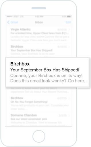
This is prime real estate that is being left empty or underutilized by marketers of all industries. Preheader text is the text that appears either directly to the right, or below an email subject line, depending on the device it is being viewed on. In the example below, it’s the light grey text.
Source: Campaign Monitor
The preheader text gives your marketing anywhere between an additional 30 to 80 characters to convince readers that they need to open their email.
If this area is left empty, it generally appears as just blank white space. In other cases, it tells the reader that there is something wrong with the email, which tends to result in the reader merely throwing it out instead of opening it up and risking something happening to their device.
Add something short and sweet! Just like Birchbox did with their message to Corinne. Now that her box is on the way, she’s more likely to open the message and click-through to see what she is getting.
5. Rethink if you want to embed a video.
Yes, the Internet loves videos. It’s also a great way to provide detailed information to the reader without having to make them read walls of text.
However, including them in your email design can be a bad idea. Between players not working, or not designed with email responsiveness in mind, they can lead to broken links or delayed opening speeds—causing nothing more than a headache to the consumer.
Source: Really Good Emails
Instead, design your email around thumbnail screengrabs from the video. Having those images with a link to watch the full video is a great way to allow the consumer the choice to either click on and watch, or move on to see what the rest of the email has to offer.
When we viewed the live email above from Strava, we noticed that they did a great job of using images from the videos to entice the reader into learning more. The also provided a GIF of sorts with a few snapshots as well, intriguing us enough to keep on scrolling through the message.
6. Avoid choices that lead to the trash bin.
Remember that cluttered mess of an email from Food Town earlier? Yes, one of the most significant design flaws in that email was providing too many options in one small area for the viewer to have to look at and sift through.
Having all those options creates a very overwhelming and anxiety-inducing feeling for the reader. Even worse, it creates a spammy look and feel.
Even email campaigns that include more organization suffer from information overload like the below example from Farfetch.
Source: Really Good Emails
While at first glance, this email design is already leaps and bounds ahead of the Food Town example, it still suffers from information overload.
Don’t get us wrong, it’s okay to offer options for readers in your email campaign, but instead of 18 options that include both men and women’s choices, why not segment your campaign by gender?
Doing this cuts this email example in half—meaning the 18 options are cut down to 9 that are more relevant to the reader.
7. Remember to be professional.
Brands want to befriend their consumers. After all, being relatable means more conversions, right?
Not necessarily.
You want your business, and its product or services to be taken seriously, so you need to design with professionalism in mind. Email designs that include poor quality images, an ugly layout, and multiple spelling errors are just asking to be thrown in the spam folder.
8. Don’t forget to add an “unsubscribe” option.
While the idea of allowing a subscriber to opt-out of receiving future messages may seem depressing, it’s now the law.
The CAN-SPAM Act requires that anyone sending commercial messages must give subscribers the option to opt-out of receiving new messages, and if the sender ignores a subscriber’s wish to end contact than there are some severe penalties that the brand can face.
Now, we aren’t saying you have to put a massive footer at the bottom of your email saying “BYE FRIEND”—instead, add the text and hyperlink toward the bottom of your message. Just make sure it’s easily identifiable.
Source: Really Good Emails
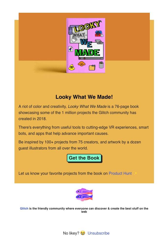
Glitch did a fantastic job of this by adding not only the anchor text and link but also by adding extra emotion to their message with their added text and emoji.
Remember to consider these factors in your email design
Okay, so now you know what you need to stop doing—how about some pointers on what you can start doing?
Include personalized and interactive content.
Personalize content is vital here, and this is why list segmentation is key. List segmentation allows marketing teams to split up and deliver personalized content to a specific category of subscribers, ensuring they are getting content that is relevant to them.
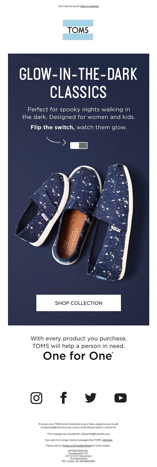
When it comes to interactive content, you want to keep things very simple to avoid deliverability issues. Take this example by TOMS. When you scroll over the white and grey dots indicated by the white arrow, the shoes change color and start to glow in the dark.
Source: Really Good Emails
Include user-generated content.
User-generated content is a great way to connect with your customers while also showing off your product.
This is a great way to get your consumers to share their experiences on social media such as Facebook and Instagram.
Use the inverted pyramid.
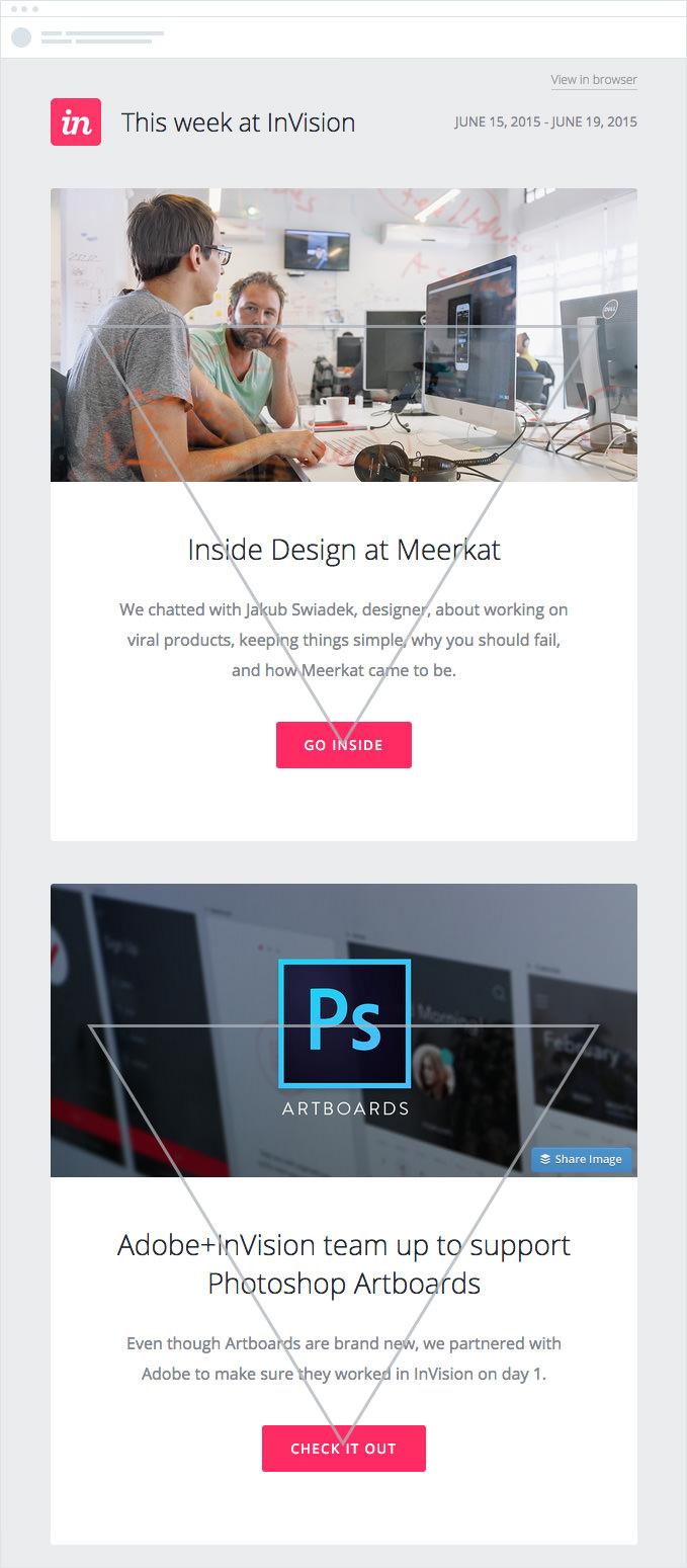
The inverted pyramid model is a basic framework for structuring the elements of your email design. The whole idea is to get readers attention early on, then guide them down to a final call to action.
In the example below, the image at the top grabs the reader’s attention, which is then followed by just enough text to give the reader some content and finally, they fall on the bold call to action button.
This is an excellent method that helps guide readers into taking action, without misleading or manipulating them.
Source: Campaign Monitor
Wrap up
When it comes to email design, there’s so much more involved than merely slapping some photos and text into an email and sending it off.
Remember, the point is to engage the reader and leads them to the conversion point. This means your email design needs to be:
-
Responsive
-
Eye-catching
-
Simple to follow
-
Professional
-
Relatable
Ready to dive into crafting your next email campaign? Check out our helpful guides on email design and start the planning process today.
MOST RECENT ARTICLES
Want to engage your audience and grow your brand? Try Emma's robust easy-to-use product today.
