What all marketers need to know about dark mode email
These days, even apps are capitalizing on the goth trend.
More seriously, we’re talking about dark mode. Operating systems have always offered inverted color schemes, but dark mode email and apps are a little different.
While many users are excited about dark mode, it’s created a bit of a headache for email marketers.
You’ve no doubt noticed that each email client can display the same campaign differently. Well, the introduction of dark mode adds one more layer to the equation.
In this post, we’ll go over some of the basics you’ll want to know before optimizing your email campaigns for dark mode.
What’s dark mode and why do people use it?
For years, operating systems and apps have defaulted to displaying content with a white background and black text. For our purposes here, we’ll call this “light mode.”
Light mode is still the default option for most apps and systems, but it’s falling out of favor with many savvy internet users – especially those who spend most of their day online.
New data shows that the average person spends over 44 hours every week online. For many people, six hours on a computer or laptop is nothing.
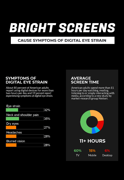
Well, it turns out staring at screens all day isn’t good for our eyes. Too much screen time – whether a TV, phone, or laptop – leads to eye strain.
Source: Weekdone
It’s not just brightness that can be harmful. Blue light emissions from white screens prevent your body from producing melatonin, which can throw off your circadian rhythm and sleep cycle. Considering up to half of Americans suffer from either chronic or acute insomnia, we could all stand to improve our sleep hygiene.
Many phones and operating systems now allow you to switch to a warmer hue to reduce blue light or turn on a blue light filter after a certain time each day automatically.
Dark mode email and apps offer a different choice. Instead of tweaking the white hue, you can just change the entire theme to black or dark gray and it will eliminate harmful blue light – easy peasy.
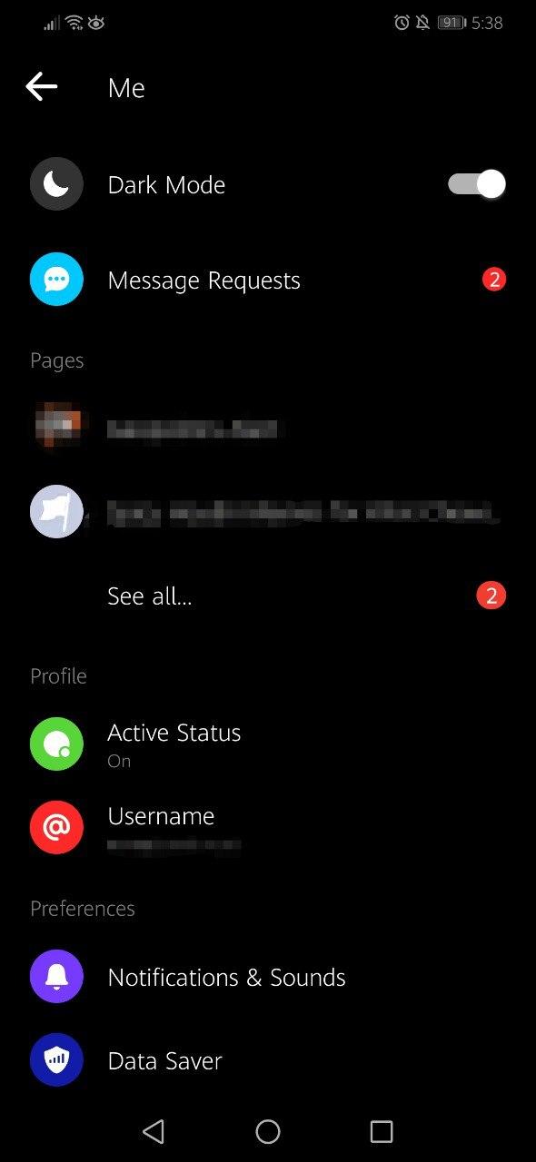
Several popular apps like Reddit, Facebook Messenger, Twitter, and WhatsApp offer built-in dark mode options. Facebook Messenger first launched dark mode as an Easter egg you could trigger by sending a 🌙 emoji, but now anyone can turn it on in their app settings.
Some smartphone apps offer dark modes, but users have to switch their Apple or Android theme to this mode. In other words, it’s not offered through app settings.
Dark mode email and apps are also useful for slashing battery consumption in devices with OLED screens. With OLEDs, dark pixels aren’t illuminated on the screen because they’re black. With LCD and standard LED screens, however, the dark pixels still require battery life.
What clients offer dark mode email?
Email clients seem reluctant to accept dark mode.
It’s not necessarily that they don’t want to offer it, but it’s difficult to implement an aesthetically pleasing dark version because each email campaign is coded differently.
Some email clients offer dark mode as a specific setting you can turn on within the app. Meanwhile, other clients require you to change your operating system’s settings before the app will automatically switch to dark mode.
Here are the clients and apps we know offer dark mode right now:
-
Gmail App (iOS and Android)
-
Outlook App (iOS and Android)
-
Apple Mail (desktop)
-
Outlook 2019 (Mac, Windows, and web)
You’ll also notice that while Gmail may not offer a specific “dark mode,” it does let you switch your theme from light to dark tones.
What does dark mode email look like?
As with all things email, it depends.
With apps, dark mode is straightforward. Developers just switch up some CSS pieces and allow users to choose.
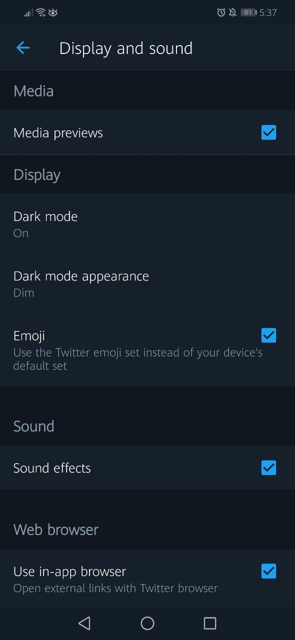
Twitter offers two versions of dark mode: lights out and dim.
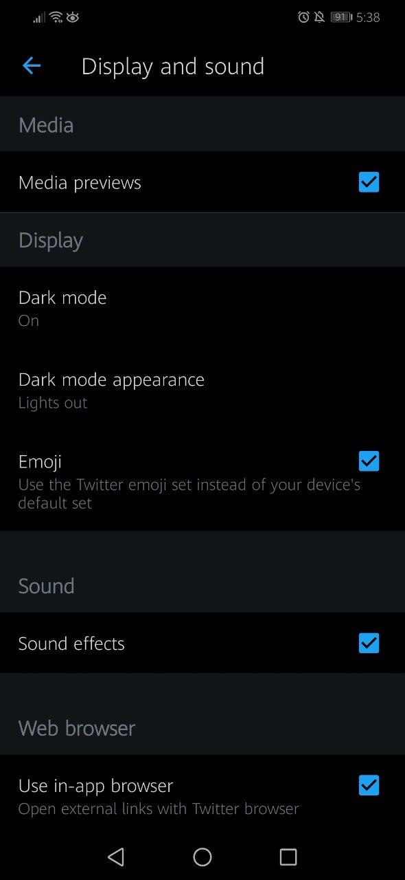
Source: Twitter
Here’s what dark mode looks like on Facebook Messenger and Reddit.
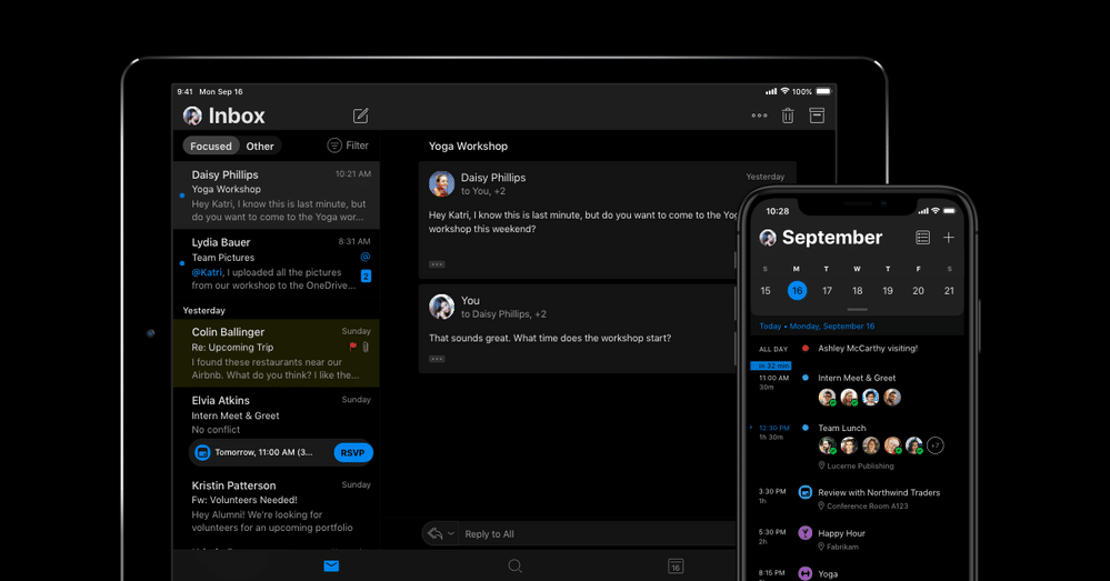
In a perfect world, dark mode email would look exactly like this graphic from the Microsoft blog.
Source: Microsoft Blog
Here’s the thing about dark mode email: email clients haven’t picked one specific version to use. It seems that there are three specific types of dark mode we’re seeing across different email clients.
1. No color changes
First, we have emails rendering with their unique HTML while the email client retains a dark mode theme.
In the case of Gmail for desktop, the contents of emails don’t change one bit – only the Gmail theme switches to dark.
Here’s what it looks like in the Gmail desktop app.
Source: Gmail
For Apple, it seems like plain text emails trigger the switch from light to dark mode – but not HTML emails.
2. Partial dark mode
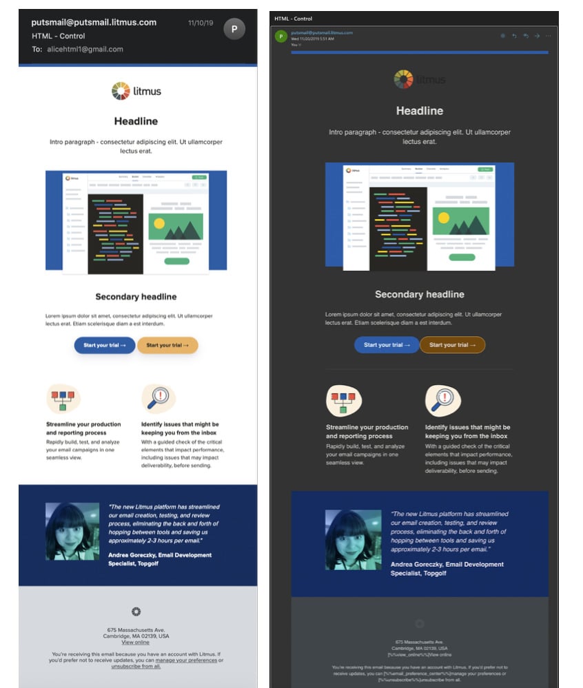
With partial dark mode email, the client identifies light backgrounds and automatically switches them to dark (while switching dark text to light).
Designing an email campaign with a dark background won’t change if a subscriber has dark mode switched on, in this case.
Source: Litmus
3. Full inverted dark mode
Finally, full dark mode targets every email – regardless of how it’s designed – and completely inverts the CSS.
That means if you design an email for dark mode with a black background, the email client will switch it back to white.
This is the version of dark mode many use.
Popular clients like Gmail and Outlook don’t allow you to target dark mode users either. Hopefully, as email developers start adapting, email clients will change their code to find a dark mode that suits everyone.
Designing for dark mode email
The most important design element to remember is that the background color will switch to black.
It’s common for designers to choose images that have partially white elements to blend with the background of the screen. Other times, designers will create images with a specific color and use the same color for the background so it looks seamless.
If dark mode inverts the colors, that can throw off a thoughtful design.
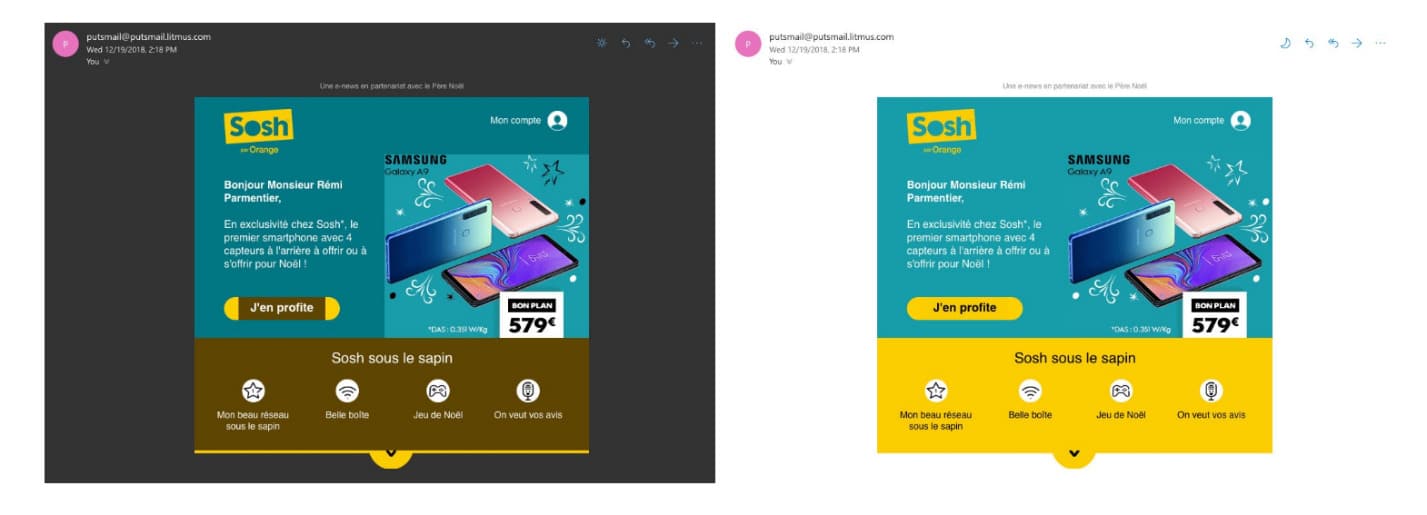
Look how the colors change ever so slightly in this email.
Source: Medium
The bright yellow in light mode switches to brown in dark mode. Meanwhile, the teal background in the Samsung image stands out in dark mode because the email background color becomes darker.
Creating images for dark mode email
It’s a smart idea to use images with transparent backgrounds as much as possible.
When you can’t control the background color, you’ll want your photos and logos to remain clean. So transparency is the way to go.
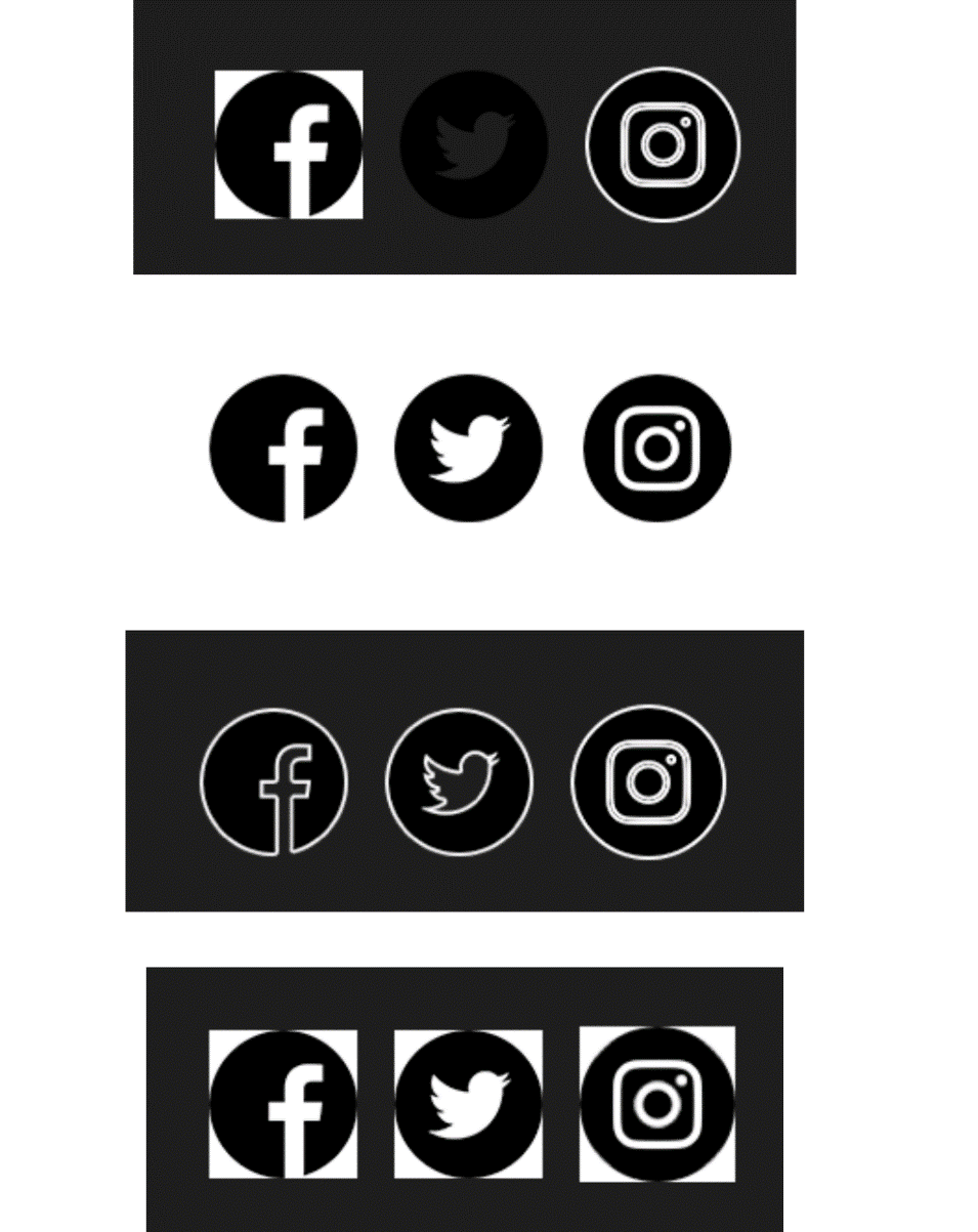
Again, most designers use logos and pictures with white trim around the edge. Normally, that’s not a problem because the trim blends into the email’s white background.
With dark mode, however, that trim stands out. It’s usually not a big flaw, but it can make your emails look a little cluttered.
See the difference with these social media icons?
Source: Campaign Monitor
It’s also worthwhile to add a dimming filter over any bright images that could feel glaring in dark mode.
Optimizing text for dark mode email
Plenty of brands use plain black logos. When you add a transparent background and throw the logo over a black background, that makes your logo invisible.
Fortunately, it’s an easy fix with a little planning.
If you’re dealing with a logo or header that’s solid black, add a white border so it shows up across black backgrounds in dark mode email.
Adding a white border works great for both dark and light mode because the border disappears when the background turns out white.
Source: Campaign Monitor
Don’t forget to test
As with all email marketing – and especially when it comes to dark mode – make sure not to send your campaigns out without running plenty of tests.
Remember that email clients and apps still haven’t found their ideal dark mode strategy yet, so expect standards and CSS styles to change a few times.
Plus, dark mode email looks different on everyone’s clients. However, running tests across light and dark mode can help keep your emails legible and stunning across every device.
Wrap up
Nailing down consistent email design can already be a challenge, and dark mode email features don’t help. Fortunately, you can learn about which email clients your subscribers use and follow a few best practices to make your emails look great.
-
Include a white outline around solid black text or logos.
-
Add a vignette or dim filter to any bright images.
-
Try to use images, logos, and photos with transparent backgrounds.
-
Avoid blending images with background colors.
-
Run plenty of tests.
Want to improve your design and send your best emails yet? Check out this ultimate guide for effective email design.
MOST RECENT ARTICLES
Want to engage your audience and grow your brand? Try Emma's robust easy-to-use product today.

