Best practices for email signup forms that work (plus examples)

Where would email marketers be without the signup form?
Simply put, they make the job so much easier. In a world where online clutter is near impossible to avoid and attention spans are short, email signups aren’t easy to facilitate. Marketers benefit from having a dedicated tool they can rely on to attract, engage, and grow an email audience.
But why email? While social media seems to dominate the internet, it’s worth remembering that people spend an average of two and a half hours each weekday to check their emails – while they’re at work. Statistics show that email marketing is better at acquiring customers than social media.
In this article, we’ll first take a refresher on the importance of using signup forms as an email marketer. Then, we’ll go through seven best practices for your email signup forms.
Why are email signup forms essential to your marketing campaigns?
From building subscriber lists from scratch to running brand promotions, the humble email signup form is essential to email marketing. Some might even say it’s irreplaceable.
Growing an email list is a continuous process. The average subscription service has a churn rate of 6% – 8%, so a consistent flow of new email signups is necessary to maintain a healthy subscriber list. Most email marketers are always seeking to increase their reach anyway, and for good reason. Mailing list subscribers spend 80% more time on brand websites and are twice as likely to purchase an offered service or product.
With one – or several – email signup forms placed strategically throughout your overall online presence, you can count on engaged and energized leads to consent to your content, even when you’re not running an active campaign. Think of email signup forms as a way for you to keep working even when you’re offline.
7 best practices for email signup forms every digital marketer needs to know
Knowing how email signup forms work is only half the battle. You need to make them engaging and impossible to miss, too (without annoying your leads).
Follow our seven tips below to craft the best possible strategy for your email signup form.
1. Figure out your purpose and target audience
Before you can brainstorm the layout and copy of your email signup form, ask yourself the basic questions:
-
What’s the focus of email marketing for your brand?
-
What types of email campaigns are you planning to execute?
-
How would you describe your ideal email subscriber?
Much-needed insights will emerge when you define your marketing goals early on and understand why you’re building an email list in the first place. This work will help you create an email signup form to attract your buyer persona.
Even though email signup forms require much less copy and design work than emails or blogs, there’s still so much that’s conveyed through tone and voice. What might lure a Generation Z subscriber won’t necessarily work as well with a millenial.
2. Confirm the signup through a double opt-in process
With the single opt-in method, you’ll get more email signups simply because there are fewer steps. Once someone completes and submits an entry, they’re immediately added to your subscriber list.
However, remember that spam bots, and fake or inactive email addresses, can contaminate your subscriber list.
The confirmed or double opt-in method is more secure and leads to better email return on investment (ROI). This process also catches human errors – like mistyped email addresses – and weeds out those who don’t confirm their subscription (take note that about 20% of people won’t complete that step).
3. Keep things simple
People will always respond better to something uncomplicated, intuitive, and easy to do.
You don’t need a lot of text. Briefly touch on the most salient points: what subscribers can expect from your content, how often you’ll send emails, and any other necessary details. You won’t entice everyone. But that’s okay, because remember that you’re looking for a particular buyer persona.
You will likely lose potential signups if your form isn’t short and easy to complete. Try to keep things uncluttered – provide up to three fields.
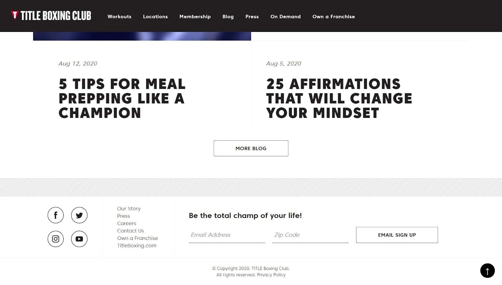
Source: TITLE Boxing Club
Bring simplicity to your email signup form by taking a minimalist approach.
The above example from TITLE Boxing Club shows that you don’t always need bright colors or multiple fields to get your point across. It’s monochromatic, shows up at a traditional location, and only asks for an email address and a zip code.
You can also consider using an email signup form builder that allows you to create and customize mobile-responsive forms.
4. Consider adding a lead magnet
Over 95% of people won’t buy anything when they first visit a website. Purchasing decisions usually come when someone has more experience with you, once they know they can trust your products and services.
To kick start that trusting relationship between you and your audience, offer something of value in your email signup form.
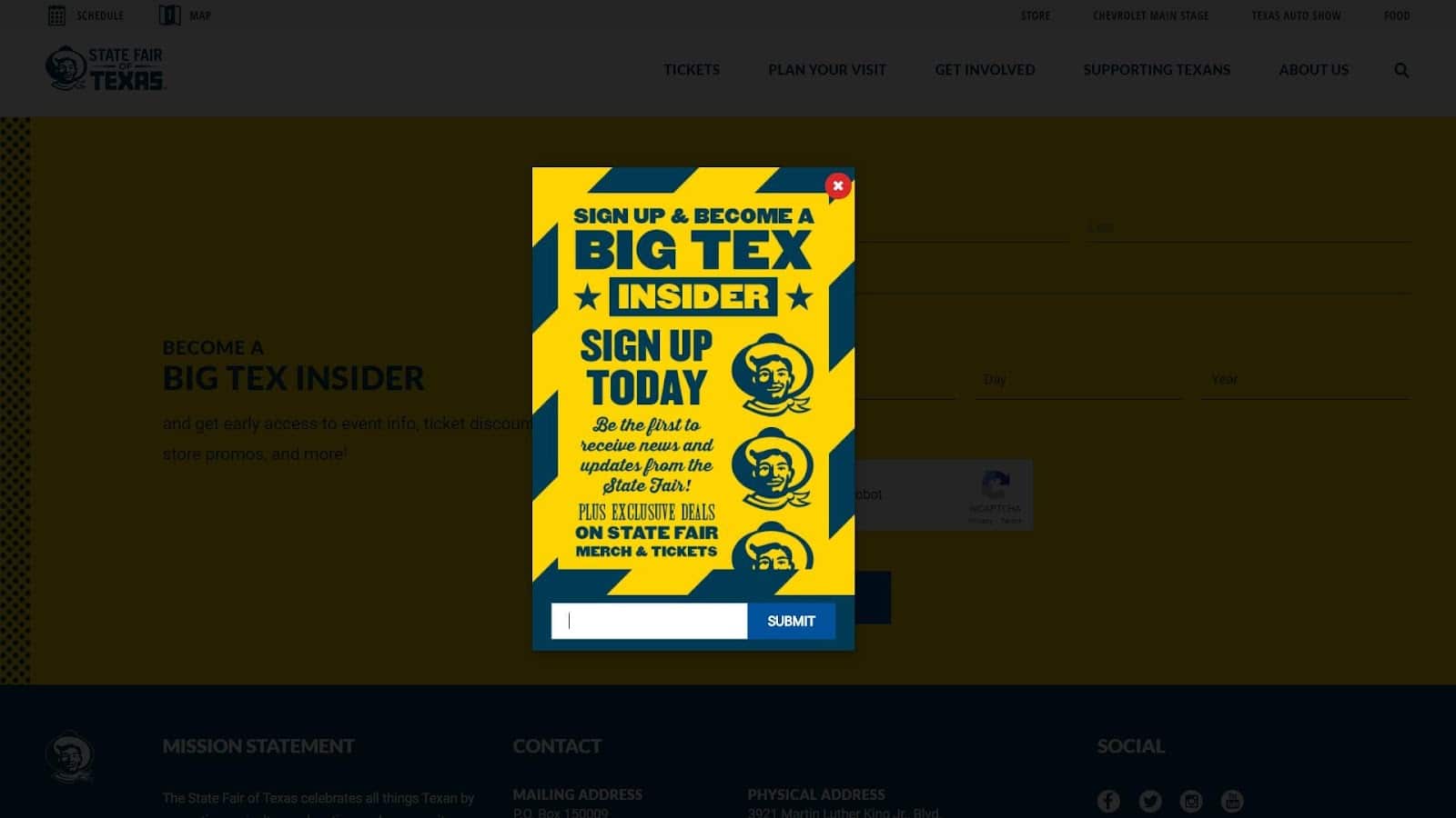
Source: State Fair of Texas
Take this State Fair of Texas email signup form. Exclusive deals on brand merchandise and event tickets are definitely valuable to this brand’s target audience.
A lead magnet can be anything from a downloadable app to a free educational course presented through an email drip campaign – but a simple promise works, too.
5. Craft a call to action (CTA) your audience can’t ignore
Did you know that people see an average of over 120 marketing messages daily? To compete with these other brands vying for attention, your messaging should be compelling and convincing.
While the goal for your primary copy is simplicity, the CTA is where you can pour all your creative magic. You can:
-
Use CTA buttons and increase conversions by more than 20%.
-
Use “my” (“start my three-day trial”) to increase click-through rates by 90%.
-
Replace friction words like “buy” or “download” with “learn” or “enjoy” to remind people of the value they’re receiving.
Adding a lead magnet, as mentioned previously, will also contribute to the persuasiveness of your CTA.
6. Prove your worth through social proof
If your email signup form has enough space for it, consider adding testimonials from existing subscribers.
You could come up with the best copy and CTA, but even those could pale in comparison to real words from real people.
Why? Authentic reactions and compliments are sincere and powerful – and over 75% of consumers use them to make buying decisions.
7. Put email signup forms where they make sense.
Marketers must recognize when website visitors are most likely to respond positively to a signup reminder. Pick moments and locations that make sense. For example, if your brand’s content marketing arm is strong, adding a boilerplate email signup form to the end of every blog post is an excellent idea.
Your website is home to multiple locations that can house your email signup form. Besides blog posts, here are some other common areas:
-
The header
-
The footer
-
The sidebar
-
Pop ups
-
A landing page
Optimal placement depends on factors like your audience, industry, and even your site design. You may also choose to place an email signup form elsewhere, like on your brand’s Facebook page.
Using signup form pop ups can be a controversial issue, but the bottom line is that they work.
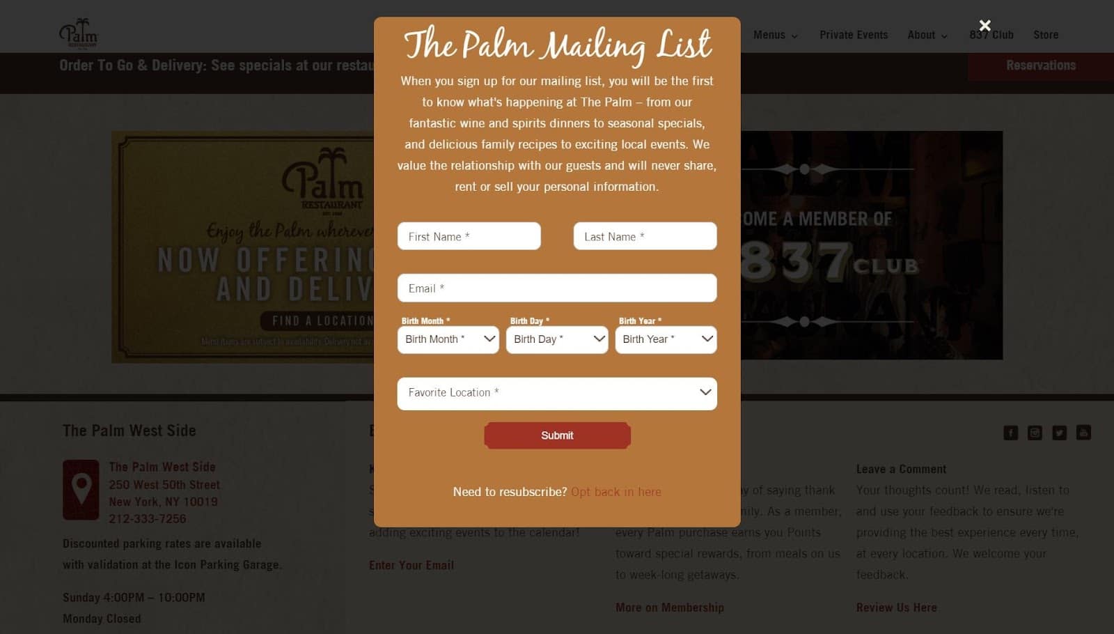
Source: The Palm Restaurant
When the Palm Restaurant’s email signup form pops up on their website, the page behind it darkens. This helps pull all focus to the email signup form.
Wrap up
The best email signup forms are clever, concise, uncomplicated, and easy to find. To make sure your email signup forms encourage more people to subscribe to your mailing list, follow these best practices:
-
Figure out your purpose and target audience.
-
Confirm the signup through a double opt-in process.
-
Keep things simple.
-
Consider adding a lead magnet.
-
Craft a call to action your audience can’t ignore.
-
Prove your worth through social proof.
-
Place email signup forms in places where they make sense.
Keep your list healthy and valuable by maintaining email signup forms. This powerhouse tool turns website visitors into subscribers and prospective customers, even when you’re away from your computer.
Cultivate an audience that’s engaged and committed to your brand. Create and customize your email signup forms today.
MOST RECENT ARTICLES
Want to engage your audience and grow your brand? Try Emma's robust easy-to-use product today.
