As we move through 2020, subscriber engagement seems to be a hot topic. More and more marketing teams are wondering how they can boost engagement in their newsletters.
One of the best ways to increase those metrics is by tweaking your email newsletter design.
You probably want to know where to start. Should you throw out your current design, or only tweak certain parts?
Newsletter design best practices are your guidepost in knowing what to change, and what readers will positively respond to. You’ll be able to update your newsletter in a way that captures your reader’s attention and encourages them to remain on your email longer (increasing chances of click-throughs or shares).
If you’d like to know what these best practices are, keep reading.
6 email newsletter design best practices
We’ve taken the time to sort through and compile this list of six email newsletter design best practices. Use these as a resource while you adjust, or revamp, your design templates.
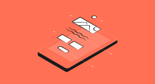
1. Include several types of imagery
It’s said that a picture is worth a thousand words. These days, however, people are less interested in what you have to say and more apt to remember a message from an image or video. Why? Because the human brain processes images over 60,000 times faster than text.
That’s why it’s important to include several points of visual interest in email newsletter design. You don’t simply want to paste in a single image, especially if your goal is to boost user engagement. Instead, slot in a variety of images and draw the reader’s eye from one point to the next.
Also, don’t limit yourself to a single image type. In fact, using these in conjunction with videos or GIFs are a great way to relay your message while keeping subscribers engaged.
One trend we’ve noticed: More brands are opting for illustrations as opposed to stock images. The following example from Smashing Magazine is a good example of this.

Source: Really Good Emails
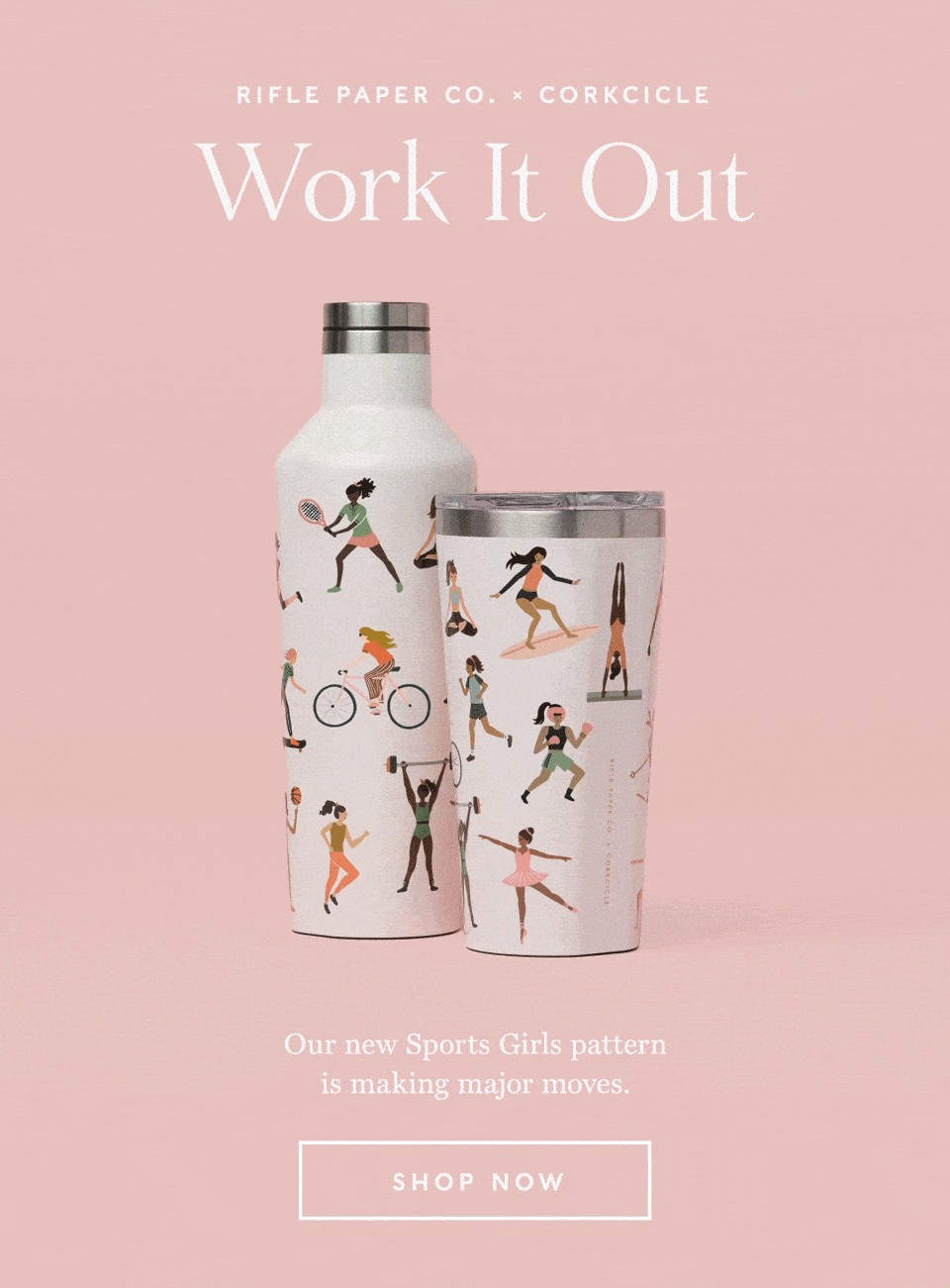
2. Animation helps you stand out
Remember how we recommended using GIFs? Here’s why.
According to the popular website GIPHY, nearly 2 million hours of GIFs are watched on their website each day. These short clips are great for conveying a message without bogging down the email with massive video files or obscure imagery.
Take this example from Rifle Paper Co. In the full newsletter, they have snapshots of their product, but they took their design to the next level by incorporating a fun GIF.
Source: Really Good Emails
3. Whitespace isn’t the enemy
Once upon a time, designers were told to fear whitespace. Designs with too much whitespace were seen as incomplete.
When it comes to modern email newsletters, whitespace is no longer feared – in fact, it’s encouraged.
You don’t want to overcrowd your newsletter with excessive amounts of text, images, or videos. This can give the reader a headache or cause your email to load improperly.
Let’s look at this example of a busy email newsletter.
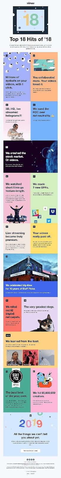
Source: Really Good Emails
In this email from Vimeo, more than 10 different background colors separated the various pieces of content. The design doesn’t feel cohesive, and it’s hard to know what to look at first, or next.
Instead of blocking off content and giving each piece a different background color, they could create a text hierarchy to separate points and use appropriate images to help move the reader’s eye.
The Royal Children’s Hospital Foundation does a wonderful job of incorporating whitespace. They also use the idea of a text hierarchy to help make certain parts, like their call-to-action (CTA), stand out.
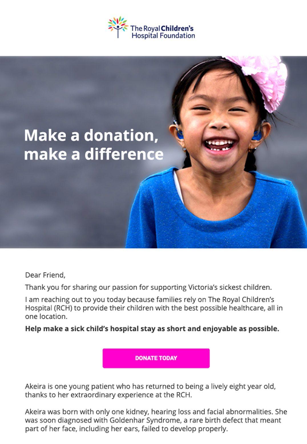
Source: Campaign Monitor
4. Leverage user-generated content
User-generated content is the must-have element for email marketing in 2020.
Marketers understand just how vital user reviews are. With 84% of consumers turning to online reviews to influence their decisions, it’s no wonder more brands take advantage of user-generated content in their email newsletters.
User-generated content is content created by your audience and shared online. Many brands have taken to Instagram with custom hashtags to spread brand awareness and embolden consumers to rep their products or services.
For instance, Alex and Ani recently ran a #charmedarms campaign that encouraged customers to post a picture wearing their jewelry (and use the hashtag). Alex and Ani promoted these images on their social media pages, their website, and their email campaigns.
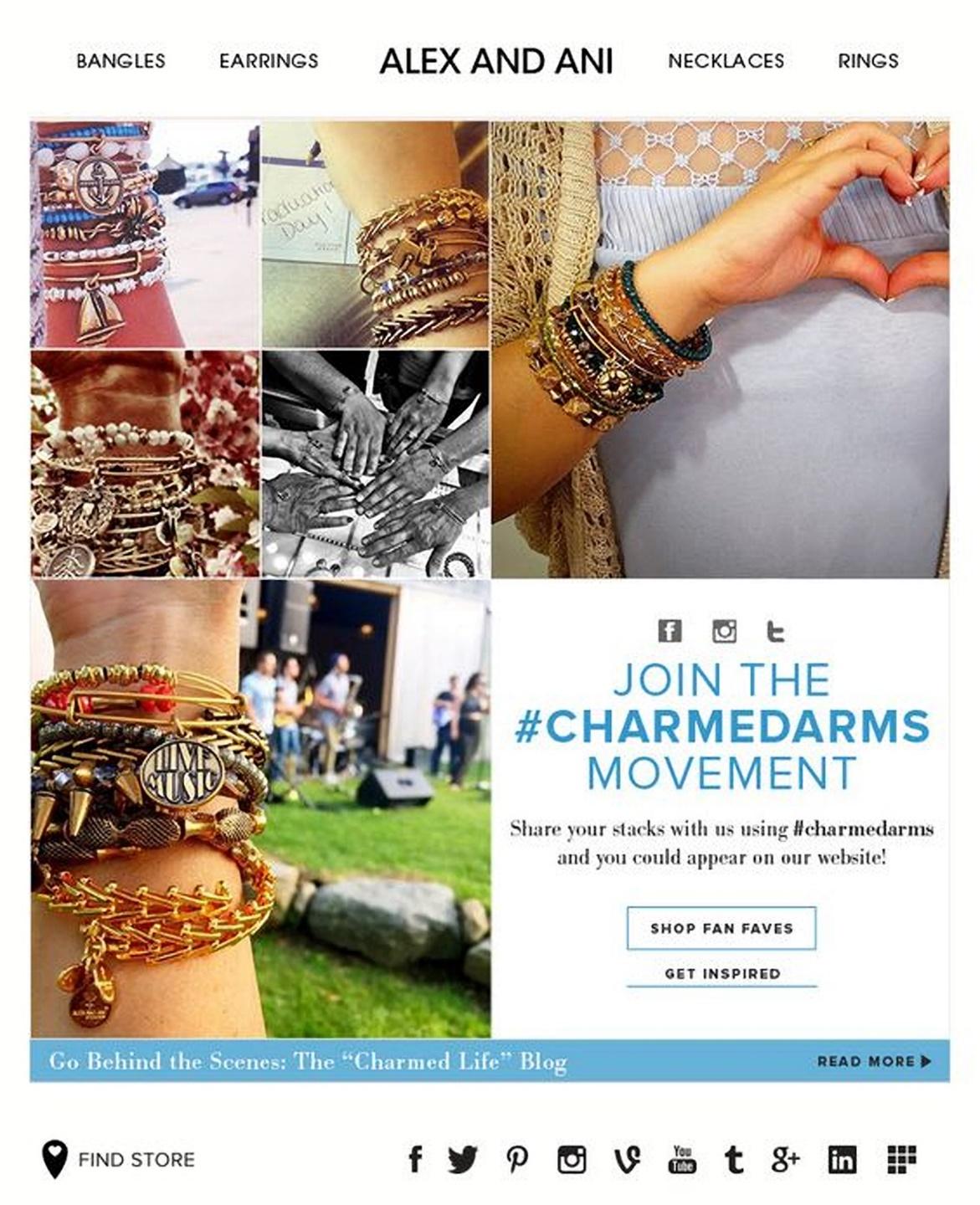
Source: Pinterest
5. Make your newsletter design interactive
You can boost user engagement through interactive design. According to Martech Advisor, interactive email content can help increase a brand’s click-to-open rate by nearly 73%.
Interactive content requires users to take part to reap the full benefits of your email – and it comes in many forms. Videos, polls, and surveys are all examples.
The holiday email below from Adestra asks readers to “shake” a snowglobe. When they click the CTA button, and once the “snow” settles, an iconic image appears (like the statue of liberty, or Big Ben).
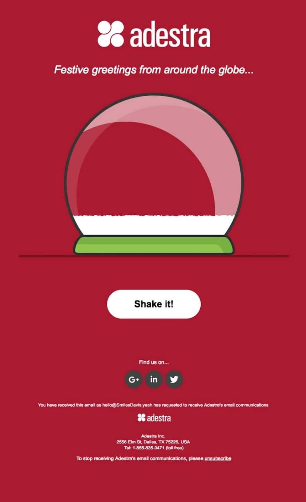
Source: Really Good Emails
Once the CTA is clicked, the button changes to read, “Shake it again!” This is a great way to get readers to remain on your email.
6. Design for scan-ability
Recent studies suggest the average human attention span is pretty short. Between 2000 and 2018, it dropped from 12 to eight seconds. So, to encourage engagement, you have to design for the reader. That means designing for scannability.
If your newsletter is packed with text, images, and video, readers are likely to close it (no matter how good the content is). Out of all the email newsletter design best practices we’ve listed, this is probably one of the most important.
When readers go through an email, they’re likely to scan for keywords and CTAs. Designing with this in mind means using the inverted pyramid.
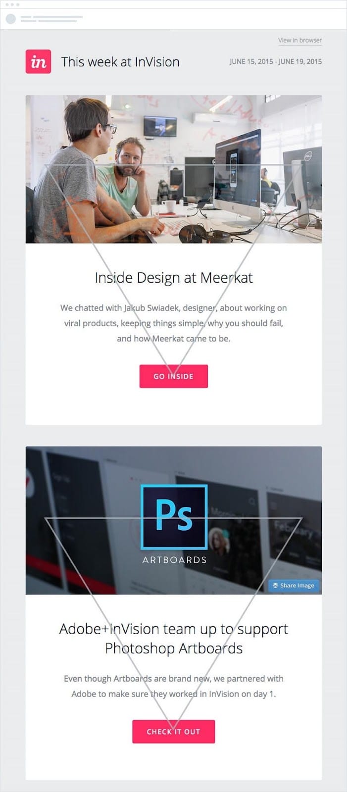
Source: Campaign Monitor
This method draws the eye from the header down to the CTA. The text hierarchy also helps the most relevant content stand out – readers don’t have to go searching for the message.
Wrap up
The year 2020 promises to be an exciting one for marketing teams across all industries. If you’re looking to increase your newsletter’s engagement this year, you should try refreshing your design. Imagery and color are as important as ever, but your subscribers want scannable emails with images, GIFs, and videos that make your messages more digestible.
Not sure where to start with your email newsletter design? Keep these six points in mind:
-
Include several types of imagery
-
Animation helps you stand out
-
Whitespace isn’t the enemy
-
Leverage user-generated content
-
Make your newsletter design interactive
-
Design for scannability
Ready to work with stunning and easy-to-use email newsletter templates? Emma’s customizable designs will help simplify processes and engage subscribers. Sign up today.