5 things to copy from these award-winning emails
Did you know 269 billion emails were sent every day in 2017?
That’s a lot and since studies show 26% of people claim they unsubscribe because they receive too many emails already, it’s more important than ever to make sure your next email campaign is not just good, but exceptional.
Email marketing remains one of the highest-performing marketing channels available, outperforming both Twitter and Facebook in key metrics. Whether you’re new to email marketing or a practiced veteran, trying to design an(other) email marketing campaign that performs well can be intimidating, especially in light of these numbers.
How do you make your email stand out in increasingly crowded inboxes?
The good news for you is that though inboxes are crowded, not all of those emails are optimized to garner best results. Implementing these best practices will help you deliver the best content to the subscribers who want to see it, not only improving your open rates and click-throughs but also earning the trust and loyalty of your customers.
There are plenty of best practices like segmentation, automation, personalization that can increase your opens and click-through rates immensely.
5 award-winning email campaigns to inspire your strategy
Feeling overwhelmed or even uninspired for your next email design? Take heart: these 5 award-winning email campaigns reveal a few sure-fire ways to stand out from the crowd and look good doing it.
Copying these award-winning emails is sure to get your emails opened, read, and subscribed:
1. Lily Lines
What they get right:
Lily Lines won the 2018 Webby Awards in the Email Marketing category and it’s clear why. The Lily is a publication of the Washington Post named after the first newspaper published by and for women, The Lily. Like the tagline says, they’re focused on “Empowering stories for women in the know.” As if that didn’t make the publication’s feminist bent clear, on their newsletter sign-up, they tell subscribers exactly who they are: a twice-weekly newsletter for women.
Source: The Lily
Subscribers want to know what they’re signing up for. By emphasizing (and re-emphasizing) their feminist angle, no one is going to sign up for Lily Lines expecting to receive gardening tips, ensuring the subscribers they gain are most likely to maintain engagement with their emails. This is especially important for Lily Lines since their twice-a-week schedule is more frequent than most subscribers prefer. Studies show that most people prefer to receive emails either once a month or once a week.
Additionally, their minimal approach to design is striking and remains consistent across all channels; their website, newsletter, and social media platforms all stick to a black and white aesthetic, adding in the occasional pop of color, especially when they want to emphasize links and CTAs.
And what they’re doing works. Not only did Lily Lines win the Webby, the subscription also boasts the highest open rates out of any Washington Post email subscription.
What you can copy:
For your next email marketing campaign, consider taking a page from Lily Lines and offering an archive of past emails in order to ensure you are building a quality list of subscribers. That way, subscribers know exactly what they can expect from your emails. It’s also a great way for new subscribers to discover older content they might have missed, continuously driving traffic to older web pages.
Source: Lily Lines archive
Not to mention, if a subscriber has the chance to fall in love with your previous content, they’re far more likely to open your next email, increasing your open rates. Offering an archive page is a practical way to build loyalty before your subscribers have even signed up.
At the top of every Lily Lines email, users see blue CTAs that allow them to share this via Facebook or tell friends via email. This blue stands out in the predominantly black and white newsletter. Subscribers who enjoy receiving the email or connect with a particular story can easily spread it around to like-minded people, thus increasing the Lily’s following. Whatever CTAs you want to include, be sure that they stand out.
2. Buzzfeed News
What they get right:
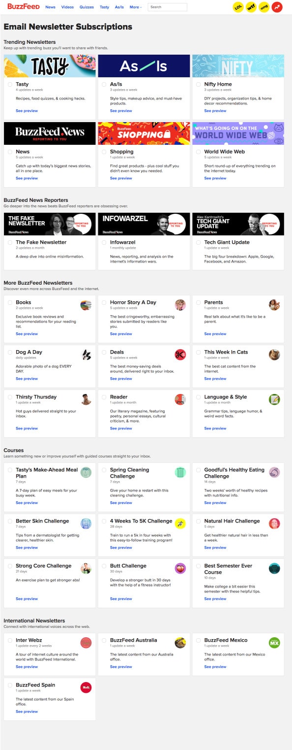
Buzzfeed News went home as the fan favorite in the email marketing category from this year’s Webbys. If you are at all familiar with Buzzfeed, you know they cover a lot of content: true crime, animals, quizzes, pop culture, news, and more. Instead of offering one huge newsletter that includes all of those categories, Buzzfeed offers a total of 22--yep, you read that correctly--different newsletters.
These different email campaigns cover topics ranging from animals to current events to hot dudes. That’s not a joke: “Thirsty Thursday” promises “hot dudes delivered straight to your inbox” while “A Dog A Day” and “This Week in Cats” contain pictures of furry friends.
In addition to these 22 newsletters, subscribers can also choose to receive 9 separate courses, such as the “Spring Cleaning Challenge” and the “4 Weeks to 5K Challenge.” Not only are these emails packed with how-tos, they also contain links to relevant posts that can help subscribers achieve their goals. For example, the “4 Weeks to 5K Challenge” includes a link to a past blog post on finding the right pair of running shoes. Even emails focused on getting subscribers off the internet and outside still contain plenty of links to keep people entertained online.
The course “4 Weeks to 5K Challenge” begins with a welcome email offering tips and tricks before subscribers start their fitness journey:
Source: Buzzfeed
Buzzfeed’s following is diverse and covering all 31 topics in one newsletter would mean sending bulky and distracting emails. Subscribers appreciate being able to limit the content they receive.
What you can copy:
Like Buzzfeed, let your subscribers do the work for you when they self-segment. Segmentation leads to better opens and improves sales: 58% of all revenue comes from segmented and targeted emails. Allowing your subscribers to self-segment means you don’t even have to analyze any data to make assumptions about the content individuals want.
Instead of sending one email that covers both cats and dogs, Buzzfeed is able to dedicate an entire newsletter to one or the other. Not only does this mean that cat-people only see cats and dog-people only see dogs, increasing their engagement, each newsletter sends at a different frequency. Whereas the dog newsletter sends everyday--the most frequent of all their newsletters--the cat-people only receive one email a week. By allowing people to self-segment into hyper-personalized groups, Buzzfeed retains the cat-people who would otherwise unsubscribe if they received emails that included both cats and dogs every day.
Source: Buzzfeed
Another takeaway from Buzzfeed’s newsletters, and specifically their courses, is the way they use automated journeys. Sending individual emails to people who sign up for a course would be exhausting, but by establishing an automated customer journey, Buzzfeed eliminates a bulk of their work. They defined their trigger (when a subscriber joins a specific list), designed their emails, and then automation takes over. Subscribers still get the emails they want, and it costs Buzzfeed no additional time or energy.
Additionally, in most of these newsletters and courses, Buzzfeed includes links to older posts related to the email’s content. These links bring in more visitors to Buzzfeed’s website and increase the time of users’ sessions. To copy this tactic, add links to your customer journeys and let automation bring in more click-throughs and drive up revenue.
3. FLOR
What they get right:
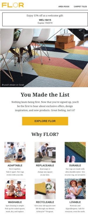
FLOR won Best Email Marketing for their email marketing makeover at the 2018 Interactive Marketing Awards. Their newest email campaigns are not only beautiful, but they’ve also seen a 23% increase in sales from email since they revamped.
FLOR’s taken advantage of automation in order to send a welcome series to introduce subscribers to their brand, highlighting the attributes of their products and encouraging prospects to make purchases. In fact, their CTAs encourage their subscribers to purchase products and often their emails include incentives, like promo codes and special sales.
For a brand that relies on online sales like FLOR, email marketing when done well can drastically increase revenue. They created automated journeys like cart emails and post-purchase emails in order to encourage customer loyalty and customer retention, increasing revenue over time with little extra work on FLOR’s part.
Source: FLOR Newsletter
FLOR is a leader in creating eco-friendly designs, a core part of their brand identity. FLOR’s emails incorporate their story into every aspect of their email campaign. Even in the first welcome email when they’re promoting the benefits of their product, they connect these attributes back to their own identity. Featuring their eco-friendly story encourages customer loyalty by connecting with them on an emotional level and creating common goals. Even in emails containing incentives and offers meant to drive sales, FLOR still connects their products and customer experience back to their story.
What you can copy:
Especially if you don’t have much of a brick-and-mortar presence, it’s important that every email drives traffic back to your website and converts prospects. Including clear and direct CTAs will increase your click-throughs and the effectiveness of your emails: emails with a single CTA increased clicks 371% and sales 1617%, according to one case study.
Don’t ask too much of your subscribers by adding too many CTAs in your email and instead include a singular CTA that moves subscribers to your website. Be sure that you offer incentives when new subscribers join you, when people buy, or on special occasions, like birthdays in order to take full advantage of your subscriber’s attention.
Regardless of the customer journey, find a way to incorporate your story into your next email marketing campaign in order to connect with subscribers and keep your brand top of mind. Communicating your brand story is especially important as a part of your lead nurturing strategy for the subscribers who aren’t quite ready to buy. A strong brand identity is what separates your company from your competitors and builds trust in your subscriber’s mind, both key aspects of sustaining revenue.
4. Peloton
What they get right:
At the 2018 Email Experience Council Awards, Peloton won the Most Innovative Use of Customer or Other Data, Including Automation and Triggers. Peloton wanted to provide a way for their customers to track their monthly progress as well as include information from the Peloton community as a whole. Thus, the “Month in Review” email campaign was born.
Peloton included data from individual users, tracking their total calories burned, total workouts, and more. These email not only tell users what they accomplished in the current month, but also compare their progress to the month before. Peloton also includes information from the greater Peloton community by recommending highly-rated or popular rides and playlists from other users, suggesting rides that will keep their customers engaged and working out.
Source: Movable Ink
What you can copy:
To copy this award-winning email, don’t just use personalization by including a name in your subject line. Though a personalized subject line can increase opens by 26%, don’t stop there! Instead, incorporate your subscribers’ data to send a unique with the content that matters most to them. Utilize your data to provide a snapshot of your subscriber’s activity and provide content that resonates with your individual subscribers and you’ll see greater opens and click-throughs.
Source: Really Good Emails
Find ways to use the data you already possess to tell your users more about themselves and plug them into a larger community. After all, 75% of consumers claim they are more likely to buy from a retailer that recognizes them by name, recommends options based on past purchases, or knows their purchase history. Utilize your data to communicate to your subscribers that you understand them and they’ll reward you for the effort.
5. Honorable Mention: Refinery29
What they get right:
Though Refinery29 didn’t leave the 2018 Webbys with a win, they’re often nominated in the email marketing category, year after year. Obviously, R29’s marketing campaigns consistently deliver impressive emails.
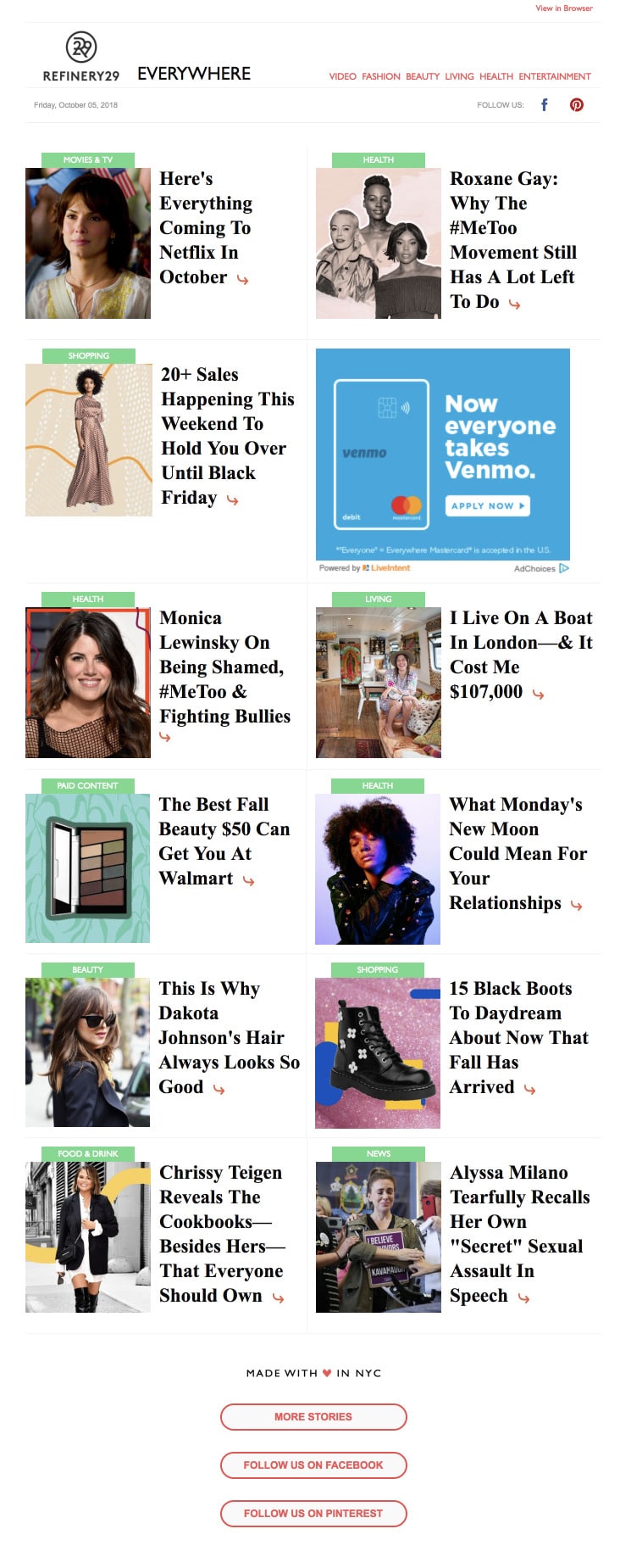
R29’s newsletter features the best content from across their site by including article titles next to the thumbnail images that link to the post:
Source: R29 Newsletter
This format allows subscribers to quickly scroll through headlines and visit the posts each individual finds most interesting. Even though R29 covers a lot of topics from health to horoscopes, much like Buzzfeed, they only have one newsletter; because the one newsletter includes so much white-space and is easily digestible, this format works for them.
In fact, utilizing white-space can increase comprehension by 20%. Considering R29 subscribers are likely to be interested in multiple topics, sending only one newsletter cuts down on the total number of emails subscribers receive, combatting email fatigue and thus increasing engagement and opens.
What you can copy:
When designing your next email campaign, copy R29’s award-winning newsletter by incorporating more white-space and including the best content from your website. Your users are more likely to open your email when they know they can scan it quickly to get to the best parts. Luckily, since each user has their own idea of what the best parts actually are, you can include more links and content without sacrificing click-throughs or overwhelming your subscribers.
Wrap up
As much as everyone loves recognition, these award-winning emails have the added benefit of bringing in revenue and increasing engagement for their brands. Copy these tactics and you’ll see greater opens, click-through rates, and revenue from email:
-
Build a quality list of engaged subscribers like Lily Lines
-
Segment and automate like Buzzfeed
-
Provide clear CTAs and include your brand story like FLOR
-
Utilize your customer’s data to personalize like Peloton
-
Optimize emails for quick comprehension like Refinery29
Copy these 5 things and you’ll be on your way to creating an award-winning email campaign, but even better, you’ll see improvements in the key metrics that matter most to your brand.
MOST RECENT ARTICLES
Want to engage your audience and grow your brand? Try Emma's robust easy-to-use product today.


