4 Inspiring email templates to jumpstart your email marketing in the new year
Now that we’re in 2020, marketing teams everywhere are amping up their strategies. That includes designing new email templates to give their campaigns a fresh new look.
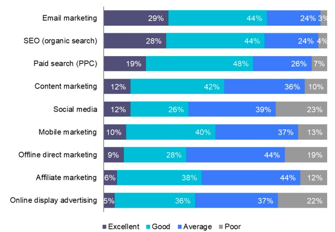
With an average return on investment (ROI) of $38 for every $1 spent, email marketing continues to be one of the most effective marketing channels for brands.
Yes, while social media marketing did see an increase in activity during 2019, several reports state that email marketing has been reinvigorated following the introduction of the General Data Protection Regulation (GDPR).
Email marketing provides a distinct set of benefits that many other channels—including social media—have yet to match. It’s still the top-ranked channel among businesses of all types and across multiple industries.
Source: 2019 Email Marketing Census
If you plan to get the most out of your marketing strategy in 2020, start working on your new email templates now.
Design trends to consider for your email templates in 2020
Email templates are a great way to help get your brand organized for the year. They provide your marketing team with a foundation and spark your creative flow (if you’re experiencing a post-holiday creative block).
While countless email template blog posts can help you brainstorm, there are several email design trends that you’ll want to consider before getting started—although many of the basic email design principles will remain the same (like designing for accessibility and mobile devices).
Interactive email templates
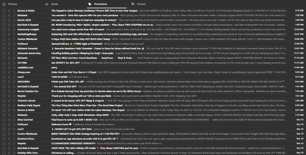
Interactive emails are becoming increasingly more popular, especially as the average reader’s attention span seems to shrink. Think about it: When your email inbox is as full as the average consumer, it’s not unreasonable for someone to skim through to find the most interesting content.
Source: Gmail
If your “from” name, subject line, and preheader text get readers to open your message, you better have an email that will hold their attention.
Instead of walls of plain text, consider adding more to your design. Studies show that interactive email content increases a brand’s click-to-open rate by nearly 73%, while adding videos can boost your click rates up nearly 300%.
Interactive content comes in several different forms:
-
Cascading Style Sheets (CSS)-animated buttons
-
Images with different effects, such as a rollover effect or a carousel
-
Video content
-
GIFs
Source: Quora
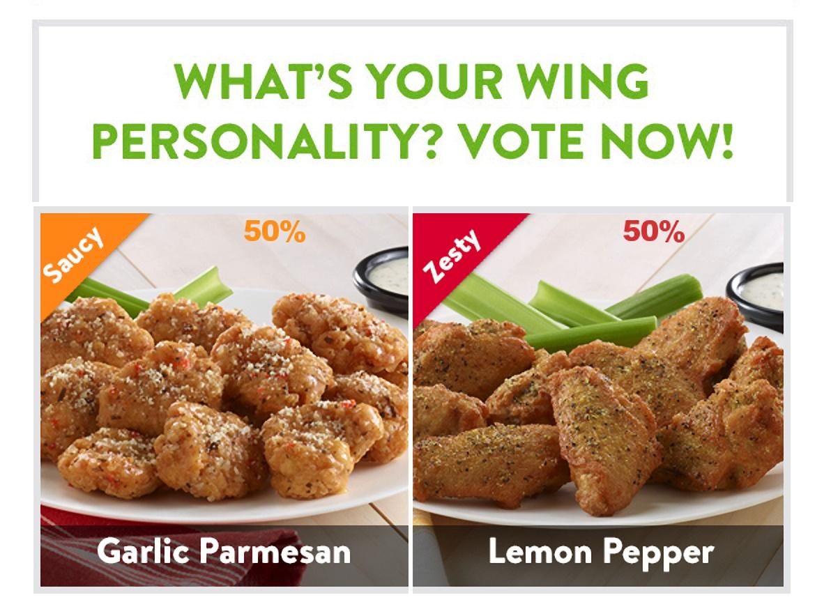
Email templates that include integrated polls and surveys
Another form of interactive content worth adding to your email template is polls and surveys. Email marketers already know these are valuable—but usually when they’re used with a call-to-action (CTA). This means your audience participates in the poll or survey by clicking a link or button and going to a landing page.
While that’s not necessarily an ineffective move, including this type of content within the actual email is preferred by many. In fact, interactive content generates nearly two times more conversions than passive content does.
Sure, while videos and GIFs are preferred, 82% of email users say they’d take any interactive material over traditional static emails.
Source: Liveclicker
Email templates that include animations
People love animated content—and it comes in many forms. While video content is excellent for certain campaigns, many marketers find that going with a GIF is more beneficial.
Why? GIFs help keep readers engaged in your email. They relay a message that’s more digestible than most videos and text. Our brains crave visuals: They process images nearly 60,000 times faster than text, and 90% of the information they transmit is visual.
And according to the popular site GIPHY, consumers spend nearly two million hours a day viewing GIFs on their site. Brands can use GIFs to relay messages in a fun and relatable way.
Take the recent explosive popularity of “The Child,” also lovingly known as, “Baby Yoda.”
Source: GIPHY
This GIF is everywhere online, and many are taking this and using it to benefit their brands.
While Lipton hasn’t officially jumped on the Baby Yoda GIF train, that hasn’t stopped their fans from having some fun.
Source: Reddit
If Lipton were looking to relate to a certain fanbase, they could include this GIF in an email campaign to help capture the reader’s attention and make their content more relatable.
Including negative space in email templates
Finally, a design that’s coming back into favor for 2020 is the use of negative space.
While many brands have focused heavily on creating flashy, eye-catching designs, the use of negative space in email templates cuts down on unnecessary clutter. This can keep readers engaged longer since they aren’t looking at content-heavy emails.
Negative space, also commonly known as white space, is easier on the eyes. This is especially important for those who prefer to scan email.
Take this example from Sur la Table.
Source: Milled
The use of negative space gently guides the reader’s eyes to the images and CTAs included within the message. This shows readers where the essential pieces of content are.
4 inspiring email templates
Intrigued by the design trends we’ve mentioned? Then you’ll love these examples we found. Here are four email templates worth reviewing before you start building your own.
1. PizzaExpress–integrated polls and surveys
This example of an integrated poll from PizzaExpress is one of our favorites. Not only does it include the poll, but the brand also went the extra mile to mimic the popular Instagram formatting. This makes it more relatable.
Here’s an idea: If they include the same poll in their Instagram story, they’ve incorporated their social media strategy into their email marketing. This will help broaden their audience interaction across multiple channels.
Source: Really Good Emails
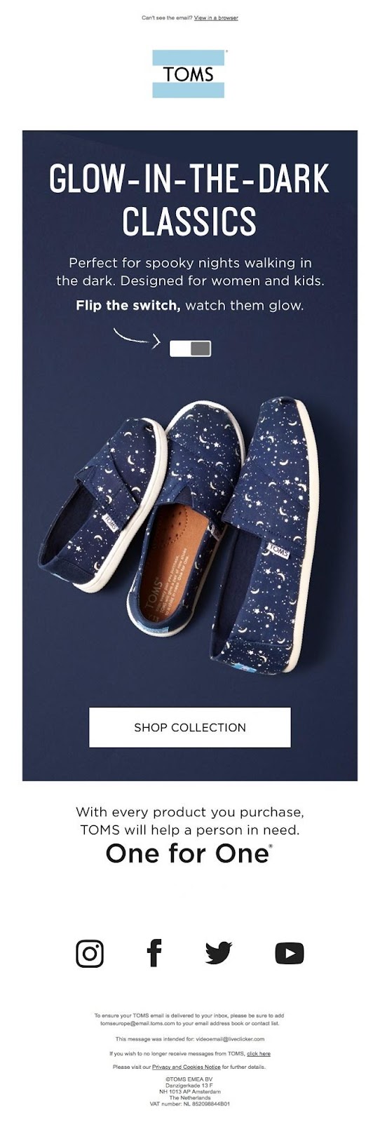
2. Toms–interactive email template
This interactive email template from Toms is both fun and straightforward. It uses the concept of an image rollover by allowing recipients to toggle over the button and view two variations of the featured product.
This is excellent because it allows viewers to see the product from different perspectives right from the email. Should the product impress the consumer, they can quickly head to the product page and make their purchase.
Source: Really Good Emails
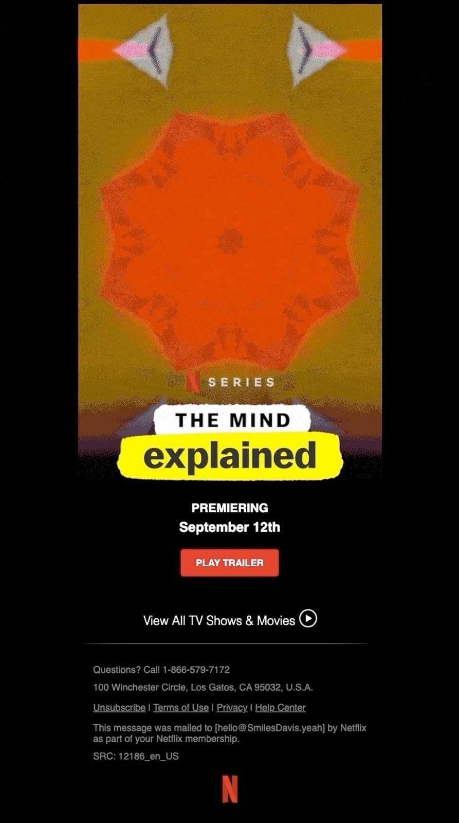
3. Netflix–animated email template
Netflix does a wonderful job of catching their reader’s attention with the use of an animated image as their email header. The animation instantly attracts the viewer’s attention and draws them down to the CTA, which encourages them to play the trailer.
Source: Really Good Emails
4. FromYouFlowers.com–negative space in a template
FromYouFlowers.com did a great job of using negative space as a design feature that helped highlight their holiday arrangements.
Since most of their holiday arrangements featured green and red, it was an excellent choice to use a white background. Also, the highlighted CTAs increase the chance of readers clicking to view more (and hopefully purchasing something).
Source: Gmail
Wrap up
With 2020 upon us, make sure you and your marketing team are working on new, exciting email templates. If you don’t know where to start, we suggest reviewing these popular email design trends and applying them to your 2020 email templates:
-
Interactive email templates
-
Email templates that include integrated polls and surveys
-
Email templates that include animations
-
Adding negative space in email templates
Ready to take 2020 by storm? Request your live demo with Emma today.
MOST RECENT ARTICLES
Want to engage your audience and grow your brand? Try Emma's robust easy-to-use product today.

