Don’t underestimate those tiny links. They’re the driving force behind every email campaign. The question isn’t whether to include links in your email—but how.
In this post, we’ll cover some tips on how to make an email link that readers can’t help but click so you can drive more traffic to your landing pages.
How to make an email link: 14 tips
Consider these best practices on how to make an email link optimized for accessibility and action.
1. Choose relevant keywords
People don’t read every word of web content—they scan in different patterns. As people scan, they look for specific keywords to find the information they need. You can help them out with relevant keywords.
Every hyperlink in your email should include at least one relevant keyword—preferably within the first two words of the link—to grab attention and help subscribers navigate your email campaign.
“New women’s styles,” “fresh organic recipes,” and “latest industry news” are all great choices.
2. Now’s not the time to be vague—get descriptive
On the subject of word choice, don’t leave your links open to interpretation with vague language.
Researchers found that hyperlinks like “learn more” and “get started” are too ambiguous because they don’t give off what’s called a strong information scent.
In other words, your subscribers should clearly sniff out what’s on the other side of your link from the hyperlink text alone without reading the surrounding copy.
“Sign up for your free trial” or “learn more about the benefits” work much better because they’re meaningful and inspire confidence to click.
3. Use actionable and relatable language
Yes, we’re still talking about hyperlink word choice. It’s an important part of learning how to make a link.
When writing a call-to-action hyperlink, action verbs are important for telling your subscribers what you want them to do after they click the link.
No one likes hints, right? Are they supposed to buy, sign up, RSVP, or learn? Tell them what to do, and they’re likely to follow through.
If you can, include the word “you” somewhere in the link as well to help subscribers envision themselves taking action.
Last tip on this: Leave out any technical jargon—it comes across as intimidating.
4. Live up to the promise behind the link
On the final topic of word choice, keep in mind your hyperlink is a promise—just like a headline.
If you promise something in a hyperlink or the surrounding contextual copy, but the landing page displays something totally different, subscribers will feel played or cheated, and they’ll get frustrated.
In a worst-case scenario, subscribers could report your email as spam, which damages your sending reputation and limits the reach of future emails (and everyone else who shares your IP address).
CB Insights included many links in the following email (something we’ll get to later), and all of them include descriptive words that live up to the promise on the other side of the link. Plus, they included plenty of actionable keywords in their hyperlinks and placed many of them at the ends of paragraphs to grab attention.

Source: CB Insights Archive
5. Choose a contrasting color
Readers scan web pages and emails looking for contrasting colors to find what’s clickable or tappable.
For many years, blue was the internationally recognized link color. These days, however, you can broaden your link color—just make sure it’s bright and stands out from the rest of your copy.
For older demographics, it may still be a good idea to stick with blue links.
It’s important to keep accessibility in mind as well. Some of your subscribers may suffer from color blindness or vision impairments.
Neon yellow on a white background may cause readers to squint, while orange text may appear gray to colorblind readers.
6. Consider background colors or images
Magenta or bright red links can sure grab attention—but not if they’re placed over a background image with similar colors or a complex design. Make sure your link colors don’t blend into the background or get lost inside a graphic.
To draw attention to a link on top of an image, you may want to choose a CTA button over a simple hyperlink.
Arizona State used nice contrasting colors for their descriptive links.
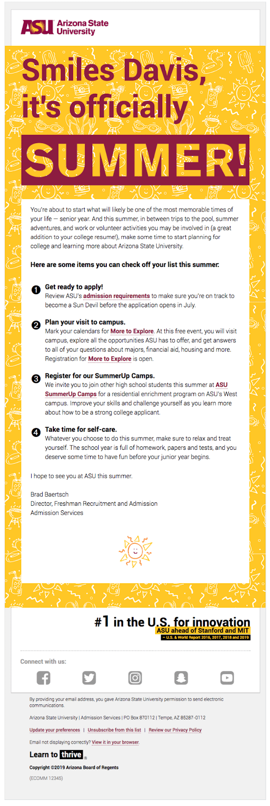
Source: Really Good Emails
7. Make sure the link is easy to click from a phone
Google punishes web pages that place hyperlinks too close together because, for mobile users, it’s too easy to click the wrong link accidentally.
Use the same mobile-first strategy for your emails: Don’t put your links too close together and use large text.
Assuming that most of your subscribers are right-handed, consider placing links along the right edge of the screen, so they’re easy to tap with a thumb while holding the phone with one hand.
8. Negative space is your friend
Links in the middle of a paragraph require subscribers to dig out their metaphorical magnifying glass even if you use a bright color. Place links at the end of a line or paragraph—better yet, on their very own line—where they’re surrounded by plenty of white space.
Remember that people scan—they don’t read every word. Negative space helps draw attention to your links.
This fundraising email from The Nation includes two CTA links in bright red isolated on their own lines with plenty of white space in between.
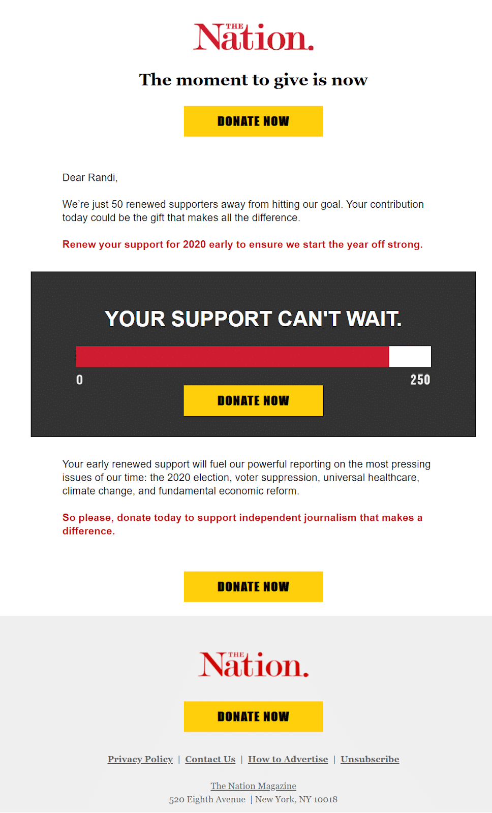
Source: Gmail
9. Give them options
Ready for a shocker? Campaign Monitor found when it comes to click rates, more is better.
While a single CTA keeps website visitors focused on a single action, email subscribers prefer choices. Including two or more links increases your chances of a subscriber finding something interesting and relevant.
Just make sure you space your links out to avoid confusion. Take your copy into consideration, too. Ten hyperlinks is far too many for a 200-word email.
10. Use a CTA button
For the most important link, go with a button instead of a hyperlink. CTA buttons have bright colors and they’re bigger than other text elements, so they’re easy to click from a phone. Don’t forget to follow the other guidelines here on how to make an email link for your CTA buttons as well.
11. Don’t rely on images alone
Many of your subscribers may have email images disabled, so it’s not smart to rely on them for your links. Likewise, many people may not realize that an image is clickable or tappable if there’s no text over it.
Instead, design your linked graphics with CTA text or buttons and include a backup link in case images don’t load.
In this email, UNICEF includes multiple options for the subscriber to choose from. Each link is actionable, descriptive, and accurately describes what’s on the other side of the link. While the images function as links, UNICEF includes descriptive backup text links as well. Plus, there are two big buttons to donate or join at the bottom.
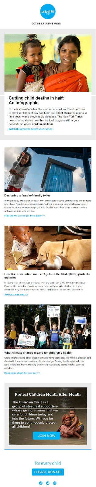
Source: Gmail
12. Optimize your landing pages
More than half of all emails are first opened on mobile devices.
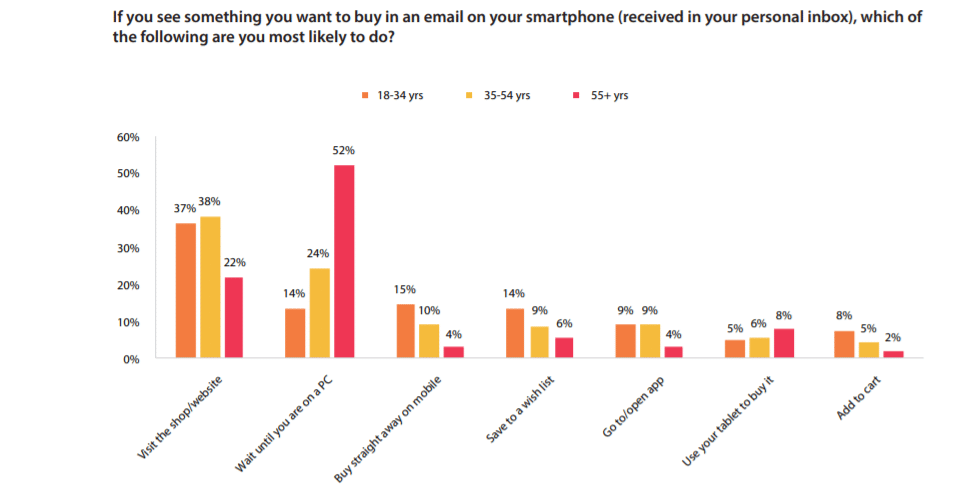
With promotional emails, 4% to 15% of people say they like to make purchases right away through their phones. Meanwhile, 14% to 52% say they prefer to read about the promotion on mobile but go on a desktop to complete the purchase. Not just your email—but landing pages as well—must be 100% optimized for both mobile and desktop browsing.
Aside from mobile accessibility, landing pages should load as fast as possible—in two seconds, but preferably less.
Use the same voice, tone, and design as your email to keep a consistent vibe flowing and avoid confusing readers.
Source: DMA’s Consumer Email Tracker
13. Test your links for accuracy
The ultimate faux pas: A broken landing page link. Yikes.
Run a quick test after you finish writing your email to make sure all links work—and lead to where they’re supposed to go.
14. A/B test your link placement and other properties
It’s also a good idea to run A/B tests to see which links perform best among different demographics. Send out two emails using unique colors, placements, and keywords to track their click rates and conversion rates. It may surprise you to find that even subtle changes can have a massive impact on clickability and your subscribers’ actions.
How to make an email link: Wrap up
The truth is, understanding how to make an email link is a fluid process. Trends and subscriber expectations change. In general, remember to:
-
Keep language relevant, accurate, and actionable.
-
Consider colors, contrast, and visibility.
-
Optimize link placement for single-hand mobile tapping.
-
Give subscribers a few link options so they can choose what’s most interesting and relevant to them.
But really: How important are colors in your email? Check out this post and learn how to pick a scheme that increases your email conversion rate.