How to create an engaging email design

Using Emma's editor to build beautiful (and effective) emails
My name is David Saunders, and I work on Emma's Design Services Team. You can think of our department as a creative agency that specializes in all things email. We work as an extension of our customers’ teams to create everything from simple header graphics and reusable templates to fully customized campaigns.
Here, I'll teach you how to take plain text, images, and links and compile them into an effective email in our drag & drop editor. You can think of me as Julia Child, only with email.
Why should I care about email design?
The remnants of our caveman brains tend to crave things that are well-made over things that aren’t. Design creates value both on a conscious and sub-conscious level. It helps us sift through the nonsense quickly and get to the good stuff.
You also have to remember that no matter how big or small your brand is, you’re still going toe to toe with companies that devote a lot of resources to design. Thankfully, even if you aren't a designer by trade, you can use our drag & drop editor to create emails that will stand up to the best of them.
An email design case study: Off The Hook Fishing Charters
Rather than styling a bunch of lorem ipsum and generic images, I’ve created a fictional client that needs some help with his email design.
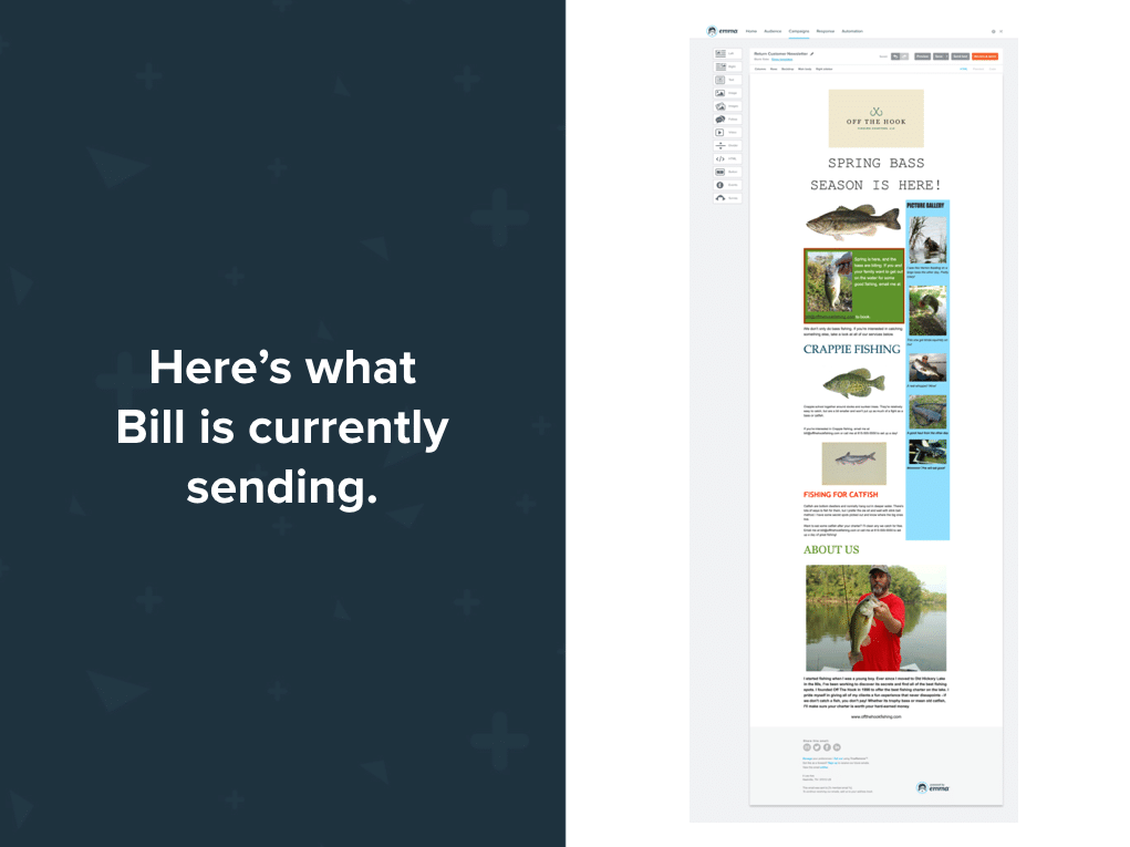
Introducing... Off The Hook Fishing Charters, LLC, a humble company that takes people fishing on Old Hickory Lake. Their owner, Bill, has sent over an example of an email he’s working on and asked for my recommendations and tips on how to make it look nice in the editor.
Step 1: Check Thyself, Or Wreck Thyself
This is where most people go wrong in email marketing: They try to do too much all at once. Bill has some great content, but he's muddled his message with too many design elements and calls to action. I've asked him to take an audit of his content and ask these questions:
• What is my goal?
• How do I want to measure my goal? (e.g. purchases, event signups, clicks on a specific link)
• Does my content help or hurt this goal?
• Is any of this excessive, or should it be a separate email entirely?
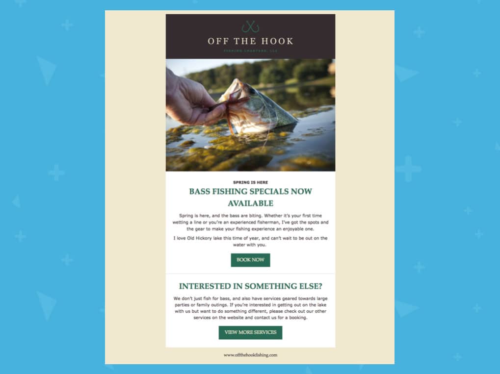
Initially, Bill listed every single service he offers, and he wanted to send the email to his entire list. Instead, we're going to target a specific audience that has expressed an interest in spring bass fishing.
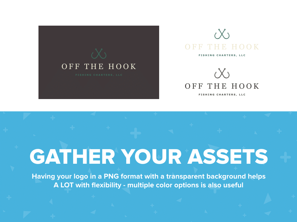
Let’s gut this and gather some new assets.
Step 2: Copy, Paste, Rinse, Repeat
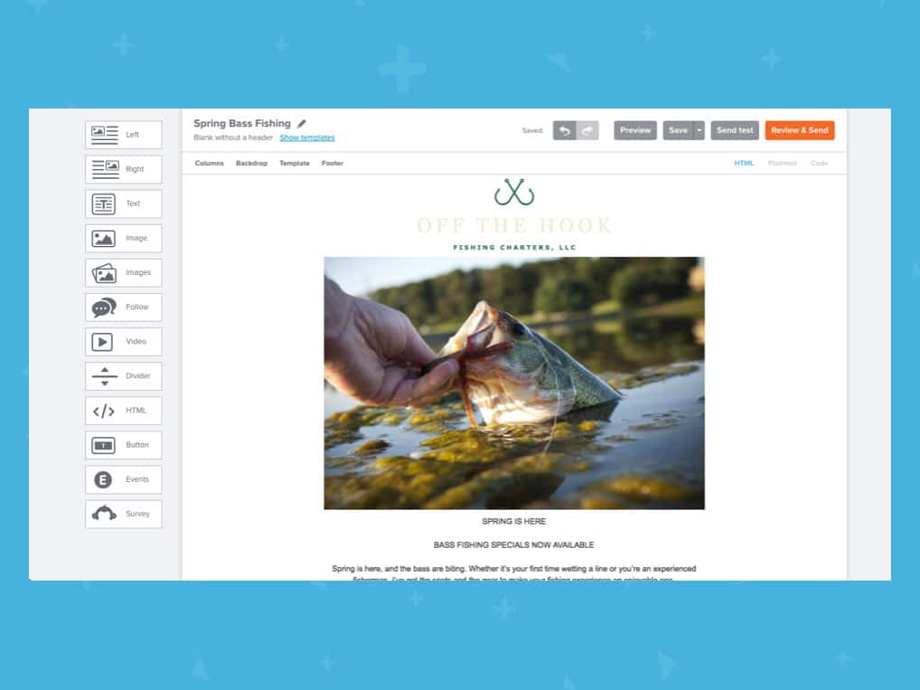
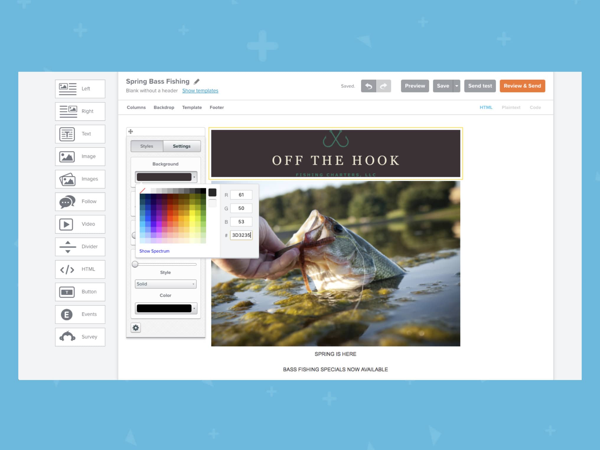
Now that we’ve decided what content is relevant to the message and gathered our images, we just need to get it in the editor so we can start working with it. Nothing here is final; we’re just laying down paint on our metaphorical canvas. I'll get all the text in place and upload my images.
Step 3: Rules Are Cool And Good (In Email)
If you ever study art or design, two of the most fundamental concepts you’ll learn are hierarchy and contrast. These things are ESPECIALLY important with text because it subconsciously tells readers what’s most important, and in the case of interactive media, what you can click on.
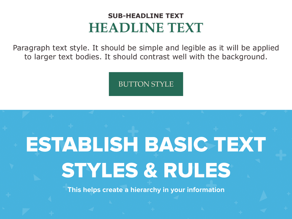
Bill needs to come up with some basics on how to style his headers, subheaders, links, and plain paragraph text, then apply that throughout his communications. It doesn’t have to be the exact same every time, it just needs to make sense for that specific email.
He should also establish a basic color palette. Again, it's ok to stray every now and then, but he should aim for consistency.
Step 4: Space (No, Not That Kind Of Space)
Believe it or not, space is just as much a design element as color or text or images. Some designs call for things that are grouped together compactly, while others have generous amounts of padding and margin between elements. Some have a combination.
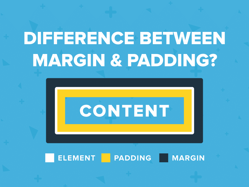
Let’s apply an appropriate amount of margin and padding to our design.
Step 5: Small – But Mighty – Touches
Now, let's spruce it up with a few other small things: “bezels," borders, dividers, etc. None of these are required, but they can add that extra layer of polish that makes everything look well put-together.
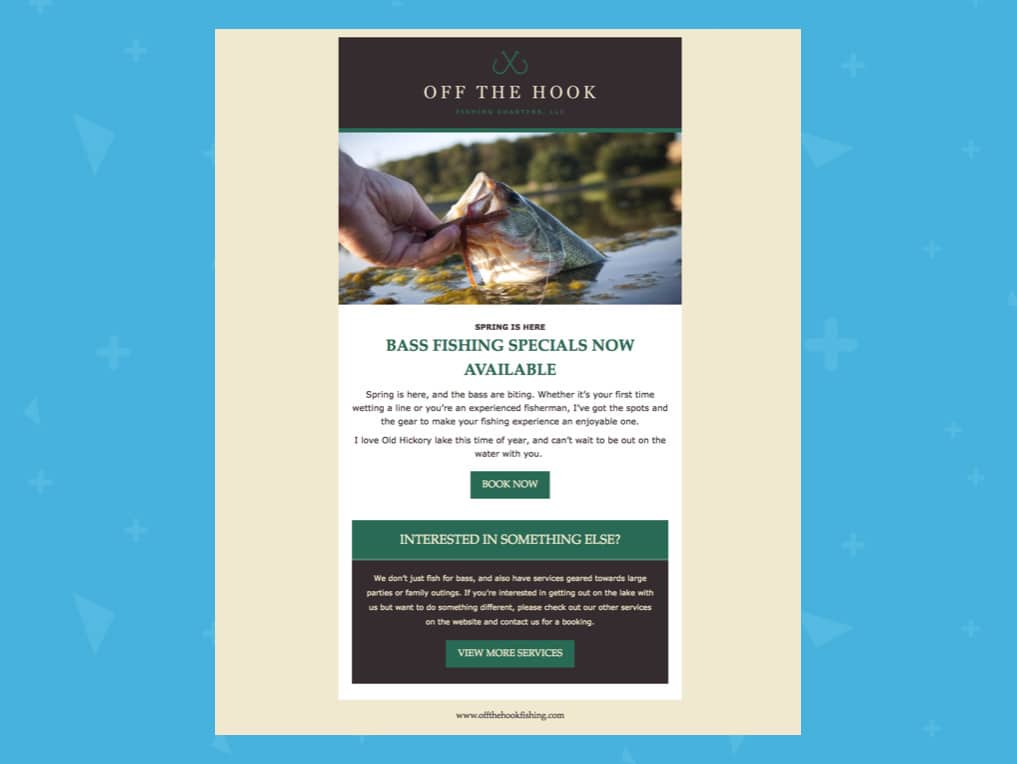
Now doesn't that look much better?
Hopefully, this new-and-improved design will help Bill book more charters and grow his business!
In summary...
1. Self-audit and edit your content to be brief and compelling – the more targeted, the better.
2. Find or furnish relevant, high-quality images to accompany your text, then add your text and images to the editor.
3. Establish a hierarchy/general style guide to follow.
4. Add appropriate padding or margin.
5. Consider extra touches for more polish.
Blamo! You’ve got a nice mailing.
Need some help with your brand's email design? My team would love to lend a hand!
Just get in touch to learn more about the custom design services we offer Emma customers.
MOST RECENT ARTICLES


Want to engage your audience and grow your brand? Try Emma's robust easy-to-use product today.