10 tips for email landing pages that convert

Crafting messages is where email marketers thrive.
You can navigate clean layouts, concise copy, and engaging calls to action (CTAs). But what happens after your readers click on that link? For those leads to turn into subscribers – and, eventually, customers – your emails need to direct people to lead-capture pages set up to convert.
It’s no wonder building landing pages is a skill most digital marketers have in their toolkit, whether they’re doing it manually or through a hassle-free landing page builder.
Below, we’ll find out more about how lead-capture pages and email marketing work together. Then, we’ll go through a list of 10 best practices for creating email landing pages.
How does building landing pages complement creating email campaigns?
Marketing emails almost always require subscribers to complete a specific action. If they don’t sign up for your mailing list, shop on your online store, download your free expert guide, or register for an event, you can’t call the campaign a success.
You can point readers to your website’s homepage or a specific product page instead. You don’t even need to hire a developer to create a custom landing page.
When you pair an email with a tailor-made lead-capture page for a particular brand promotion or subscriber list segment, both will likely perform better. Email marketing needs that boost, too. Less than 25% of businesses indicate satisfaction with the conversion rates of their email campaigns.
10 email landing page best practices for increasing conversions
Less than 50% of marketers that incorporate building landing pages into their campaigns report getting a substantial return on investment (ROI).
So why bother? Because, similar to email design, landing page design matters. If you make the right choices and follow best practices, conversion rates can rise dramatically.
To help you figure all of this out, here are 10 tips for building landing pages that convert.
1. Know your audience.
Marketers should always have an ideal or representative customer in mind. How old are they? What are their interests? You may also recognize this concept as the buyer persona.
When you know what type of audience you want to attract, it’s much easier to construct a lead-capture page that entices them. You can also make adjustments, like using larger fonts for marketing to an older audience or using youth-oriented copy to market to Gen Z.
With a big enough subscriber list, you may even want to craft unique landing pages based on demographics like age or gender.
2. Design complementary emails and landing pages.
As two parts of a single campaign, matching the messaging on both your email and landing page is crucial. Don’t promise something in your email that you can’t back up with an actual offer found on the lead-capture page.
Charity: Water’s email below features a simple and clear message that gets straight to the point.
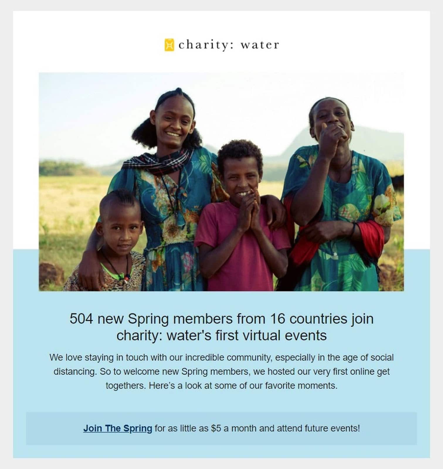
Source: Milled
As we’ll see in succeeding examples, this Charity: Water email matches its landing page not only in messaging but in visual cues. They used sans-serif fonts, white space, and the color blue. When a subscriber clicks “Join The Spring,” they’re taken to a landing page that feels like an extension of the email. It’s instant confirmation that they’re on the right track, giving them the confidence to follow through on the desired action.
3. Lead with a compelling headline.
Like email subject lines, page headlines need to stand out. It’s that foot in the door that keeps the opportunity for conversion alive. Think of an email landing page’s headline as your second first impression.
Eight out of 10 people will get to a point where they can read your landing page headline. What those readers do after depends on the strength of your words. Your emails will hook readers into clicking links, but page headlines will help readers decide if your brand is worth their time. If you want them to read the rest of your copy, click on a page’s CTA, or talk about you on social media, you have to make sure those headlines are flawless.
4. Make your CTA irresistible.
When building email landing pages that convert, persuasive headlines and succinct copy must support a killer CTA. It’s tempting to add several CTAs to drive traffic to other parts of your website that need visibility, but often this muddles the point and dilutes the focus of your audience. However, longer landing pages may benefit from several CTA buttons.
Place your primary CTA above the fold and consider including power words. You may offer people something they want as a lead magnet to increase the chances of conversion – anything from a downloadable guide to an in-store discount will work.
5. Don’t ask for too much information.
The typical format of an email landing page features a form with one or more fields to fill out before people can claim a deal or sign up for an event or mailing list.
Of course, you want to get to know your audience better – but that can come later. Resist the urge to add too many fields for information-gathering purposes. Forms perform best with up to three fields, with an average of a 25% conversion rate. The more fields you add, the less likely the form will help convert.
Landing pages work well with emails because together, they present a streamlined process. Don’t compromise the effectiveness and efficiency of your marketing campaign with a form that will tire out prospective leads.
6. Keep the page short and simple.
Brevity and simplicity make pages easier to navigate, cutting down on possible human confusion.
Statistics show long-form content as better performers for ranking. However, the strategy works for blogs and articles—not for landing pages. Keep the main copy of your landing page under 500 words.
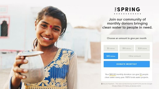
Source: Charity: Water
The Charity: Water landing page detail above shows what the email’s “Join The Spring” CTA entails. There will likely be a second form to fill after you click “Donate Monthly,” but that’s expected of actions that require payment information.
What’s noteworthy here is how easy Charity: Water makes it for people to donate. Buttons designating suggested monetary amounts and a field to type in a custom number – with a short note in fine print explaining in concrete terms how your donation will help – are great elements of an uncluttered design.
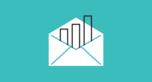
7. Add images or videos.
Significant visual components can attract attention and convey so much information in a fraction of the time it takes for people to process words. Customers are 80% more likely to read marketing content if it’s broken up with colorful and bold graphics.
Videos embedded in landing pages have increased conversion rates by around 80%. This comes as no surprise as the human mind processes images around 60,000 times faster than pure text. Explainer videos – such as the one featured in the Charity: Water landing page screenshot below – take less time to understand than paragraphs of copy.
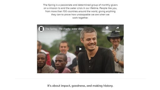
Source: Charity: Water
Watch out for display issues or slow loading times, though. More than 85% of consumers online won’t give a website a second chance if their first experience is a bad one.
8. Reduce the number of navigational links.
Fewer than 20% of landing pages follow this practice. Most lead-capture pages include a navigation bar or several non-CTA links. Though it may feel counterintuitive, more navigational links can tank your conversion rates.
Why? Besides your CTA, each avenue out of your landing page is a path to non-conversion. If you must add more links, keep them away from focus and consider putting them near, or at, the footer of the page.
9. Consider including customer testimonials.
This practice is also called using social proof. Consumers expect brands to talk about themselves and why their products are so great, so it’s no great surprise if the language is positive. When customers leave glowing reviews or talk about how satisfied they are, the effect is more convincing.
Let your success speak for itself through your customers.
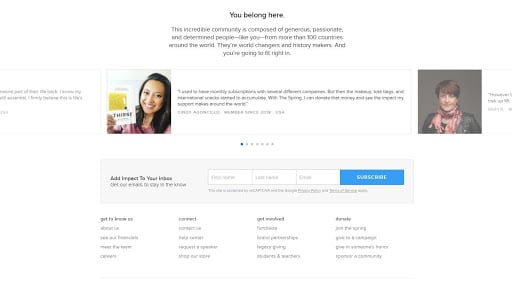
Source: Charity: Water
The idea remains the same for nonprofits, as seen in the Charity: Water landing page detail above. Multiple donor testimonials on a carousel near the end of the landing page – right above a secondary CTA that looks to be an email signup form – can encourage others to be part of the nonprofit’s community.
10. Always test your landing pages.
At the top of this list, we mentioned the low ROI of landing pages. Did you know that their average conversion rate is less than 2.5%?
Testing and targeting can increase landing page conversion rates by up to 300%. Too many businesses create their landing pages and then don’t A/B test them with any consistent strategy, so it makes sense that this best practice is the game-changing one in terms of increasing metrics.
Wrap up
Marketing emails and landing pages are a great pairing to supercharge your marketing initiatives because each one lifts the other. Email campaigns perform better with custom lead-capture pages and vice versa.
Here are 10 tips for crafting landing pages that will engage and convert:
-
Know your audience.
-
Design complementary emails and landing pages.
-
Lead with a compelling headline.
-
Make that CTA irresistible.
-
Don’t ask for too much information.
-
Keep the page short and simple.
-
Add images or videos.
-
Reduce the number of navigational links.
-
Consider including customer testimonials.
-
Always test your landing pages.
Do you lack the expertise to create landing pages manually? We can help. Build and publish landing pages with us in no time.
About the Author
Emma is an email marketing platform that gives you all the tools you need to send campaigns that really connect with your subscribers. With our
More Content by Emma Email
MOST RECENT ARTICLES


Want to engage your audience and grow your brand? Try Emma's robust easy-to-use product today.